
4. How to Read Footprint Charts: The Complete Guide
How to read footprint charts: cell anatomy, delta, ticks, ATS, absorption, divergence, POC and value area — plus a complete free footprint setup you can copy.
4. How to Read Footprint Charts: The Complete Guide
To read a footprint chart, you read one candle at a time and ask three questions in order: where did the volume concentrate, which side was aggressive, and what happened at the extremes. A footprint takes a normal candle, slices it horizontally into every price it traded at, and shows you at each price how much was bought aggressively and how much was sold aggressively. The candle tells you the result. The footprint tells you the transaction.
This is the longest lesson in the course and the one that matters most. The standard footprint chart is free for every user — open it in another tab and read this with a live chart next to you. Get a coffee.
What you'll learn in this lesson
- Exactly what a footprint candle is, cell by cell, and why the numbers sit where they do
- The zoom problem that makes most beginners give up in the first ninety seconds
- Delta — and the trap that catches every single person who learns it
- Volume vs ticks, and how to tell a crowd from a whale
- ATS, AVB and ABS, and which of them you will actually use
- The visual signature of absorption, divergence and convergence
- POC, value area, naked POCs and aggregation
- A complete, copyable footprint setup with the reasoning behind every setting
Lesson 4 of 16 · Part 1 — Analysis. Part of the free order flow trading course. Previous: How Price Really Moves. Next: Market Structure and Trend.
▶ Prefer to watch it?
Footprint Charts for Beginners — How to Actually Read Them (Free, Step by Step) is this article on a live chart. Every setting: Footprint Charts & Range Candles Explained (Ep 2) · The three reads that matter: Footprint Charts Changed How I See the Market · 60 seconds: FREE FOOTPRINT CHARTS
Key terms
| Term | What it means |
|---|---|
| Footprint candle | A candle sliced by price, with aggressive buy and sell volume shown at every level |
| Delta | Aggressive buy volume minus aggressive sell volume |
| Ticks / Trades | The count of trades, as opposed to their size |
| ATS | Average trade size = volume ÷ number of trades |
| AVB | Average volume per block — how evenly volume is spread across the structure |
| ABS | The absorption metric. Always written and said "A-B-S" |
| POC | Point of control — the single price with the most volume |
| Value area | The price range containing the bulk of the volume, conventionally 70% |
| Absorption | Heavy aggression met by passive orders, producing volume without movement |
What a footprint chart actually is
In the last lesson we walked an order through the book: it took 2 units at one price, 12 at the next, 6 at the next. Volume was created at each level, on the way through.
A normal candle takes all of that and gives you one number.
A footprint chart simply refuses to throw it away. It takes the same candle, slices it horizontally into every price it traded at, and at each level shows two numbers: how much was bought aggressively and how much was sold aggressively.
A footprint = the candle, sliced by price, split by aggressor.
That is the entire concept. Everything else in this article is detail on top of it.
Note the word aggressive — this is where people get confused, and it is why the previous lesson came first. A footprint is not showing you "how many buyers and sellers" (every trade has both). It is showing you, at each price, how much volume was started by an impatient buyer lifting the offer versus started by an impatient seller hitting the bid.
Green = someone paid up to buy. Red = someone sold down to get out.
Keep this image for the rest of your trading life: the candle is the headline, the footprint is the receipt. The headline says "price closed up $400 today." The receipt says who bought what, at which price, and where they stopped. Nobody makes decisions on headlines once they have seen the receipt.
Turning it on — and the zoom problem that stops most beginners
In NOROVIEW: top bar → Chart → Footprint. There are four chart types — Line, OHLCV, Footprint and NORO Footprint — and each row has a small gear that switches to that type and opens its settings at the same time.
The standard Footprint chart is free for every user. Not a trial, not a teaser. The chart this entire course is built on costs nothing. (The multi-column NORO Footprint is a paid upgrade — more on that later.)
Now the problem. You switch to a footprint chart and it looks like... normal candles. No numbers. Nothing.
This is exactly where beginners give up, so let us solve it immediately.
The cells are there. They are just too small to draw.
The numbers exist. The chart physically cannot draw thirty rows of two numbers inside a candle that is nine pixels wide, so it hides them until there is room.
And here is the trap: double-clicking does not fix it. Double-click re-frames the chart back to the latest candles — an excellent habit in general — but re-framing is not zooming. You will double-click, see nothing, and conclude the feature is broken.
The fix: zoom on both axes
- Scroll to zoom in a few notches.
- Drag the time axis (bottom) to the right. This is the step that actually does the work — it spreads the candles apart and gives each one width.
- Drag the price axis (right) to stretch vertically, giving each price level height.
Keep going until the cells are unambiguously legible. Confirm you can read the numbers before you start drawing conclusions about them.
Two working habits come out of this:
A footprint chart is a close-up instrument. You will be looking at somewhere between five and thirty candles at a time. If you can see a hundred candles, you are not reading a footprint — you are looking at coloured mush. That is normal and correct: you do your wide analysis on a normal chart, then come here.
This is exactly why footprints pair with range candles. Fewer, more meaningful candles means each one gets more of your screen. See the previous lesson for why range candles make footprints comparable.
▶ Try this now
Switch a BTC/USD chart to Candles → Range → 10 pt, then Chart → Footprint. Now zoom: scroll in, then drag the bottom time axis to the right until you can read the numbers inside the cells. This takes about fifteen seconds once you know it, and about fifteen minutes of frustration if nobody tells you. Launch NOROVIEW free →
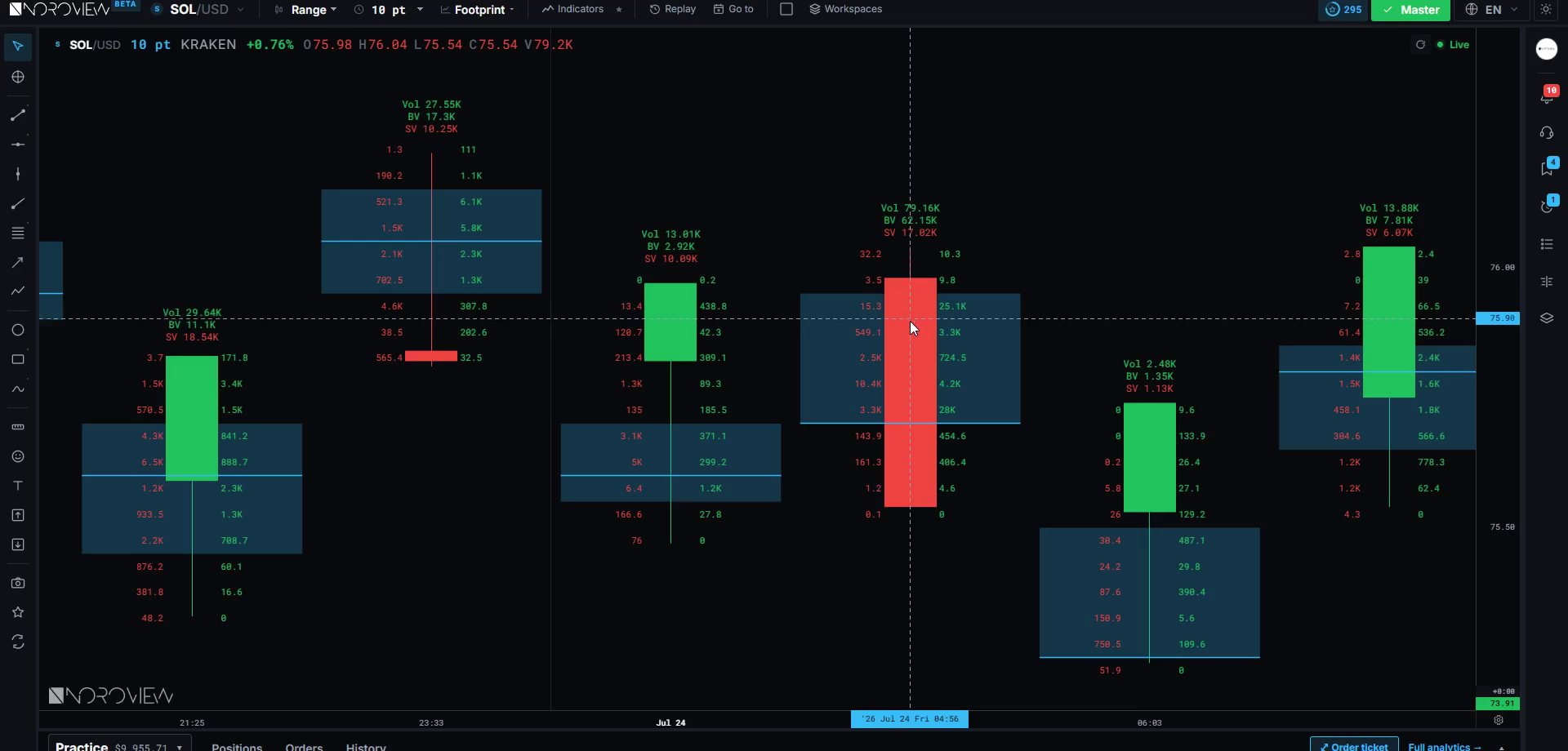
This is what "zoomed in enough" looks like — every number legible, cyan POC lines marked, the value area shaded:
Anatomy of one footprint candle
Let us read one candle completely. Slowly. This is the skill.
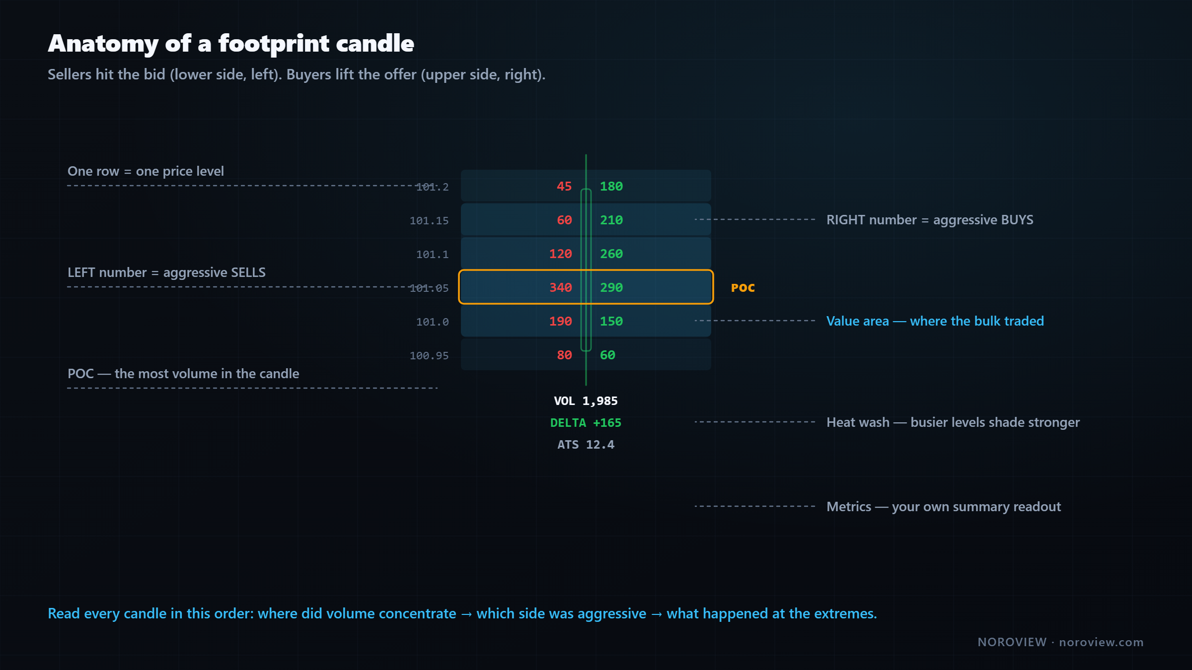
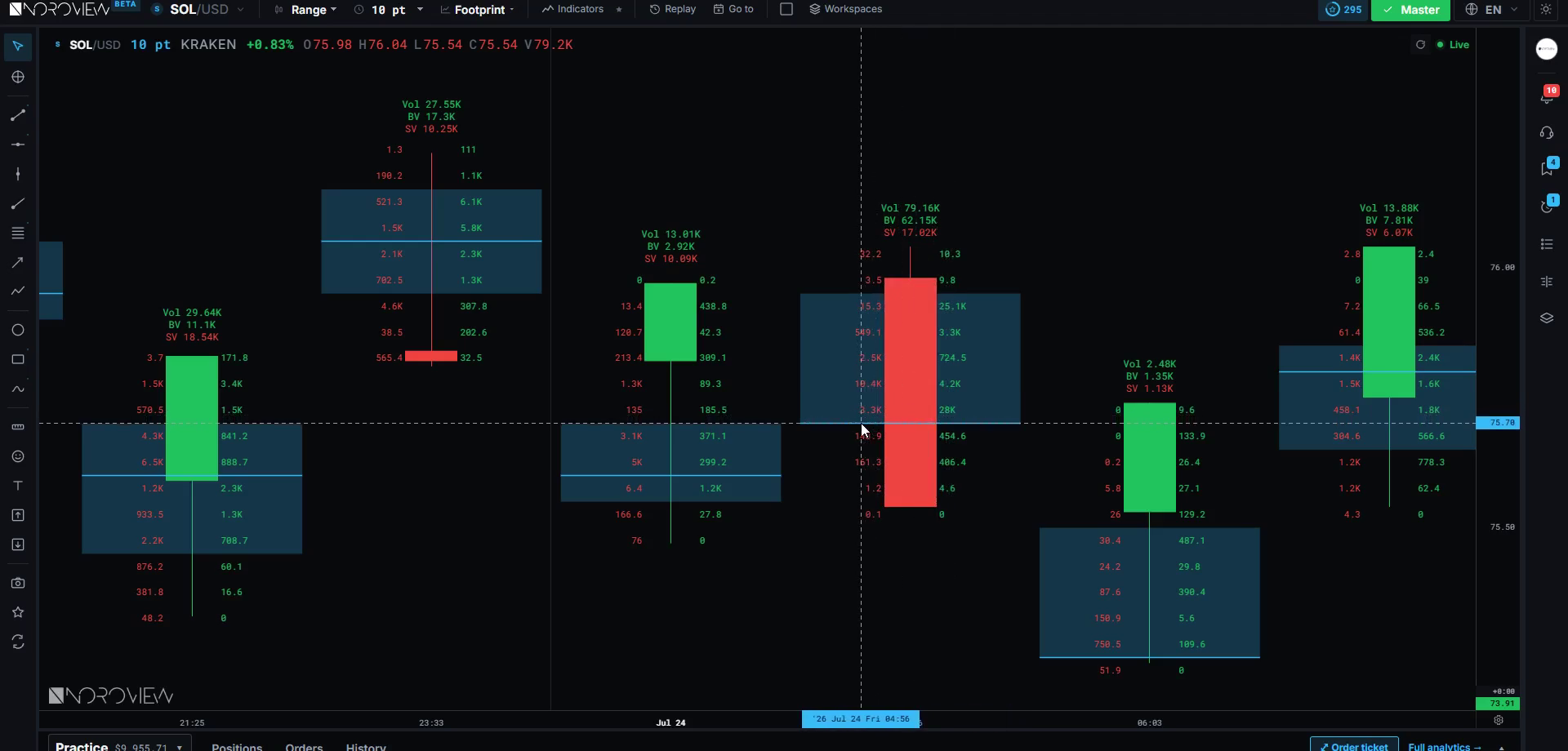
The candle skeleton. The body and wicks are still drawn, as a thin skeleton, so you keep your normal price context. Open, high, low and close are exactly where they always were.
Each row is a price level. One row equals one price — or a group of prices, which is what aggregation controls.
Inside each row, two numbers. On the left, the sell volume — aggressive selling that happened at that price. On the right, the buy volume — aggressive buying at that price.
LEFT = aggressive SELLS · RIGHT = aggressive BUYS
There is a logic to the convention: sellers hit the bid, which is the lower side of the market, so they sit on the left. Buyers lift the offer, the upper side, so they sit on the right. Say it a few times and it becomes automatic.
The shading behind the numbers is a heatmap. Busier levels shade more strongly, so your eye finds the action before you read a single digit. On a fast market that shading does most of the work.
The highlighted row is the point of control (POC) — the single price with the most total volume in this candle. That is where the most business got done, where the auction found the most agreement.
The shaded band around it is the value area — the range where the bulk of the volume traded, conventionally 70%. Inside that band is where the market considered price acceptable; outside it is where price was just passing through. The CME's material on value area explains where the 70% convention comes from.
The numbers above and below the candle are the metrics — a summary readout for the whole candle. That is your dashboard, and it is completely customisable.
Read every candle in this order
- Where did the volume concentrate? (POC)
- Which side was aggressive overall? (delta)
- What happened at the extremes — the high and the low?
Those three questions, in that order, get you roughly 80% of the value of a footprint chart. Everything else is refinement.
Delta — and the trap that catches everyone
Delta = aggressive buy volume − aggressive sell volume. That is the whole formula. 400 bought aggressively against 300 sold aggressively gives a delta of +100. Positive delta means aggressive buyers did more; negative means aggressive sellers did. It measures who was in a hurry, and by how much.
Delta exists at two levels, and people constantly conflate them:
- Level delta — buying minus selling at one specific price row. Tells you where the aggression happened.
- Candle delta — the total for the whole candle. Tells you who won overall.
Both matter. They answer different questions.
Now the trap
Delta does NOT tell you direction.
Big positive delta does not mean price is going up. I will say it again, because your brain will fight it: big buying does not mean price goes up.
Think back to how price moves. Price moves when aggression consumes resting liquidity — so the outcome of big aggressive buying depends entirely on what it ran into.
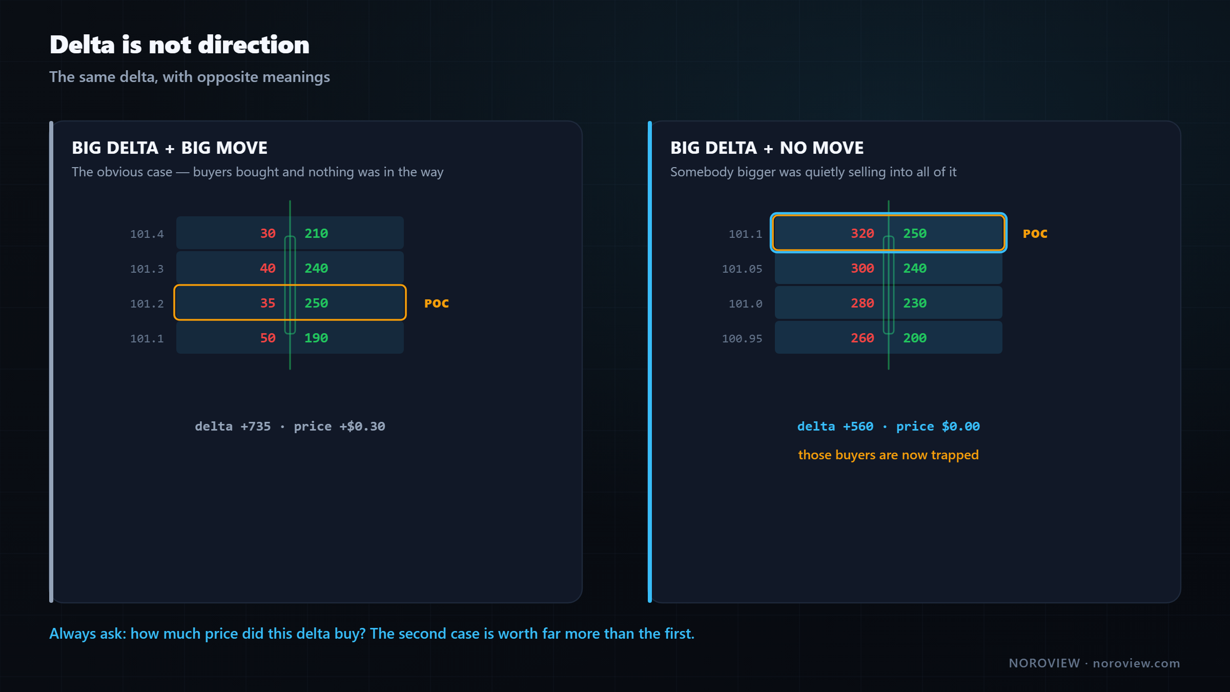
| What happened | What it means |
|---|---|
| Big delta + big move | Aggressive buying arrived and nothing was in the way. The obvious case. You learned that buyers bought |
| Big delta + no move | Aggressive buying arrived and somebody bigger was quietly selling into all of it. Those buyers are now trapped |
The second case is worth far more than the first. In the first you learned that buyers bought. In the second you learned that somebody with more size was on the other side, and that a whole cohort of aggressive buyers is now holding losing positions.
That is the foundation of everything we do. The interesting information is never delta on its own — it is delta compared with the price movement that delta produced.
Always ask: how much price did this delta buy?
Ask it at every important candle. A delta of 1,000 that moved price $200 is a completely different animal from a delta of 1,000 that moved price $10. Same delta. Opposite meaning.
Volume vs ticks: crowd or whale?
In the metrics you will see both volume and trades (the trades family is sometimes called ticks). They count the same activity two different ways:
- Volume = how much was traded (size)
- Ticks = how many trades happened (count)
Here is why anyone cares. Compare two candles, both with exactly 1,000 of aggressive buy volume.
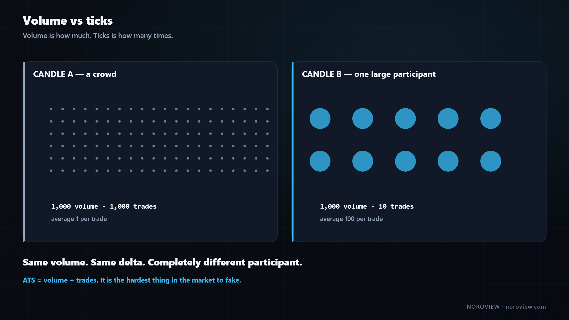
| Volume | Trades | Average per trade | |
|---|---|---|---|
| Candle A | 1,000 | 1,000 | 1 |
| Candle B | 1,000 | 10 | 100 |
In candle A, a thousand different trades each bought one unit. That is a crowd — a thousand small participants, retail and bots, diffuse. In candle B, ten trades bought a hundred units each. That is not a crowd. That is somebody big.
Same volume. Completely different participant.
Identical volume, identical delta, and completely different information. In one, a thousand small opinions. In the other, a handful of decisions by somebody with real capital. Which of those would you rather be trading alongside?
So buy ticks and sell ticks are the number of aggressive buy and sell trades. Compare those against volume and you learn the character of the participants, not just their size.
That comparison — volume divided by trades — is so useful it gets its own metric.
ATS: average trade size (the most underrated number)
ATS = volume ÷ number of trades. The average size of a single transaction.
In my opinion it is the most underrated number on a footprint chart, and here is why.
A large participant can hide their identity, their intention and their order size in the book. Slicing orders into many small pieces is the main way they hide. But ATS asks a question that is very hard to fake: when business happened here, was it happening in big pieces or small pieces?
High ATS = the participants here were big.
A price level with a much higher average trade size than everything around it is a price where somebody substantial was transacting. Not a thousand retail traders — somebody with real size.
And this is exactly why it becomes a level rather than just an observation. Think it through: if a large participant did serious business at a specific price, that price now means something to them. It is their cost basis. It is where their position lives. When price comes back there, they have a reason to act — defend it, add to it, or get out flat.
Big participants defend the prices where they did business.
Levels built from the highest-ATS prices are among the most reliable I use, and lesson 9 is entirely about them.
Like every metric here, ATS comes in four variants — total, buy, sell and delta. ATS delta is the interesting one: it compares the average size of aggressive buys against the average size of aggressive sells. When the buys are being done in big pieces and the sells in small pieces, that tells you something about who is on each side of the trade.
AVB and ABS
Two more families to define.
AVB — average volume per block. Where ATS answers "how big was one trade", AVB answers "how much business happened per unit of the structure." Practically, it tells you whether volume is spread evenly across the candle or stacked into a few places. A candle where every level traded roughly the same is a market moving smoothly through price. A candle where two levels hold most of the volume is a market that found something at those two prices.
ABS — the absorption metric. Always written and said "A-B-S", letter by letter, because that is how it appears in the platform and because "absorption" is a separate concept we are about to cover. It is designed to surface places where aggression is being soaked up instead of producing movement. Instead of you comparing volume to price movement by eye on every candle, this metric measures that relationship for you.
Both come in total, buy, sell and delta variants.
An honest note on these two: delta and ATS are the ones I use constantly. AVB and A-B-S I use situationally. I am teaching all of them because you should know what every number on your screen means — but do not feel you have failed if, in three months, you are mostly reading delta, volume and ATS. That is what most experienced order-flow traders actually do.
Min delta and max delta: the path, not the destination
Everything so far has been totals. But a candle is not a single moment — it has a life. It might have been strongly positive in its first ten seconds, then collapsed, then recovered.
Max delta is the highest cumulative delta the candle reached at any point during its life. Min delta is the lowest. They tell you the path, not just the destination.
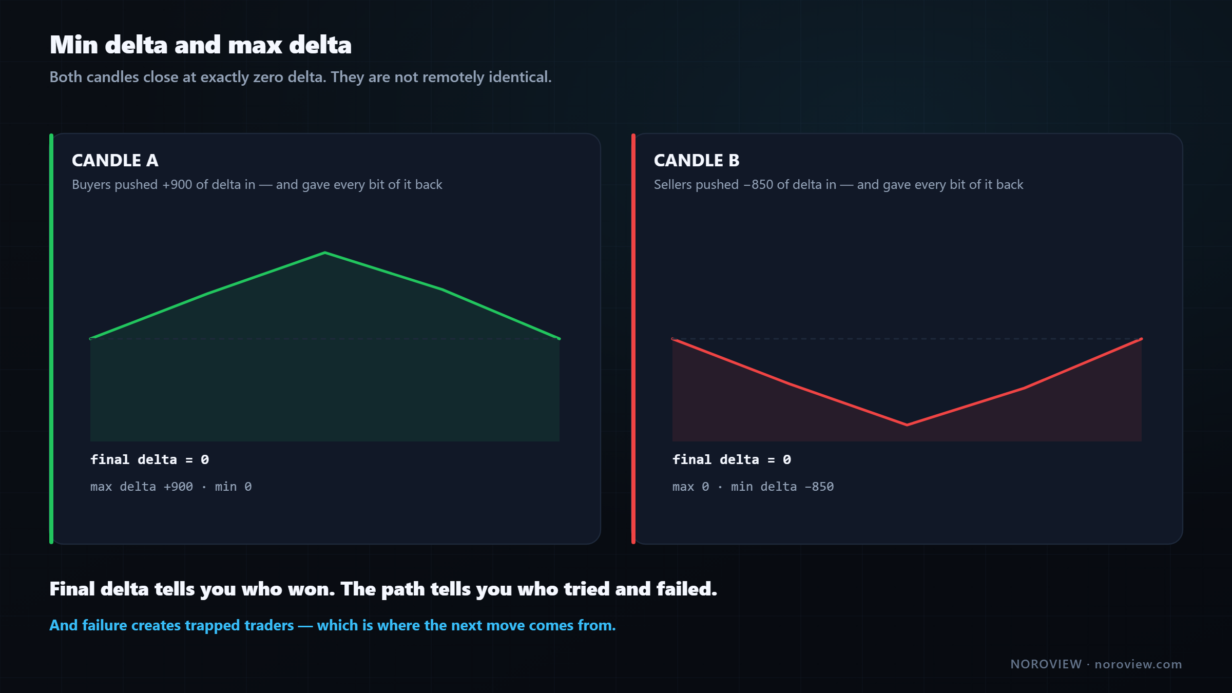
| Path | Final delta | |
|---|---|---|
| Candle A | 0 → +900 → 0 | 0 |
| Candle B | 0 → −850 → 0 | 0 |
Both candles close with a final delta of zero. On a readout showing only the final number they are identical. They are not remotely identical.
In candle A, aggressive buyers pushed 900 of delta into the market during that candle — and by the close every bit of it had been given back. Somebody sold into all of that buying. Those buyers are underwater now, and they know it. In candle B, the exact opposite happened to sellers.
Final delta tells you who won. Min and max delta tell you who tried and failed.
And "tried and failed" is where the money is, because a failed attempt creates trapped traders — a group holding losing positions who will be forced to exit, and whose exit pushes price the other way. We come back to this in lesson 10 and lesson 11.
Because a footprint aggregates by price rather than by time, the intra-candle delta path is a time-ordered quantity — read it from a candle-level metric if your build shows one, from a lower-timeframe view of the same period, or most directly from the CVD indicator, which plots running delta as a line.
The 20 metrics, without memorising them
Open the metrics editor and you will see a long list that looks intimidating. It is not. There are twenty entries built from a very simple grid.
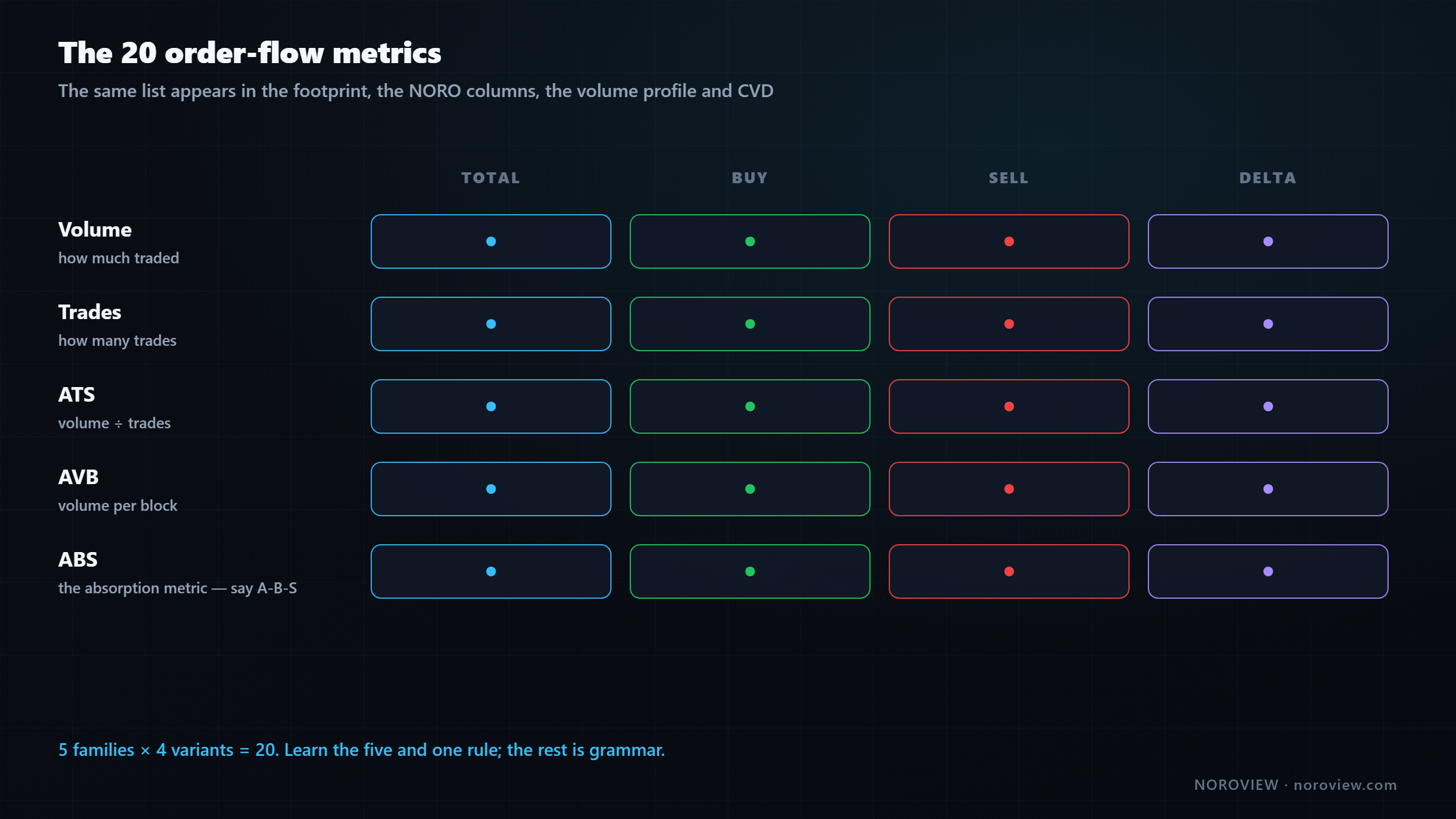
| Total | Buy | Sell | Delta | |
|---|---|---|---|---|
| Volume | · | · | · | · |
| Trades | · | · | · | · |
| ATS | · | · | · | · |
| AVB | · | · | · | · |
| ABS | · | · | · | · |
Five families × four variants = twenty. Total is everything, Buy is the aggressive-buy part, Sell is the aggressive-sell part, and Delta is buy minus sell.
Learn the five families and one rule. The rest is grammar.
"ATS delta" — average trade size of buys minus average trade size of sells. You just worked that out without ever having seen it before. That is the point.
This same twenty-item list appears in four different places in NOROVIEW: the footprint metrics editor, the NORO Footprint columns, the content of a volume profile, and the source of the CVD indicator. Learn it once, use it everywhere.
Free footprint charts. No download, no data feed, no workstation.
The standard footprint chart, market replay and paper trading are all on the free plan. All the heavy computation runs server-side, so your browser stays fast. Create a free account → · Compare plans
Absorption on a footprint chart
This is the pattern the whole chart exists to reveal.
Find a level with enormous aggressive selling — one of the biggest sell numbers on the screen — and then look at what price did afterwards. If the answer is "nothing," you are looking at absorption.
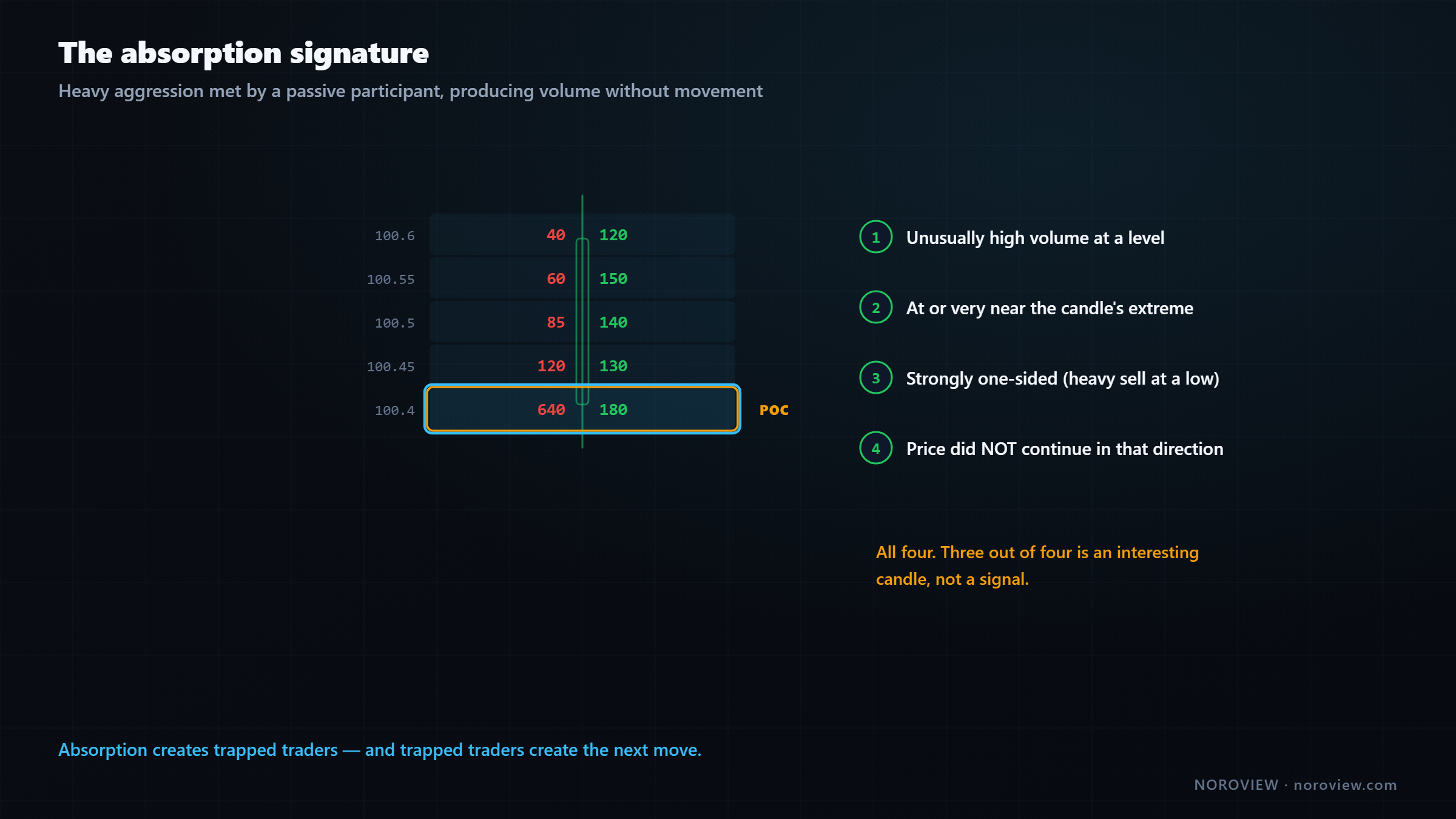
Here is what physically happened. Aggressive sellers came in with real size and hit the bid, hard. Normally that pushes price down. It did not — because there was a passive buyer sitting there with a large limit order, absorbing every one of those sells.
The hammer hit the wall. The wall did not move.
Heavy aggression + no movement = somebody bigger on the other side.
Why this is tradeable
Think about the consequences. The aggressive sellers spent real money and got nothing. They are short from a price that has not gone down. Every one of them is now sitting on a losing position, thinking about the exit — and their exit is a buy.
Meanwhile the passive buyer who absorbed all of that now holds a large long position, at a price they chose, with a very strong interest in defending it.
So you have one group who eventually has to buy to escape, and one large participant who wants price higher.
Absorption creates trapped traders. Trapped traders create the next move.
The visual signature — all four, not three
- A level with unusually high volume
- At or very near the candle's high or low
- Strongly one-sided — heavy selling at a low, heavy buying at a high
- And price did not continue in that direction
All four. If you have three of them, you have an interesting candle, not a signal. Lesson 10 goes much deeper; for now, the goal is simply to be able to look at a footprint and physically see it.
Divergence and convergence
Two words you will hear constantly, and they are simpler than they sound.
- Convergence = delta and price agree
- Divergence = delta and price disagree
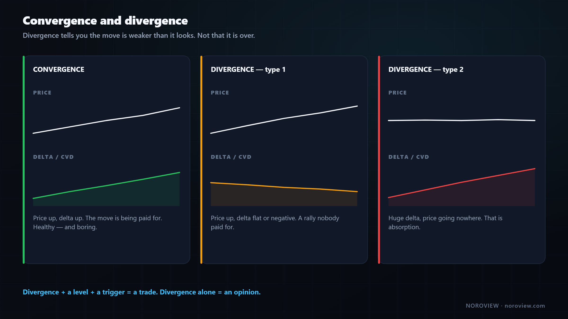
Convergence is price going up while delta is positive: aggressive buyers are driving it and the move is being paid for. Healthy. Boring, and healthy.
Divergence comes in two flavours that mean different things:
Flavour 1 — price goes up, but delta is negative or flat. Price is grinding higher while aggressive sellers are actually dominating. How is that possible? Because price can rise on absence — sellers stepped away, so price drifted up on very little buying. That is a rally nobody paid for. Nobody is committed to it, and those tend to get given back.
Flavour 2 — huge delta, but price barely moves. Aggressive buyers pouring in and price going nowhere. That is absorption, which we just covered. Somebody is selling into all of it.
The warning that stops people getting burned
Divergence is not a signal. It is a warning.
Divergence tells you the current move is weaker than it looks. It does not tell you the move is over, and it absolutely does not tell you to trade the other way right now. A market can diverge for hours and keep going. Traders who short the first divergence in a strong uptrend get destroyed, repeatedly.
Divergence + a level + a trigger = a trade. Divergence alone = an opinion.
Divergence is a reason to pay attention and tighten up. It becomes a trade when it happens at a level you already cared about and you get an actual trigger. That combination is lesson 11.
POC, value area and naked POCs
In the footprint settings (gear → Inputs → POC) there are a few controls most people never turn on, and some of them are genuinely valuable.
Show POC marks the point of control on every candle. Show when zoomed out keeps those markers visible even when you have zoomed too far out to read the cells, so you can still see where value was on a wider view.
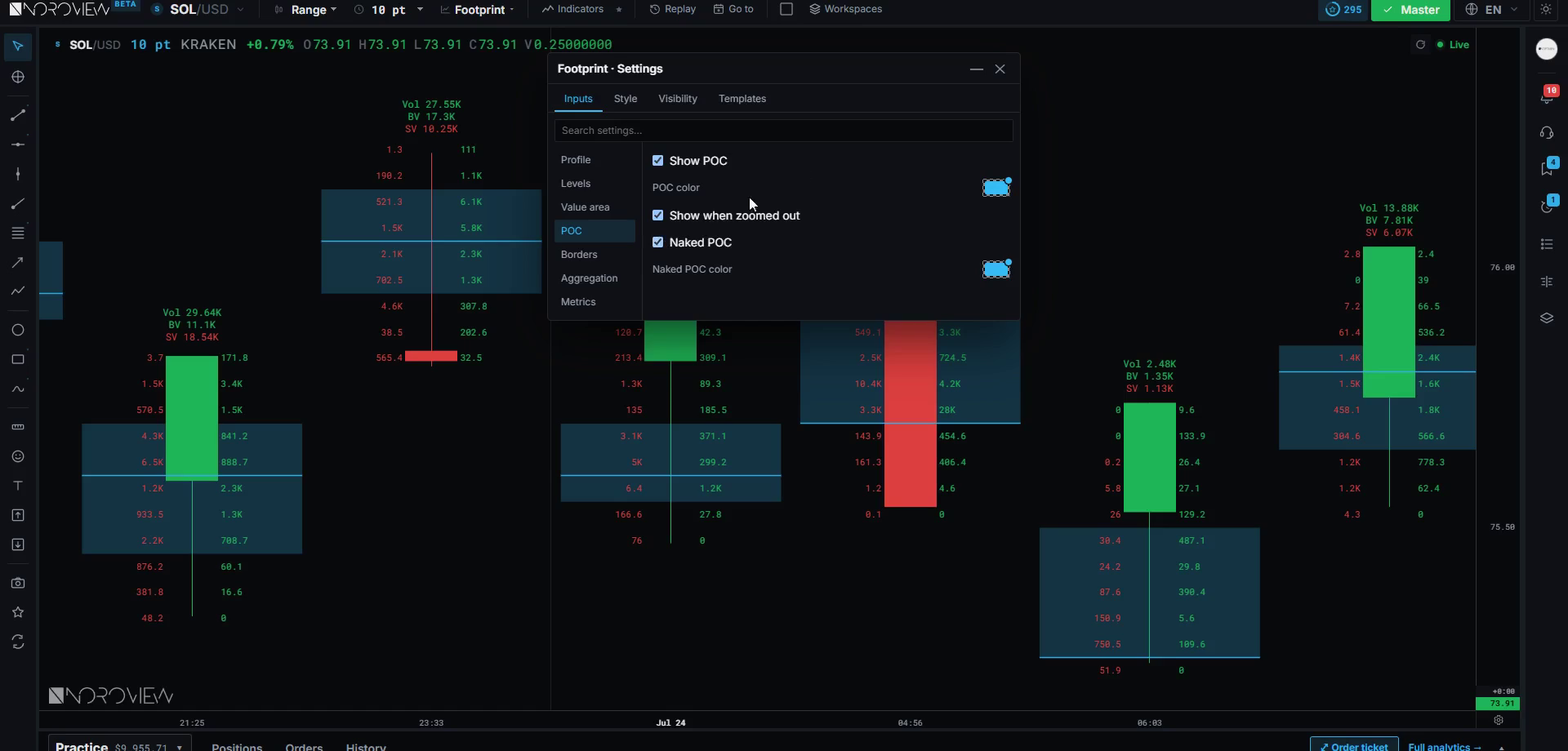
Naked POC is the one I actually want you to use.
A naked POC is a point of control that price has not traded back through.
These behave like magnets. Why? Back to the auction. A POC is a price where a lot of business got done — where the market found agreement. If price then leaves that area quickly and never returns, there is a good chance participants who wanted to do business at that price never got filled. The auction has unfinished business there, and markets return to unfinished business remarkably often. Not always. Often.
So naked POCs make excellent targets — not entries, targets. When I am long and I need somewhere sensible to take profit, an untested POC above me is one of the first places I look.
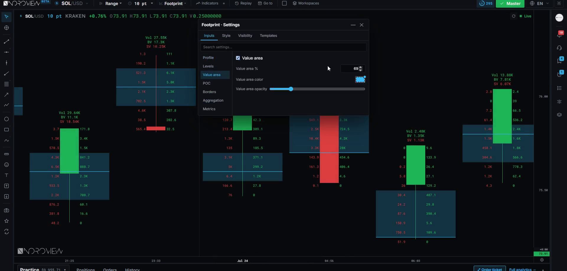
Value area (gear → Inputs → Value area) defaults to 70%, a convention borrowed from market profile. There is no magic in the number. Value-area edges matter because they are the boundary between "the market considers this price acceptable" and "the market is just passing through." Price reacts at those edges constantly. Lesson 7 is entirely about this on a bigger scale.
Aggregation: levels per cell
This setting solves a very practical problem. Bitcoin ticks in tiny increments; a candle might touch two hundred distinct prices. If the footprint drew a row for every one, you would have two hundred rows of tiny numbers and no information at all.
Aggregation groups price levels together. In NOROVIEW: gear → Inputs → Aggregation → Levels per cell (Off / Auto / Custom).
| Setting | Result |
|---|---|
| Too little grouping | Hundreds of tiny rows, no signal |
| Auto | The platform picks a sensible grouping for the market and your zoom |
| Too much grouping | Three fat rows, all detail lost |
Start with Auto. Genuinely — use it for a few weeks and only go custom when you have a specific reason. When you do, my rule of thumb is eight to twenty rows in a typical candle. Below that you are losing the detail that makes this chart worth using; above that you are just making yourself dizzy.
One warning, because it confuses people: changing aggregation changes what a "level" means, which changes your level deltas and your POC. It is not cosmetic. If you build a habit of reading levels at one aggregation and then change it, your intuition needs recalibrating. Pick one and stay with it.
The metrics editor: building your own readout
gear → Inputs → Metrics opens the metrics editor, where you build the summary readout above and below each candle. For each metric you choose four things:
- Whether it appears at all
- Where it goes — above or below the candle
- Whether it shows its title — the
Ttoggle. Titles help while you are learning and become clutter once you know your own layout - How it is coloured — Static, Bullish, Bearish, Content side, or Gradient
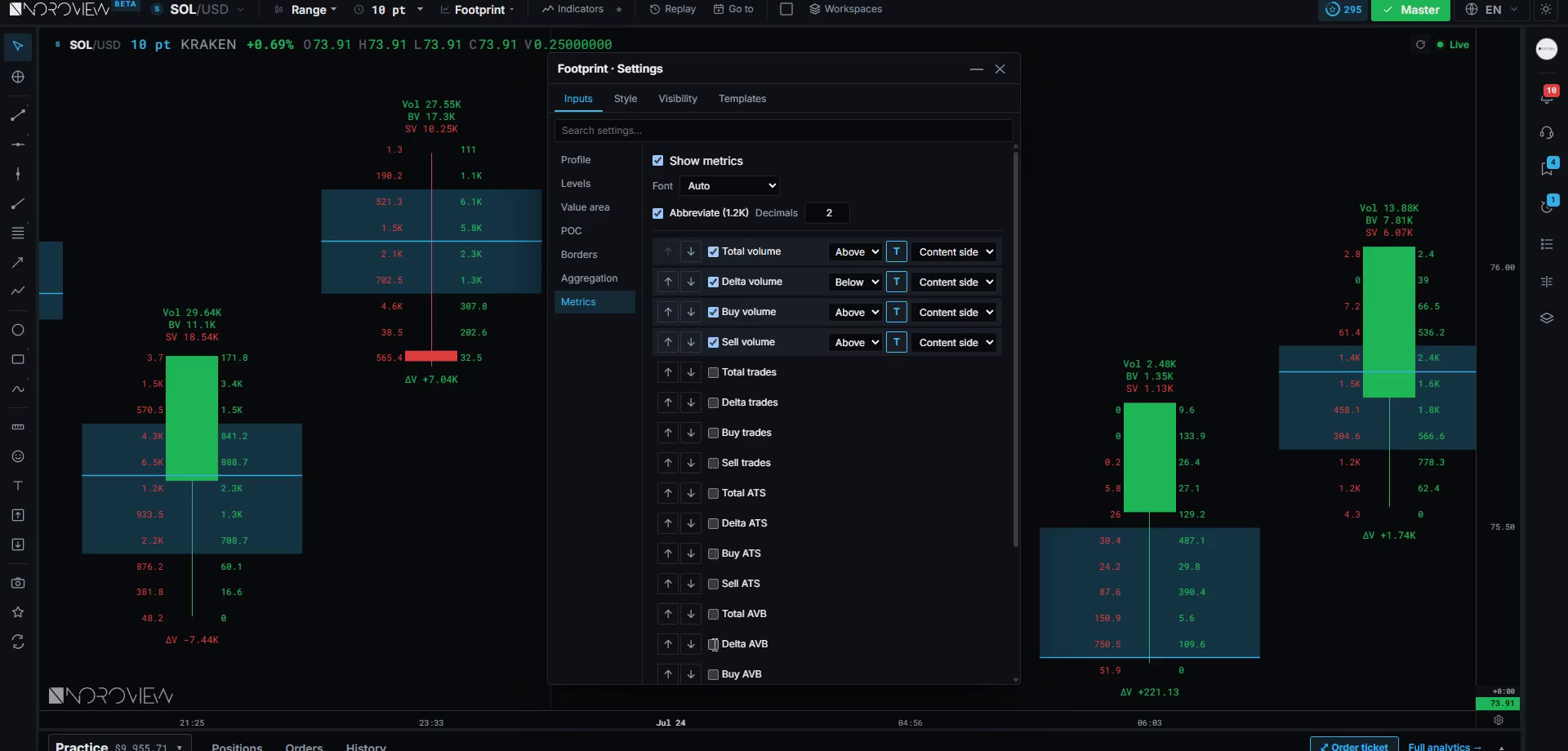
The colouring options change how fast you can read. Static is one fixed colour, calm and neutral. Bullish/Bearish force a colour. Content side colours by which side the number represents. Gradient shades by magnitude, so bigger numbers are visually louder.
My advice: gradient on delta, static on everything else. You want exactly one thing on the chart shouting at you, and it should be delta. If five metrics are all colour-coded and glowing, none of them stand out — you have built a Christmas tree.
You can drag rows to reorder, so the metric you check first sits closest to the candle. And the Templates tab is where you save the setup, name it, and set it as default so every new chart opens like this. Note that "Reset to defaults" lives on the Templates tab too — not in a footer, which catches everybody the first time.
The NORO Footprint (paid) — what the upgrade actually buys
Let me be completely straight first: everything taught in this article works on the free footprint chart. Delta, volume, ticks, ATS, absorption, divergence, POC, value area, the metrics editor — all of it. Free. If you never spend a cent on this platform you can do this entire course.
The NORO Footprint is a paid upgrade. Here is the difference.
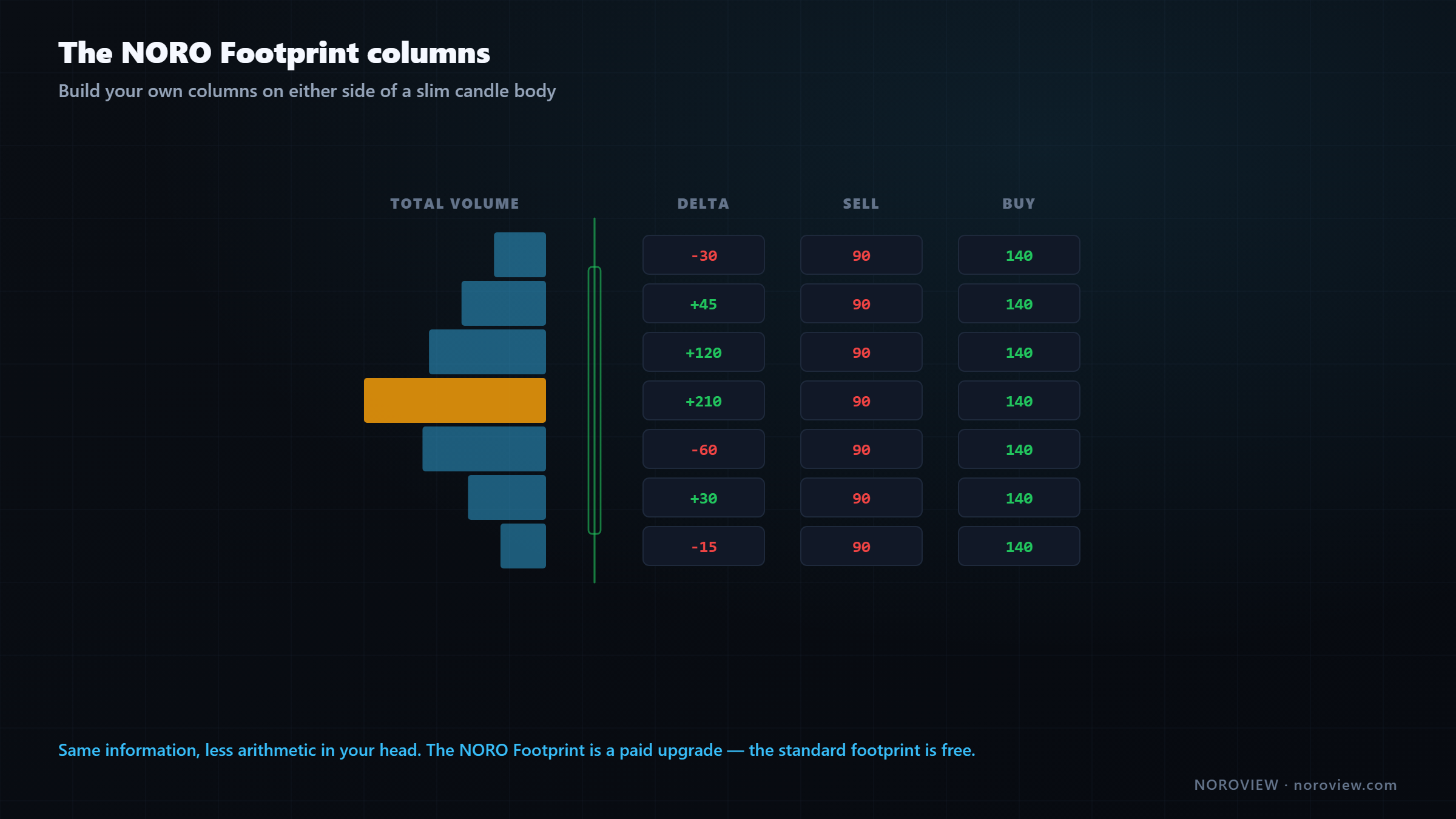
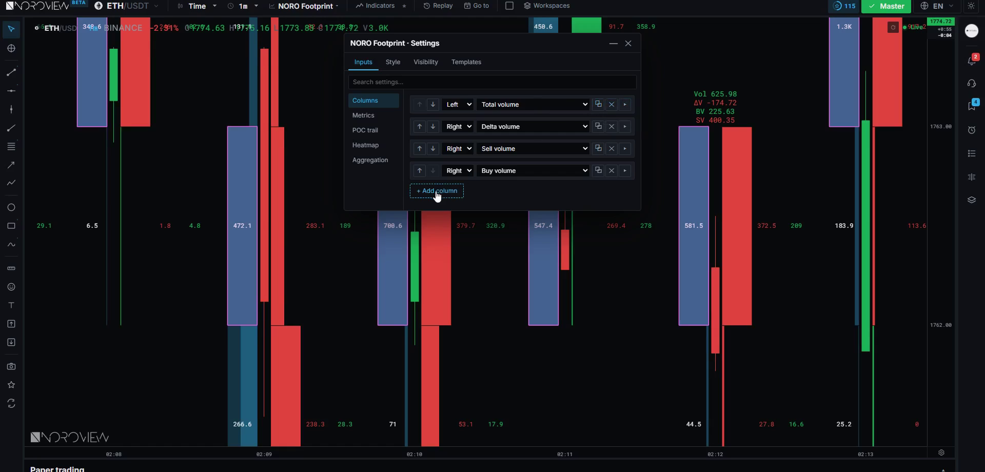
A standard footprint gives you one fixed layout: sell on the left, buy on the right. The NORO Footprint lets you build your own columns — as many as you like, on either side of a slim candle body, each showing a different metric from the twenty-item list, each styled independently.
Each column is a card where you set the side (Left/Right), the content, the width, whether it draws as a profile bar, whether it shows numbers, whether it marks its own POC and value area, and its background, border and divider. So you might build: total volume as a profile on the left, then delta, sell volume and buy volume as three separate columns on the right.
That is a genuinely different reading experience. Instead of doing arithmetic in your head across two numbers, everything you care about has its own dedicated space.
The POC trail is worth knowing about too. Turn it on and it draws a line connecting the point of control from candle to candle — showing you where value is migrating. If price is rising and the POC trail is rising with it, value is genuinely moving up and the market is accepting higher prices. If price is rising and the POC trail is flat or falling, price has run away from value, and that usually resolves by price coming back.
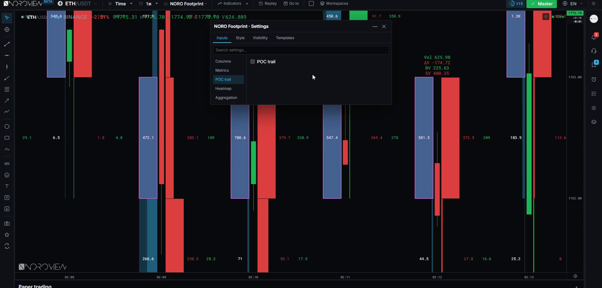
Price can run. Value has to be carried.
If you are on the free tier: use the standard footprint, put your key metrics in the metrics editor, and you are 90% of the way there. The NORO Footprint is a comfort and speed upgrade — not a different kind of information.
A complete footprint setup you can copy
Here is a full build from a clean default, with the reasoning for every choice — because a setup you copied without understanding is a setup you cannot fix.
1. Candles — Range, 10 points. Why: comparable business per candle, and the chop disappears.
2. Aggregation — Auto. Why: it adapts as you change market and zoom, and keeps you in the 8–20 row range where a footprint is actually readable.
3. Levels — Show level values ON. Why: the shading tells you where to look; the numbers tell you how much. You want both.
4. Profile — Volume bars ON, Volume heatmap ON. Why: this is the "find it before you read it" layer. Your eye lands on the busy levels in a fraction of a second, and only then do you read digits.
5. POC — Show POC ON, Show when zoomed out ON, Naked POC ON. Why: POC is where value is, and naked POCs are the most-used target levels in the whole course.
6. Value area — ON, at 70%. Why: you need to know instantly whether price is inside value or outside it. That single fact changes how you treat every signal, and it is a large part of the entry rules in lesson 11.
7. Metrics — keep it deliberately small.
ABOVE the candle:   Volume total
BELOW the candle:   Volume delta   (gradient coloured)
                    ATS total
Why only three? Because in a live market you have about two seconds to read a candle, and three numbers is what a human can absorb in two seconds. Total volume tells you whether this candle matters at all. Delta tells you who was aggressive. ATS tells you whether it was big participants or a crowd. That is the whole decision.
Everything else — trades, AVB, A-B-S, the buy and sell variants — turn on temporarily when investigating something specific, then turn off again. They are diagnostic tools, not dashboard items.
8. Colours — delta on gradient, everything else static. Why: exactly one thing on the chart is allowed to shout.
9. Save it. Templates tab → name it → Set as default. Why: so every new chart, on every market, opens exactly like this.
That last one matters more than it sounds. Consistency is what builds pattern recognition. If your chart looks different every day you never develop an instinct for "that number is unusually big," because you have no stable sense of normal.
A stable setup is what lets "unusual" become visible.
Five mistakes every beginner makes
- Reading delta as direction. Big green delta does not mean go long. The most valuable case is big delta with no move.
- Reading footprints everywhere. A footprint is a close-up instrument for the moment price arrives at a level you already care about. It is not a chart you scan the whole market on.
- Too many metrics. Five glowing numbers means none of them stand out. Three is the working maximum.
- Zooming out and getting frustrated. The cells are always there. If you cannot see them, you are not zoomed in far enough on both axes — and double-clicking will never fix it.
- Treating one candle as a signal. One footprint candle is evidence. A trade needs evidence plus a level plus a trigger.
Your homework
About an hour, and the third item is the one that matters.
- Build the setup above from a clean default, save it as a template, and set it as your default. Do not skip the "why" for each step — read it as you set it.
- Read twenty candles out loud using the three questions: where did volume concentrate, which side was aggressive, what happened at the extremes. Out loud is not a joke — it forces sequence.
- Open Market Replay and find three absorption candles. All four conditions present. Screenshot each one, and write one sentence under each explaining who is trapped and what their exit would be.
Open Market Replay and hunt for absorption →
Three things to remember
- A footprint is the candle sliced by price and split by aggressor. Left is aggressive selling, right is aggressive buying. The candle is the headline; the footprint is the receipt.
- Delta is not direction. Always compare delta to the price movement it produced. Big delta with no movement means somebody bigger was on the other side.
- Absorption is the pattern to hunt. Unusually high volume, at an extreme, strongly one-sided, and price failed to continue. All four — not three.
← Previous: How Price Really Moves · Course index: Order Flow Trading Course · Next → Market Structure and Trend
Frequently asked questions
How do you read a footprint chart for beginners? Read one candle at a time with three questions in order: where did the volume concentrate (the POC), which side was aggressive overall (delta), and what happened at the high and the low. Left-hand numbers are aggressive sells, right-hand numbers are aggressive buys. Those three questions cover most of the value.
What does a green footprint cell mean? Colouring conventions vary by platform, but in a bid-ask footprint the right-hand number at each price is aggressive buying — someone lifting the offer — and the left-hand number is aggressive selling. Highlighting usually marks where buying meaningfully outweighed selling at that price level, or vice versa.
Why is my footprint chart not showing numbers? Because you are not zoomed in far enough. The cells cannot be drawn inside a candle that is only a few pixels wide, so they are hidden until there is room. Double-clicking re-frames the chart but does not zoom. Scroll to zoom, then drag the time axis to spread the candles out.
What is delta in a footprint chart? Delta is aggressive buy volume minus aggressive sell volume. It exists per price level and per candle. Positive delta means aggressive buyers dominated. Crucially it does not indicate direction — the useful reading is delta compared with the price movement that delta actually produced.
What is average trade size in order flow? Average trade size, or ATS, is volume divided by the number of trades. It reveals whether business at a price was done by many small participants or a few large ones. A price level with unusually high ATS is where somebody substantial transacted, and those prices tend to get defended later.
What is the difference between a bid-ask footprint and a delta footprint? A bid-ask footprint shows two numbers per price level — aggressive selling and aggressive buying, side by side. A delta footprint shows a single net number per level. The bid-ask view carries more information; the delta view is faster to scan. Most traders start with bid-ask.
Are footprint charts free anywhere? Yes — the standard footprint chart is free for every NOROVIEW user, in a browser, with no download and no separate market-data subscription. The customisable multi-column NORO Footprint is a paid upgrade, but every technique in this article works on the free version.
What is the point of control on a footprint candle? The point of control is the single price inside the candle with the most total traded volume — the price where the auction found the most agreement. A "naked" POC is one price has not traded back through, and those tend to act as magnets, which makes them useful profit targets.
Do footprint charts work better on range bars? Generally yes. Because each range candle contains a similar amount of price travel, each footprint contains a comparable amount of business, which makes candles genuinely comparable to one another. On time candles one bar might hold forty trades and the next four thousand.
Sources
- CME Group Education — understanding the value area
- Investopedia — volume analysis
Soroosh Moghimi — six years inside financial markets: algorithmic trading, HFT, crypto and AI, after a decade building startups. He publishes this course free because he already paid for the lessons in it. There is no paid course and no signal group. @sorooshmoghimi · About
Start reading real order flow
You cannot learn this from a candlestick chart, and you do not need to spend a cent to begin. The standard footprint chart is free for every NOROVIEW user, market replay is free, and the paper-trading simulator is free.
Open NOROVIEW free → · Compare plans →
⚠️ DISCLAIMER — EDUCATIONAL CONTENT ONLY
This article is for educational and informational purposes only. It is not financial, investment, or trading advice, and nothing in it is a recommendation to buy, sell, or hold any asset. Trading cryptocurrencies and leveraged derivatives is high risk and can result in the loss of some or all of your capital. Only risk money you can afford to lose. Any levels, indicators, signals or results shown are illustrative and are not a promise or prediction of future performance. Charts may be shown on a demo or paper-trading account and do not represent real trades or returns. Always do your own research. You alone are responsible for your decisions.
Keep reading
Related posts

16. Trade Management: Break-Even, Partials and Trailing Stops
Trade management explained: when break-even stops cost you money, partial exits, four kinds of trailing stop, the order-flow exit, and diagnosing yourself with MFE and MAE.
15. How to Day Trade Crypto With Order Flow (Starting Small)
How to day trade crypto with order flow: exchange security, spot vs perpetuals, leverage and liquidation, order types, fees, and an honest $100 starting plan.

14. Risk, Drawdown and the Mind: Day Trading's Real Edge
Day trading risk management and psychology: position sizing math, drawdown recovery arithmetic, hard limits, decision vs outcome, and the five states that break traders.
13. Fair Value Gaps, Confirmed With Order Flow
Most fair value gaps do nothing. Five order-flow checks that tell you in advance which FVGs are worth trading and which are decoration.

5. Market Structure and Trend: How to Pick Your Side Objectively
How to identify market structure objectively: higher highs and higher lows, swing point rules, impulse vs correction, and the arithmetic behind trading with the trend.
11. My Order Flow Entry Model, Step by Step
A complete order flow entry model: the four conditions, the exact trigger candle, the value-area filter, and the ten-item blocker list that vetoes a trade.
Discussion (0)
Want to join the discussion? Comments live inside the platform.
Open NOROVIEW