
5. Market Structure and Trend: How to Pick Your Side Objectively
How to identify market structure objectively: higher highs and higher lows, swing point rules, impulse vs correction, and the arithmetic behind trading with the trend.

5. Market Structure and Trend: How to Pick Your Side Objectively
To identify market structure objectively, use one rule: an uptrend is higher highs and higher lows, a downtrend is lower highs and lower lows, and anything else is a range. Define a swing point mechanically — a candle whose high exceeds the five candles either side of it — and the definition becomes something a stranger could apply to your chart and reach the same answer you did.
Ask ten traders whether Bitcoin is in an uptrend and you get ten answers, five of them confident and contradicting each other. That is not because the market is ambiguous. It is because almost nobody has a definition. They have a feeling, and a chart they stare at until the feeling shows up.
A trend you cannot define is a mood.
Open a daily chart and mark the swings as you read — this is a twenty-second skill once you have done it five times.
What you'll learn in this lesson
- The three definitions of trend most people use, and why each one fails
- The objective definition, and the word in it that everybody cheats on
- What actually counts as a swing high or low
- Impulse vs correction — the most useful piece of chart reading in the course
- When a trend genuinely ends, and the three qualifications that stop you flipping too early
- The range: the market's default state, and why trend logic actively loses money in it
- With the trend or against it — answered with arithmetic, not a slogan
Lesson 5 of 16 · Part 1 — Analysis. Part of the free order flow trading course. Previous: How to Read Footprint Charts. Next: The Order Flow Trading Strategy.
▶ Prefer to watch it?
The top-down routine needs a multi-timeframe desk — Multi-Chart Layouts & Linked Charts (Ep 4) shows how to build one. To practise structure without waiting for live markets: Bar Replay & Backtesting for Order Flow (Ep 3)
Key terms
| Term | What it means |
|---|---|
| Swing high / low | A candle whose extreme exceeds the N candles either side of it |
| Higher high (HH) | A swing high above the previous swing high |
| Higher low (HL) | A swing low above the previous swing low |
| Impulse | The market going somewhere: fast, large bodies, little overlap |
| Correction | The market resting: slow, small bodies, heavy overlap |
| Break of structure | Price trading through the last opposing swing point, ending the sequence |
| R | One unit of risk. Risk 1R, make 2R = you won twice what you risked |
| Expectancy | (win rate × average win) − (loss rate × average loss), measured in R |
Why direction comes first
Everything in the previous four lessons was about reading what is directly in front of you: order flow, delta, absorption. That is powerful, and it has a weakness worth naming clearly.
Order flow is local. It tells you about now, and about here.
Order flow is extremely good at telling you what is happening at this level, in this candle, in this minute. It is not designed to tell you what the market has been doing for three days.
And if you only read what is in front of you, you will find beautiful buy signals in the middle of a brutal downtrend. They will look perfect. The absorption will be real, the delta will be real — and price will keep falling, because the whole market is leaning the other way.
So we need a frame. Before you touch any order-flow tool, you should be able to answer two questions:
- Which way is this market going on a higher timeframe?
- Am I in a trend at all — or in a range?
Those two answers decide which signals you are allowed to take and which you ignore. That is what a frame does. It does not find trades. It removes them.
And removing trades is most of this job. You will make more money from the trades you did not take than from any indicator you ever add.
Three wrong ways to define a trend
Wrong way 1 — the moving average. "Price is above the 50, so it's an uptrend." The problem is visible on any choppy chart: price crosses above, below, above, below, eleven times in two weeks. Was the trend changing eleven times? Obviously not. A moving average is an average of the past, so in a range it sits in the middle of the noise and produces a signal every time the noise wiggles. Moving averages are useful for other things. As a trend definition they are the worst option available.
Wrong way 2 — the trendline. Draw a diagonal under a rising market and say "the trend is intact while we are above the line." The problem is not that it is wrong — it is that it is not unique. Give the same chart to two honest people and you get two different lines connecting two different pairs of lows, and two different conclusions. Anything that flexible cannot be your foundation.
Wrong way 3 — "I can see it." You look at the chart, it looks like it is going up, so it is going up. This fails not because your eyes are bad but because your eyes are biased by your position and by what you want. If you are long, the chart looks strong. If you are short, the identical chart looks like it is topping. This happens to everyone, permanently, and the only defence is a rule that does not care how you feel.
The objective definition
UPTREND = higher highs AND higher lows DOWNTREND = lower highs AND lower lows RANGE = anything else
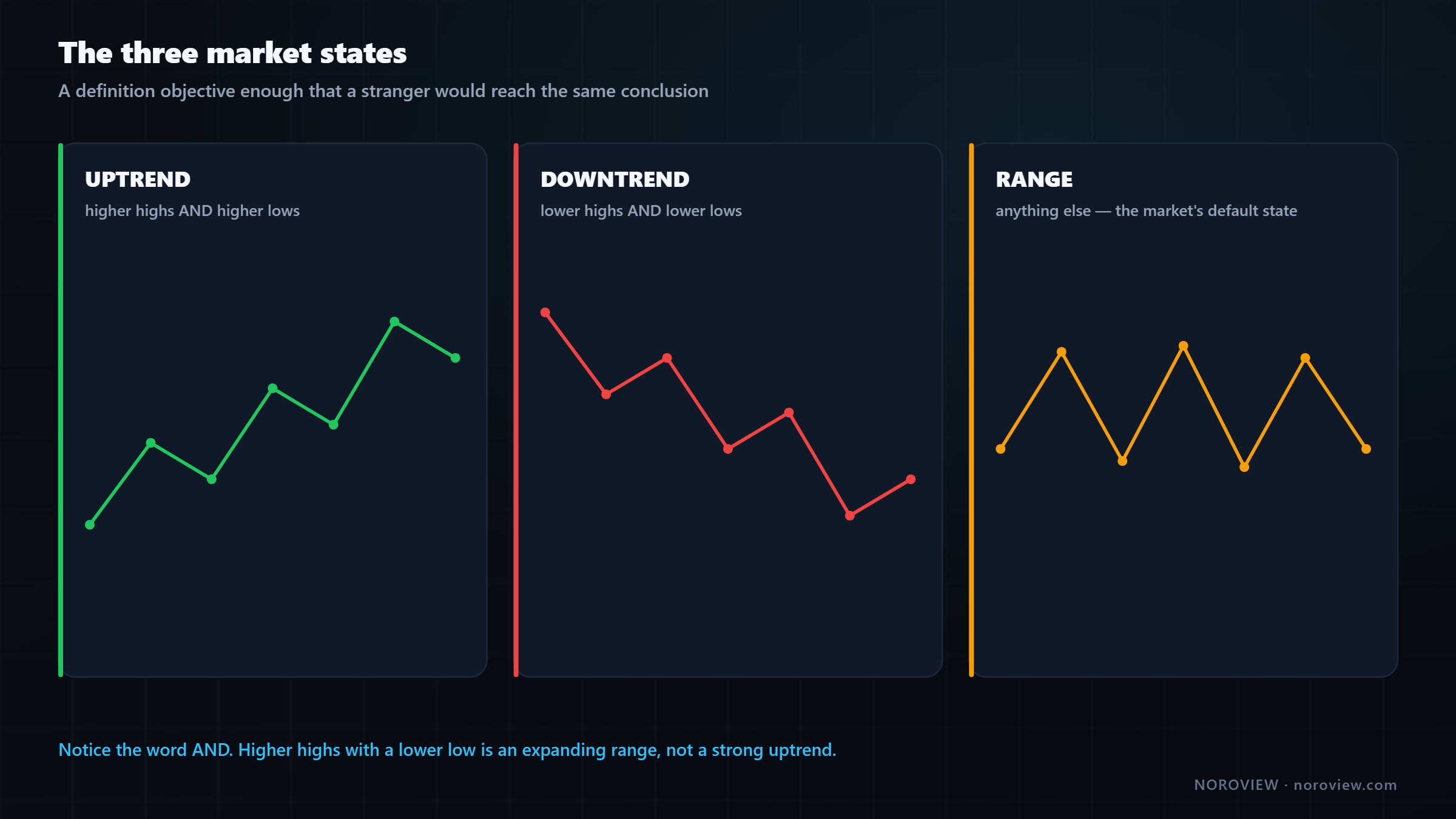
An uptrend is a market making higher highs and higher lows: each push up goes further than the last, and each pullback stops above where the last one stopped. A downtrend is lower highs and lower lows: each drop goes further, each bounce fails earlier. Anything that is not clearly one of those two is a range — and that third category is not a failure to decide. It is a real, distinct state, and treating it as one is worth a lot of money.
Notice the word AND. Both conditions. This is where people cheat.
If a market makes a higher high and then makes a lower low, that is not "an uptrend with a deep pullback." That is an expanding range, and it is one of the most dangerous structures there is, because both directions are producing losses.
Higher highs AND higher lows. If you have to argue for it, it isn't one.
Working left to right on a chart: here is a swing low, here is a swing high. Next swing low — is it above the previous low? Yes: higher low. Next swing high — above the previous high? Yes: higher high. Higher highs and higher lows. Uptrend.
No feeling required. No indicator. No opinion. And you did not need to know a single thing about the asset to answer it. Twenty seconds per timeframe, forever.
What actually counts as a swing point
Here is the honest problem with that definition: what counts as a swing high? If you count every tiny wiggle you get thirty swing points on one screen and you can prove anything you like.
The rule I use is deliberately mechanical:
A swing high = a candle whose high is higher than the N candles either side. I use N = 5.
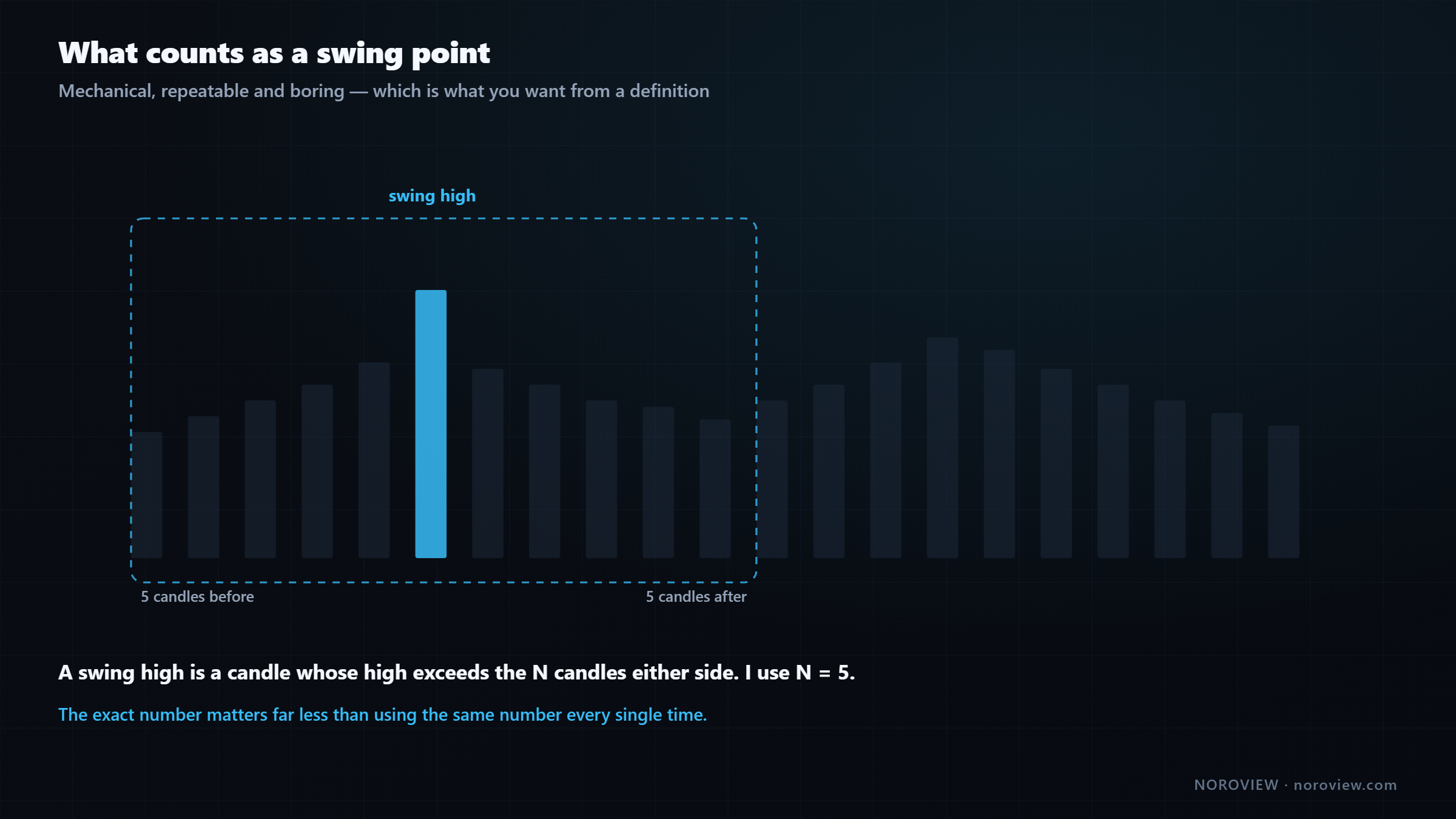
Three is noisier, ten is slower, five is a reasonable middle — and honestly the exact number matters far less than using the same number every time.
Two practical notes:
A swing point is only confirmed after the fact. By definition you need five candles on the right-hand side, so the most recent swing is always provisional. That is not a flaw, it is honesty: the market has not finished the move yet. Anyone who tells you they identified the exact top in real time was either lucky or is lying.
Use the wick, not the body. The high is the high. The wick is where price actually traded, and in order-flow terms that is where the transactions happened. Some traders use closes instead. Pick one and never switch.
▶ Try this now
Open a daily chart, press
Hfor the horizontal line tool, and mark the last four swing highs and lows. Say each one out loud: "higher low… higher high…" It takes about thirty seconds and it will give you a firmer opinion about the market than an hour of scrolling. Launch NOROVIEW free →
Impulse vs correction
This is the most useful piece of chart reading in the lesson.
Every trend is made of two alternating things: impulses (the market going somewhere) and corrections (the market resting — pulling back against the direction, usually slowly, often messily, before the next attempt).
Getting this right matters enormously, because the entire with-trend strategy is: wait for the correction, then enter in the direction of the impulse. If you cannot tell them apart, you will buy into what you think is a correction and it will turn out to be the start of a new impulse down.
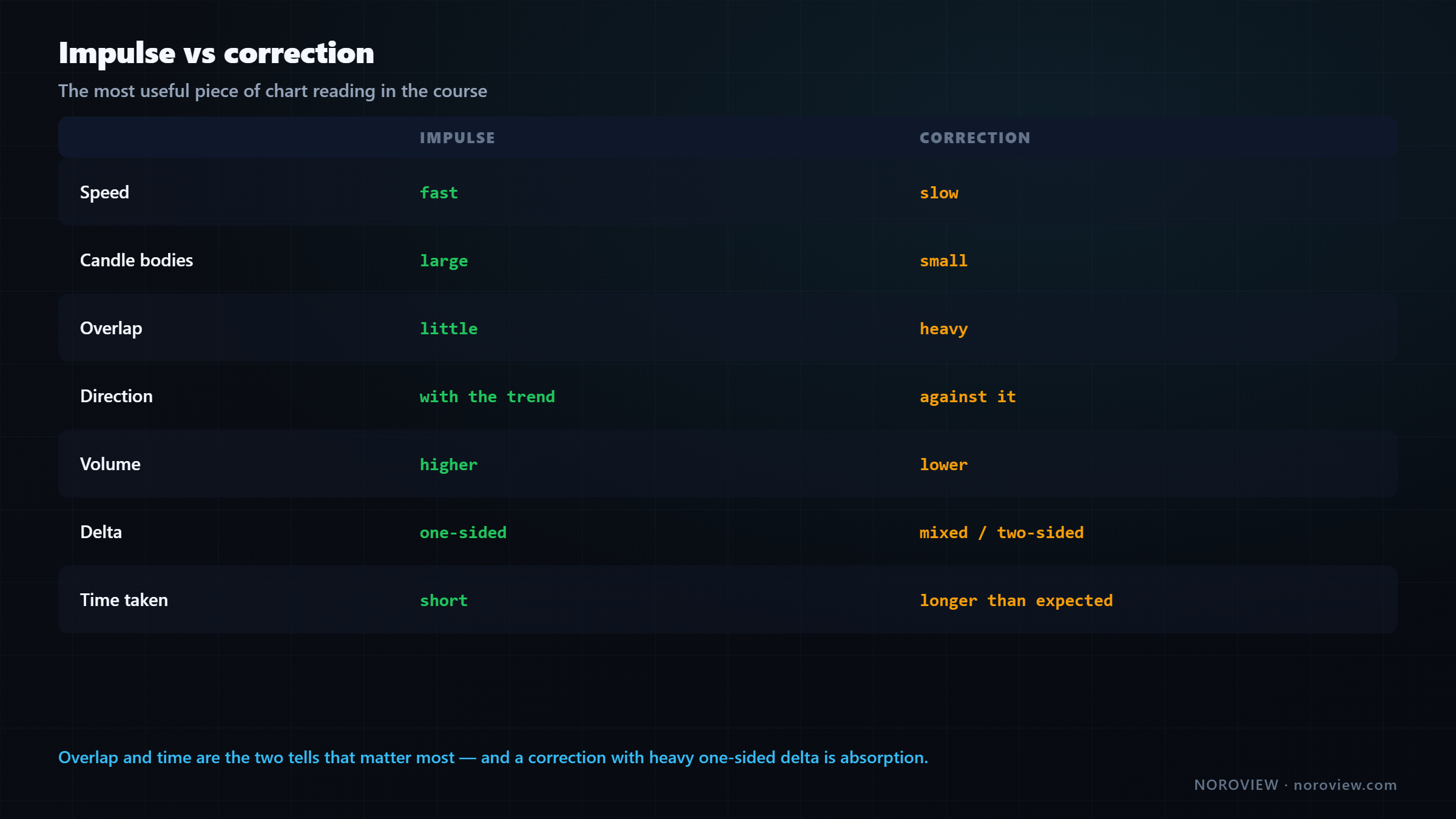
| Impulse | Correction | |
|---|---|---|
| Speed | Fast | Slow |
| Candle bodies | Large | Small |
| Overlap | Little | Heavy |
| Direction | With the trend | Against the trend |
| Volume | Higher | Lower |
| Delta | One-sided | Mixed / two-sided |
| Time taken | Short | Longer than you would expect |
The two tells that matter most
1. Overlap. In an impulse, each candle opens near where the last one closed and pushes on. In a correction, candles cover the same ground over and over, going nowhere. Heavy overlap is the single best correction tell there is.
2. Time. Corrections take longer than they should. If a market covers a distance in four candles and then takes fifteen candles to give back half of it, that slowness is the market refusing to go the other way. That is information.
Where this joins up with order flow
Now bring in the footprint:
A correction with big delta and no progress isn't weakness. It's absorption.
Look at the footprint during the pullback. If it is happening on low volume with mixed delta, that is a genuine correction — nobody is fighting, the market is just resting.
But if the pullback has heavy one-sided delta and price is barely moving, that is not a correction. That is somebody being absorbed: sellers hitting the bid with real size and price refusing to go down. That is one of the highest-quality with-trend entries that exists, and we build it properly in lesson 11.
When does a trend actually end?
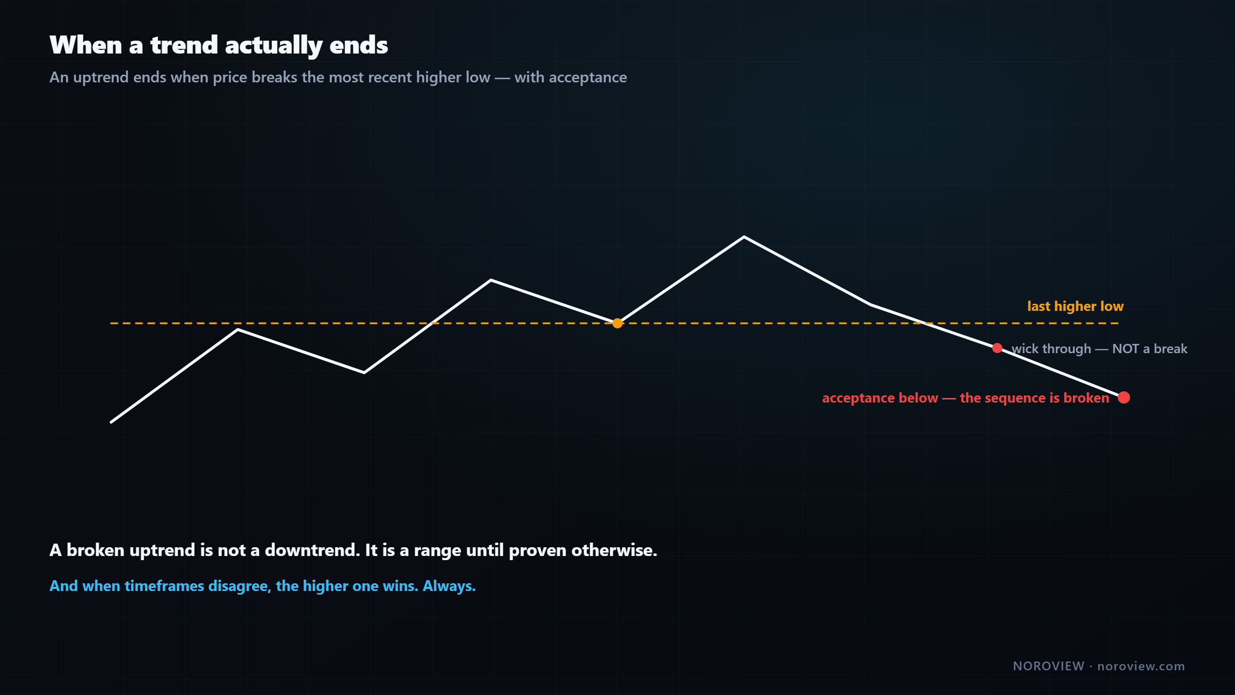
An uptrend ends when price breaks the most recent higher low.
The moment price trades below the low that the last correction stopped at, the sequence is broken and you are no longer in a confirmed uptrend.
Three critical qualifications, because this is where people go wrong.
1. A broken uptrend does not mean a downtrend. It means "no longer a confirmed uptrend." To have a downtrend you need lower highs and lower lows. In between those two states is the range — and the range is where most structure breaks actually lead. Do not flip from long-biased to short-biased on a single break.
2. A wick through is not a break. Price pokes through levels constantly; that is what a market does when it is hunting for liquidity. You want acceptance below, not a touch. In practice that means a candle that closes below and stays below — plus what the order flow did on the poke. If price dips below, gets absorbed, and closes back above, that is not a break. That is the level being defended, and it is often an entry in the original direction.
3. The timeframe you broke matters. Breaking a 1-hour higher low in the middle of a strong daily uptrend is a normal event that happens several times a week. It changes your 1-hour bias. It does not change your daily bias.
Which brings us to the rule that saves the most money:
The higher timeframe wins. Always.
When timeframes disagree, the higher one is the context and the lower one is the noise. If the daily is up and the hourly just broke down, that is not a sell signal — it is very often a correction inside the daily uptrend, which is precisely the thing you were waiting for.
Mark structure once. Reload it in one click.
Workspaces save your entire desk — every chart, every timeframe, every drawing — so your level map and swing marks are exactly where you left them. Create a free account → · Compare plans
The third state: the range
Markets spend most of their life going nowhere.
Weeks with no higher highs and no lower lows, price bouncing between two areas over and over. By our definition that is neither an uptrend nor a downtrend. And it is not rare — this is the market's default state. Trends are the exception; ranges are the rule.
Here is why that matters so much:
Trend logic in a range = buying the high and selling the low. Repeatedly.
Every with-trend technique inverts in a range. "Buy the breakout" becomes "buy the top of the range just before it comes back down." "Buy the pullback" becomes "buy just above the range low, then get stopped out at the range low." Take a perfectly good trend method, run it in a range, and it does not merely stop working — it actively loses, over and over. And it feels personal.
So the first job every day is: trend or range? When the answer is range, you have two legitimate options:
Option 1 — stand aside. Completely valid, and far more professional than it feels.
Option 2 — trade the range as a range: longs at the bottom, shorts at the top, expecting price to return to the middle. Which is the exact opposite of trend behaviour.
And this is where order flow earns its keep. Range edges are exactly the kind of level where you want evidence before committing. Price arrives at the range low for the fifth time — does it hold again, or is this the one that breaks? A normal chart cannot answer that. The footprint often can, because you can see whether real size is defending it or whether the defenders have gone. Lesson 9 covers which levels are worth marking in the first place.
With the trend or against it? The arithmetic
Everyone answers this with a slogan. Let us answer it with numbers.
Expectancy is the only thing that matters:
Expectancy per trade = (win rate × average win) − (loss rate × average loss)
Not win rate on its own — win rate times the size of the wins, minus loss rate times the size of the losses. We measure it in R, where 1R is what you risked. That makes everything comparable regardless of account size, and we use it for the rest of the course.
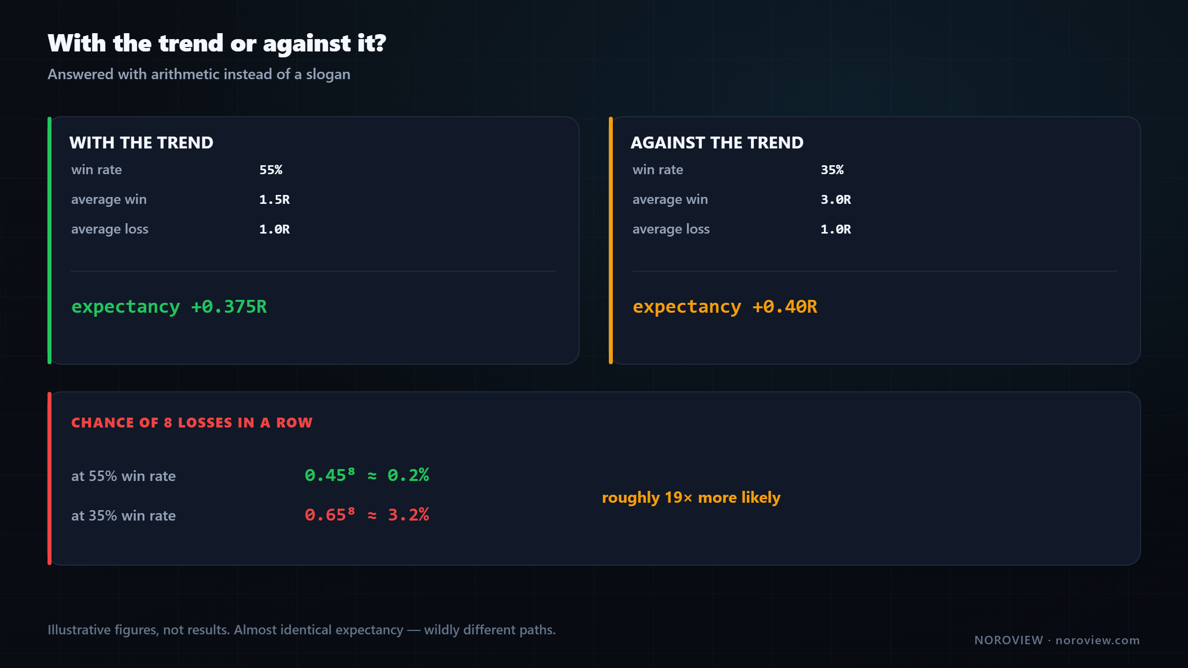
| With the trend | Against the trend | |
|---|---|---|
| Win rate | 55% | 35% |
| Average win | 1.5R | 3.0R |
| Average loss | 1.0R | 1.0R |
| Expectancy | (0.55 × 1.5) − (0.45 × 1) = +0.375R | (0.35 × 3.0) − (0.65 × 1) = +0.40R |
⚠️ These are illustrative numbers used to demonstrate the arithmetic. They are not my results, not anyone's results, and not a promise of performance.
Look at that. The two styles produce almost the same expectancy.
That is the honest answer nobody gives you. Counter-trend trading is not stupid. Done properly it has genuinely competitive expected value, because when you catch a turn you catch it near the extreme and your reward-to-risk is much larger.
So if the expectancy is the same, why does almost every professional lean with the trend?
Because expectancy is not the only thing that matters. You have to survive the path.
| Chance of 8 losses in a row | |
|---|---|
| At a 55% win rate | 0.45⁸ ≈ 0.2% |
| At a 35% win rate | 0.65⁸ ≈ 3.2% |
| roughly 19× more likely |
At 55%, eight losses in a row is a freak event. At 35%, eight losses in a row is a normal Tuesday — it happens regularly, and over a few hundred trades you should expect it more than once.
Now be honest. Not theoretically — actually honest. Eight losses in a row. Your account is down. You followed your rules perfectly and got punished eight consecutive times. Do you take trade number nine, at full size, exactly by the rules?
A strategy you can't follow has an expectancy of zero.
Most people cannot. They reduce size right before the winner. They skip the setup. They change the method. And the moment they do, the beautiful expectancy on the spreadsheet becomes irrelevant, because they are no longer running the strategy they calculated.
There is also a second, quieter problem the maths does not show: catastrophic risk. Trade with the trend and be wrong, and you are usually wrong slowly. Stand in front of a strong trend and be wrong, and you can be wrong very fast, in a market that does not pause. Stops slip. Liquidations cascade. The loss you planned is not always the loss you get. Lesson 14 deals with this properly.
My choice, and the honest reason
I trade in the direction of the trend. Mostly. Not because counter-trend is wrong — the arithmetic says it is not — but for two reasons, and I want to separate them cleanly.
Reason 1, the technical one: trading with the trend puts probability on my side on each individual trade. More of my trades work, so I need less from each one.
Reason 2, the honest one: I prefer to win more often. That is a preference about how I want to experience my own work, and I am not going to dress it up as something more scientific.
But it is not only comfort, and this part matters:
A higher win rate is a psychological risk-management tool.
It is protective. It keeps me inside my rules. It means I get feedback often enough that I do not start doubting the method after a normal losing sequence, and I never end up in the state where I have lost eight in a row and I am making decisions from fear.
I would genuinely rather run a slightly lower-expectancy strategy that I will follow perfectly for two years than a slightly higher-expectancy strategy I will abandon in month four. The second one has a better spreadsheet and a worse outcome.
Choose the strategy you can execute. Not the one that looks best on paper.
Two caveats so this does not become dogma. First, I do take counter-trend trades — at major levels, with strong order-flow evidence, and usually at smaller size. The exception exists; it is an exception. Second, "with the trend" is meaningless until you say which timeframe's trend.
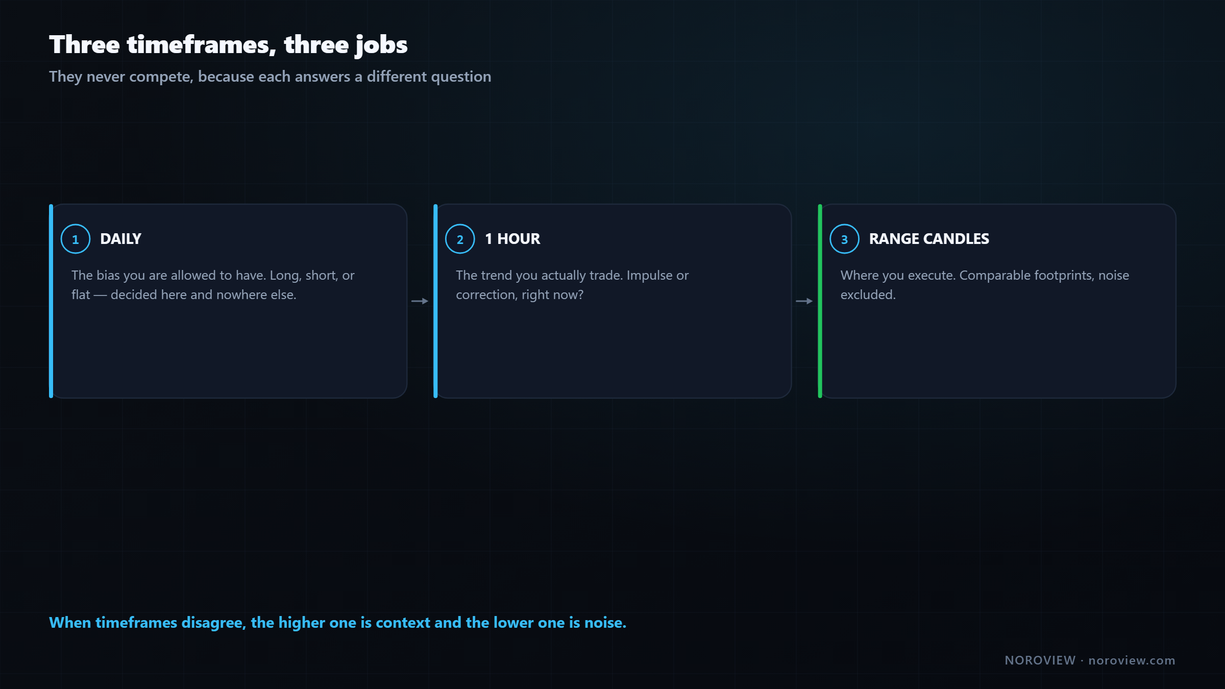
Daily = the bias I am allowed to have 1 hour = the trend I actually trade Range candles = where I execute
The top-down routine, step by step
Three minutes, before you trade. In NOROVIEW: Layout → Two columns, daily on the left, 1h on the right, panes symbol-linked, global cursor on.
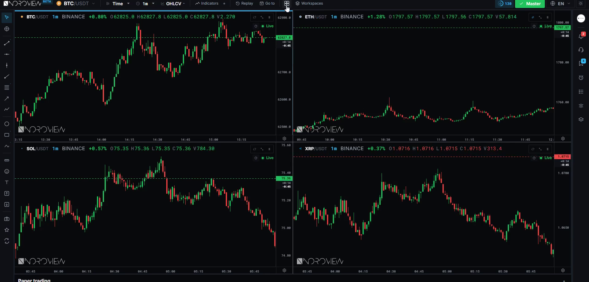
Step 1 — the daily. Mark the last three or four swing highs and lows. Higher low? Higher high? If yes, the daily is in an uptrend and your bias is long. You are allowed to look for buys. You are allowed to be flat. You are not looking for shorts today unless something big changes.
Step 2 — the invalidation. Mark the most recent daily higher low with a horizontal line. If price closes below that, your daily bias is gone. Write that number down. One number, and it governs your whole week.
Step 3 — the 1 hour. Same process. When the daily and the hourly agree, that is the cleanest possible situation, and those are the days to be most willing.
Step 4 — impulse or correction, right now? Look at the last few candles. Overlapping, small bodies, slow? You are in a correction inside an hourly uptrend, which means your job is not to chase. Your job is to find the level where the correction should end, and wait there.
Step 5 — where? That is the whole of lesson 6: building the level map.
Five steps, three minutes, and what comes out of it is exactly three things: a direction, an invalidation level, and a state.
Common mistakes
- Using a moving average as the trend definition. It signals every time the noise wiggles.
- Cheating on the AND. A higher high plus a lower low is an expanding range, not a strong uptrend.
- Changing the swing-point rule to make the chart say what you want. Pick N and never move it.
- Flipping bias on a single break. Broken uptrend means "no longer confirmed," not "downtrend."
- Treating a wick through a level as a break. You want acceptance, not a touch.
- Running trend logic in a range. It does not merely fail; it inverts and actively loses.
- Not saying which timeframe. "With the trend" is meaningless without one.
Your homework
About forty minutes.
- Mark structure on three timeframes for one market: daily, 4-hour, 1-hour. Write down, in words, the state of each. Do not look for trades.
- Find one clear impulse and one clear correction on the hourly, and check the footprint inside each. Note the difference in volume and delta character.
- Find a range at least two weeks long and count how many times a with-trend method would have lost money inside it. This exercise changes people.
Open the terminal and run the top-down routine →
Three things to remember
- Uptrend = higher highs AND higher lows. Downtrend is the mirror. Everything else is a range, and the range is the market's default state.
- Overlap and time separate an impulse from a correction — and a correction with heavy one-sided delta and no progress is absorption, not weakness.
- With-trend and counter-trend have similar expectancy but wildly different paths. Choose the strategy you can actually execute for two years.
← Previous: How to Read Footprint Charts · Course index: Order Flow Trading Course · Next → The Order Flow Trading Strategy
Frequently asked questions
How do you identify market structure? Mark swing highs and lows mechanically — a candle whose extreme exceeds the five candles either side — then read the sequence. Higher highs and higher lows is an uptrend, lower highs and lower lows is a downtrend, and anything else is a range. The rule must be applied identically every time.
What is the difference between break of structure and change of character? A break of structure is price trading through the last opposing swing point, ending the current sequence. A change of character is the earlier, softer signal that momentum has shifted — a correction that runs deeper or slower than the previous ones. The break is objective; the change of character is interpretive.
When does a trend actually end? An uptrend ends when price breaks the most recent higher low with acceptance below, not merely a wick through. Importantly, that does not create a downtrend — it creates a range until lower highs and lower lows are both established.
What counts as a swing high? A candle whose high is greater than the highs of the N candles before and after it. Five either side is a reasonable default: three is noisier, ten is slower. Consistency matters far more than the exact number, and use the wick rather than the close.
Is counter-trend trading profitable? It can be. Counter-trend setups typically have a lower win rate but a much larger average win, which can produce expectancy comparable to with-trend trading. The problem is not the maths — it is that a 35% win rate produces eight-loss streaks regularly, and most traders abandon the method during one.
How do you trade a range market? Either stand aside, or trade it as a range: longs near the low, shorts near the high, targeting the middle. What you must not do is run trend logic inside it, because "buy the breakout" and "buy the pullback" both invert into buying highs and selling lows.
Which timeframe should I use for trend? Use at least two, with defined jobs. A higher timeframe such as the daily sets the bias you are allowed to have; a lower one such as the hourly is the trend you actually trade. When they disagree, the higher timeframe is the context and the lower one is noise.
Sources
- Investopedia — trading expectancy
- CME Group Education — technical analysis fundamentals
Soroosh Moghimi — six years inside financial markets: algorithmic trading, HFT, crypto and AI, after a decade building startups. He publishes this course free because he already paid for the lessons in it. There is no paid course and no signal group. @sorooshmoghimi · About
Start reading real order flow
You cannot learn this from a candlestick chart, and you do not need to spend a cent to begin. The standard footprint chart is free for every NOROVIEW user, market replay is free, and the paper-trading simulator is free.
Open NOROVIEW free → · Compare plans →
⚠️ DISCLAIMER — EDUCATIONAL CONTENT ONLY
This article is for educational and informational purposes only. It is not financial, investment, or trading advice, and nothing in it is a recommendation to buy, sell, or hold any asset. Trading cryptocurrencies and leveraged derivatives is high risk and can result in the loss of some or all of your capital. Only risk money you can afford to lose. Any levels, indicators, signals or results shown are illustrative and are not a promise or prediction of future performance. Charts may be shown on a demo or paper-trading account and do not represent real trades or returns. Always do your own research. You alone are responsible for your decisions.
Keep reading
Related posts

16. Trade Management: Break-Even, Partials and Trailing Stops
Trade management explained: when break-even stops cost you money, partial exits, four kinds of trailing stop, the order-flow exit, and diagnosing yourself with MFE and MAE.

15. How to Day Trade Crypto With Order Flow (Starting Small)
How to day trade crypto with order flow: exchange security, spot vs perpetuals, leverage and liquidation, order types, fees, and an honest $100 starting plan.

14. Risk, Drawdown and the Mind: Day Trading's Real Edge
Day trading risk management and psychology: position sizing math, drawdown recovery arithmetic, hard limits, decision vs outcome, and the five states that break traders.

13. Fair Value Gaps, Confirmed With Order Flow
Most fair value gaps do nothing. Five order-flow checks that tell you in advance which FVGs are worth trading and which are decoration.

11. My Order Flow Entry Model, Step by Step
A complete order flow entry model: the four conditions, the exact trigger candle, the value-area filter, and the ten-item blocker list that vetoes a trade.

9. The Only Support and Resistance Levels I Actually Trade
Order flow support and resistance: how to find levels built from participants rather than price — high-ATS levels, automatic S&R and untested POCs.
Discussion (0)
Want to join the discussion? Comments live inside the platform.
Open NOROVIEW