
9. The Only Support and Resistance Levels I Actually Trade
Order flow support and resistance: how to find levels built from participants rather than price — high-ATS levels, automatic S&R and untested POCs.

9. The Only Support and Resistance Levels I Actually Trade
Order flow support and resistance means levels built from who transacted, not from price patterns. After lesson 6 gave you five families and roughly twenty drawable lines, this article takes almost all of them away. Three level types stay on my chart: high average-trade-size levels, automatic order-flow support and resistance, and untested points of control. One of them is my favourite level in trading, and almost nobody uses it — because it is not built from price at all.
Open a footprint chart and find your first ATS level while you read. The by-hand method is free and it teaches you more than the automated one.
What you'll learn in this lesson
- Why cutting twenty levels down to three is about your attention, not about the levels
- How to find high-ATS levels by hand on a free footprint chart, step by step
- Why a level built from participants behaves differently from one built from price
- Automatic order-flow support and resistance, setting by setting
- Untested POCs — and why they are targets, not entries
- How to rank levels when they disagree
- The four ways a level dies, and why deleting is half the job
Lesson 9 of 16 · Part 2 — Technique. Part of the free order flow trading course. Previous: VWAP and Anchored VWAP. Next: Absorption, Exhaustion, Icebergs and Imbalance.
▶ Prefer to watch it?
Smart Support/Resistance & Scan for Any Setup — NOROVIEW Smart Filters (Ep 17) walks the automatic levels and every dial that controls them.
Key terms
| Term | What it means |
|---|---|
| ATS level | A price where average trade size was conspicuously larger than its neighbours |
| Caliber | How large the participants at a level were (a sensitivity dial, not a formula) |
| Untested / naked POC | A point of control price has not traded back through |
| Break and retest | Price closes through a level, returns to it from the other side, and fails |
| Break tolerance | How far past a level price must go before it counts as broken |
Why I cut the list down
Everything in lesson 6 was legitimate. Previous-day levels work. Pivots work. VWAP works. The problem is not the levels.
The limit isn't the chart. It's you.
You have a limited amount of attention, and it is far smaller than it feels while you are reading calmly. In a live market, with a position on, your effective attention is roughly three things.
So if your chart has twenty levels, you are not watching twenty levels. You are watching whichever one price happens to be near — and finding a reason to justify what you already wanted to do. That is not analysis. That is decoration.
The real question is not "which levels work?" It is:
Which levels are worth one of my three slots?
Once you ask it that way the answer changes. You stop asking whether a level type is valid and start asking whether it is better than what it would replace.
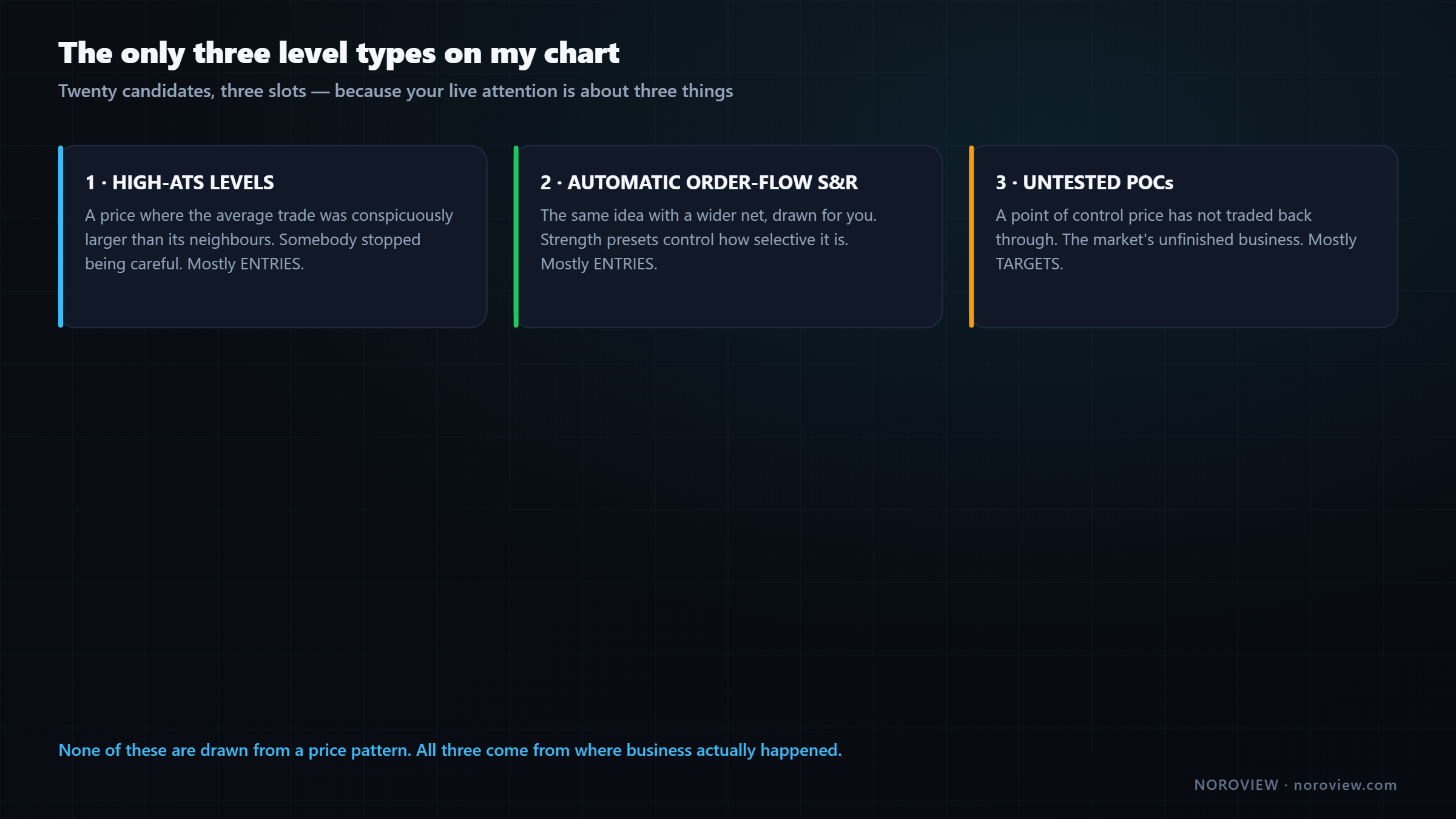
- High-ATS levels — where big participants actually transacted
- Automatic order-flow S&R — the automated version of the same idea
- Untested daily and weekly POCs — unfinished business
Notice what they have in common: none of them are drawn from a price pattern. All three are built from where business actually happened — from volume, and from participants.
The previous day's high is a level because it is a number people watch. A high-ATS level is a level because somebody with real money had to transact there. The second one has an owner. That is why I prefer it.
High-ATS levels, by hand
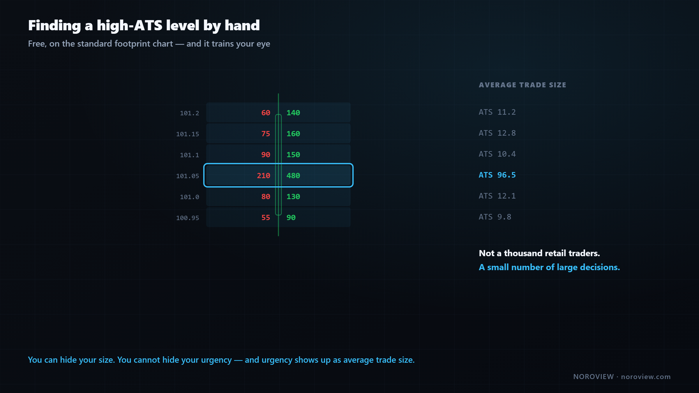
This comes straight out of lesson 4: ATS = average trade size = volume ÷ number of trades.
Remember why it matters. A large participant can hide their identity, hide their resting orders behind an iceberg, and slice one big order into hundreds of small pieces. But there is a limit to slicing. Slicing costs time, and time costs price — every extra second in the market is a second price can move away from you. So when a big participant genuinely needs to get filled, they stop being delicate. The pieces get bigger.
You can hide size. You can't hide urgency.
And urgency shows up as average trade size. A price level where the average trade was much bigger than everywhere around it is a price where somebody stopped being careful.
Why that becomes a level that works in future
Big money that transacted at a price now has a position at that price.
A participant who did serious size at that price owns a position with a cost basis right there. When price comes back to somebody's cost basis, they have reasons to act:
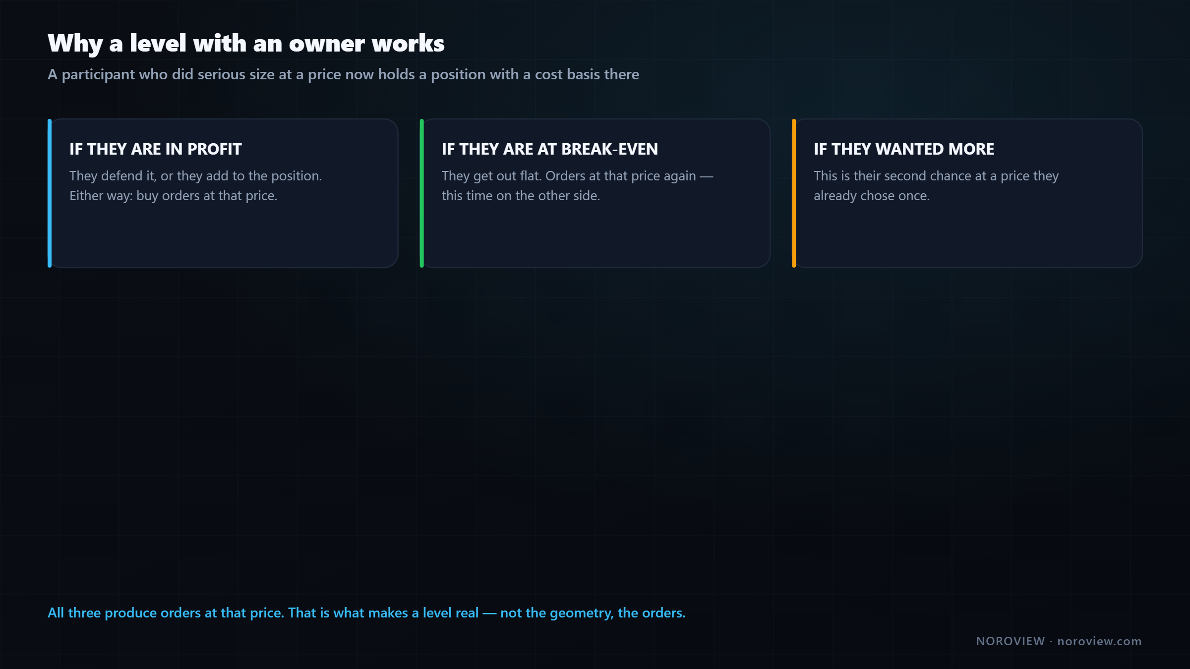
- If they are in profit → defend it, or add
- If they are at break-even → get out flat
- If they wanted more → this is their second chance
All three produce orders at that price. That is what makes a level real. Not the geometry. The orders. Larry Harris's Trading and Exchanges covers the underlying execution behaviour in far more depth if you want the academic version.
The four-step method (free, on the standard footprint)
I genuinely recommend doing this manually for a few weeks even if you can automate it, because it trains your eye in a way the automatic version never will.
Step 1. Put ATS total into your footprint metrics (or set a NORO Footprint column to it).
Step 2. Scan the last day or two of candles for levels where ATS is conspicuously bigger than its neighbours. Not slightly — conspicuously. The kind of difference you notice without comparing carefully.
Step 3. Check the candidate against two things. Was there also meaningful volume there? An enormous average trade size on three total trades is noise. And did price react there at the time — did it stall, reverse, or accelerate away?
Step 4. When you find a real one, draw a horizontal line at that price. Not a zone — start with a line and let price show you how wide the zone really is over the next few days.
Rejecting candidates is the skill. Big ATS with almost no volume behind it — three trades — is noise. Skip it. Learning to throw those away is worth more than finding three good ones.
The payoff is that price comes back days later and reacts right there, at a price nothing on a normal chart marks. No swing high, no round number, no pivot. The only reason to know about it is that you looked at who was transacting.
This is a level with an owner.
▶ Try this now
Add ATS total to your footprint metrics, zoom in on both axes, and scan yesterday's candles for one level where average trade size is obviously larger than its neighbours. Draw a horizontal line there. That is a real institutional level, found for free, in about three minutes. Launch NOROVIEW free →
Automating it: the smart footprint filter
Doing that by hand across a whole week is slow. The automated version is a paid, top-tier tool — the smart footprint filter. If you are on the free tier, keep doing it by hand; you are not missing the concept, only the speed.
It scans every individual price level inside your footprint and highlights the ones matching rules you define. Not whole candles — cell by cell. So you build a rule like average trade size at or above a large threshold, and every price level in the visible history where the average trade was that big gets highlighted.
Two things about the thresholds, and I want to be precise here.
The size classes — Notable · Large · Huge · Whale — are calibrated per market. A "large" trade on a smaller-cap coin is judged against that coin's own history, not against Bitcoin's. That is what makes the tool portable: you do not re-tune it every time you change symbol.
How the calibration works is proprietary. It is NOROVIEW's own analysis running on their servers. I do not know the internals, and I would not publish them if I did.
What you need is the mental model, and it is simple:
Treat them as sensitivity settings: higher = fewer, stronger.
Turn it up until you have a handful, not a wall. On Large you get a lot; on Huge it thins to a few. That is the setting you want, because you only have three slots.
There is also a smart candle filter doing the same thing for whole candles rather than individual levels — same rule builder, same tiers. You define a setup like "delta at a huge threshold and the candle closed in the top third" and every matching candle gets marked.
Footprint filter → price LEVELS. Candle filter → whole CANDLES.
I use the footprint filter for building levels, which is today's job, and the candle filter for finding setups, which is lesson 11. Same engine, two jobs.
Automatic order-flow support and resistance
Level type two does the same job with a wider net and draws the levels for you. Also a paid, top-tier indicator (NORO Support & Resistance).
It finds the price levels where unusually large participants concentrated and marks them automatically across days of history. Same honesty as above: how it decides is proprietary.
I can't tell you how it decides. I can tell you exactly how to control it.
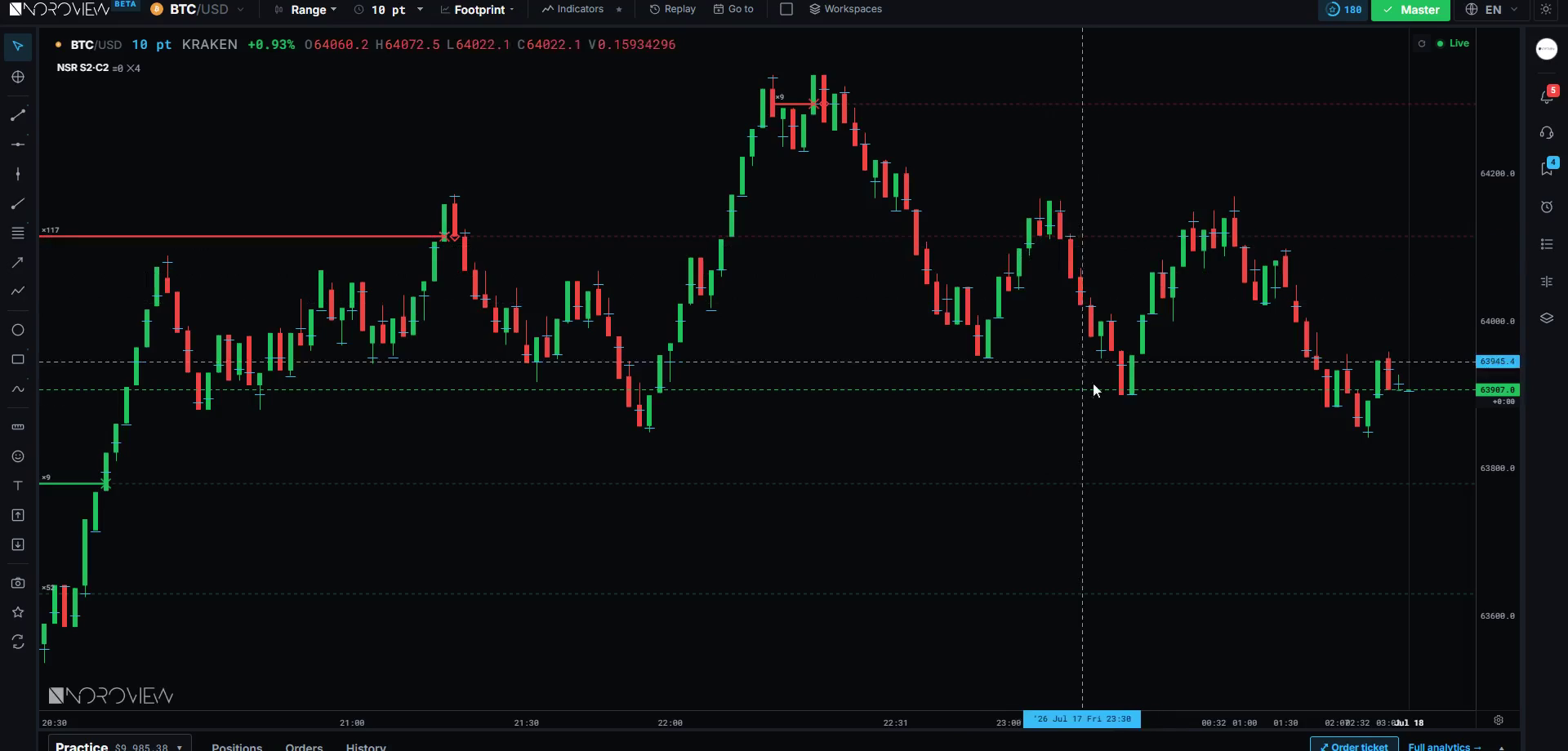
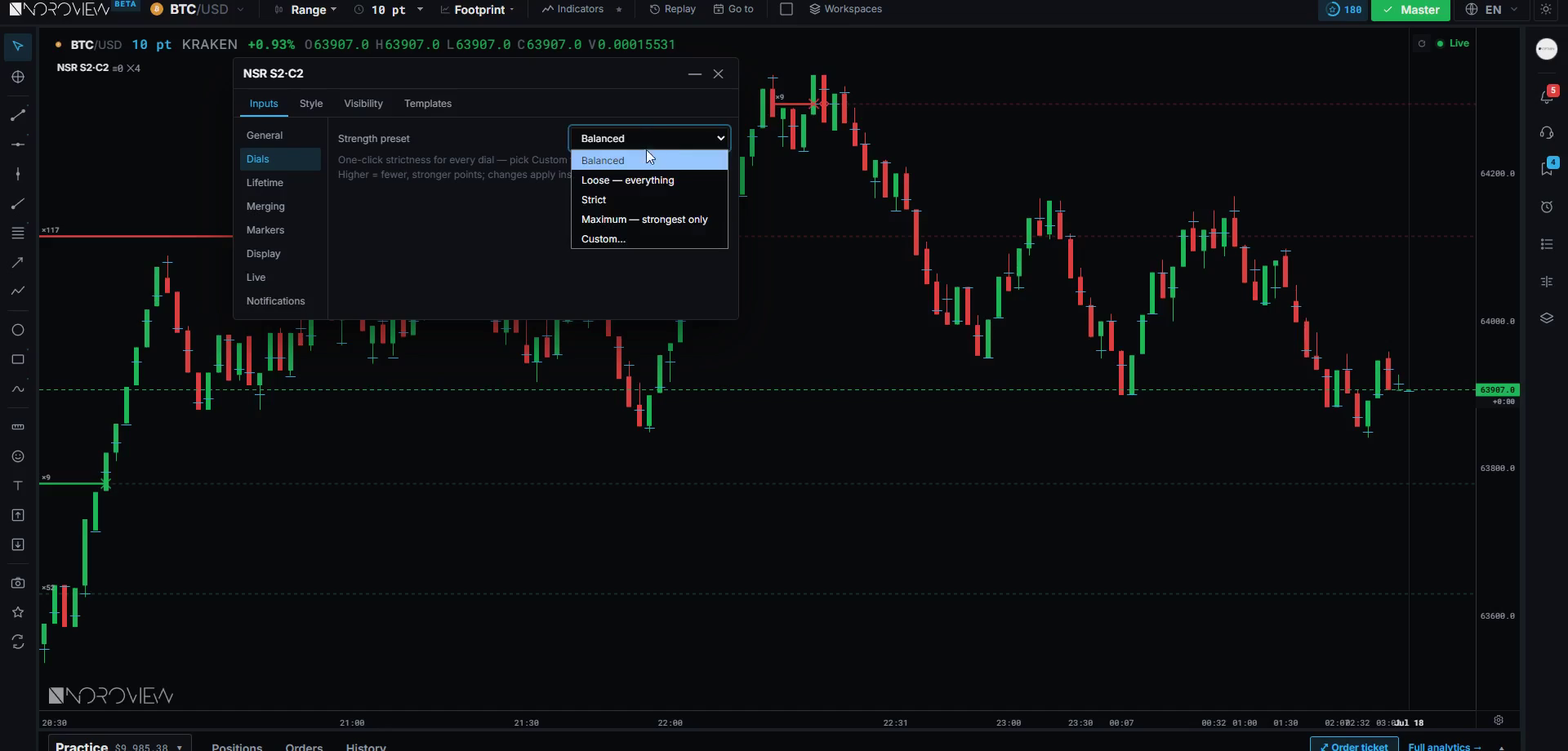
The strength preset is the master dial: Balanced, Loose, Strict, Maximum, and Custom. Think of it exactly like the sensitivity on any instrument. Loose gives you many levels including weak ones; Maximum gives you only the very strongest — perhaps one a week.
Custom reveals two dials: Significance (how much a level stands out from normal) and Caliber (how large the participants were). Both work the same way: higher means rarer and stronger.
Start on Balanced. Run it two weeks before touching anything. Getting more levels than you can respect? Go Strict. Going three days with nothing? Go looser. Do not start on Custom — you will tune it to whatever produced levels near yesterday's price, which is curve-fitting your own eyes.
The lifetime settings that actually matter
Extension — until broken, to the right edge, or a fixed number of bars. I use until broken, because a level should persist until the market invalidates it, not until an arbitrary count runs out.
When broken — keep faded, remove, or keep. I use keep faded, and this matters enormously:
A broken level isn't gone. It's a level from the other side now.
A support level that breaks becomes potential resistance. That is not a cliché, it is mechanical: everybody who bought at that level is now underwater, and when price comes back they sell to get out flat. Keeping broken levels faded means you can see those — and a break-and-retest of a high-caliber level is one of the cleanest setups there is. If the level had been deleted on break, you would never have seen it.
Break tolerance — how far through the level price must go before it counts as broken, in percent or ticks. Set it to zero and every wick kills your levels. You want a small tolerance so a poke through does not invalidate something real. Remember lesson 5: a wick through is not a break.
Level lookback days — how far back it searches. More history means more levels; keep it to a range you would actually trade against.
Merging — combines nearby levels into one. Turn this on. Three levels within a few dollars of each other are not three levels, they are one zone, and treating them as three tricks you into thinking there is more evidence than there is.
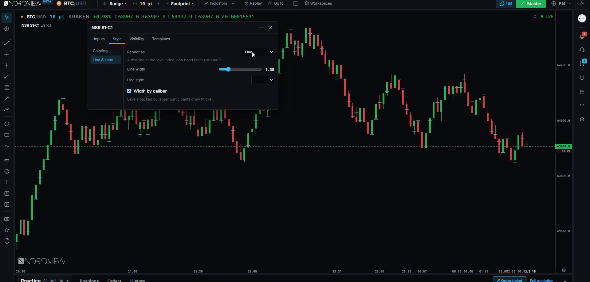
Two style settings that are not cosmetic: render as zone rather than line (levels are areas, and a zone stops you putting a stop two ticks the wrong side of a hairline), and width by caliber so the stronger levels draw bolder. Your eye then ranks them without you thinking about it.
Find the levels big participants actually transacted at
Footprint charts are free on every plan. The automated order-flow level tools sit on the higher tiers. Create a free account → · Compare plans
Untested daily and weekly POCs
Level type three comes straight from lesson 7 and is the simplest of the three.
An untested POC is the market's unfinished business.
A daily point of control is the price where the most business happened that day. An untested (naked) POC is one price has not traded back through since.
The logic once more, because it is worth being solid on: a POC is a price where a lot of participants wanted to do business. If price leaves quickly and never returns, it is likely there are participants who wanted to trade there and never got filled. Their interest is still sitting at that price. Markets come back to unfinished business more often than chance would suggest — not always, but often. And "often" is exactly what you need from a target.
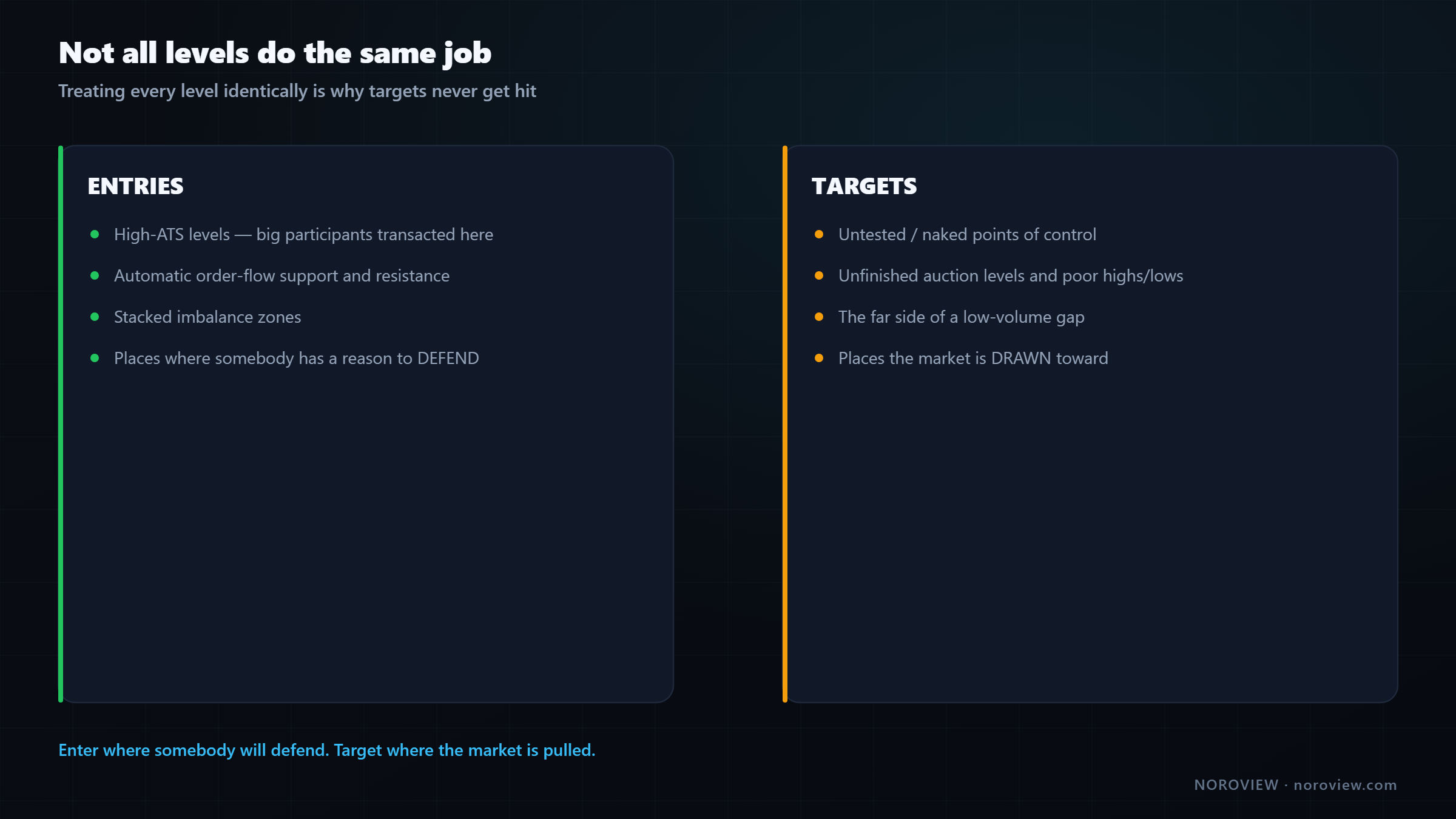
ATS levels & automatic S&R → mostly ENTRIES. Untested POCs → mostly TARGETS.
The first two are where I look for entries, because those are prices where somebody has a reason to defend. Untested POCs are where I look to take profit, because they are prices the market gets drawn toward. That distinction stops you doing the thing everybody does — treating every level identically and then wondering why your targets never get hit.
Weekly POCs are the same idea, slower and stronger: where the most business happened in a whole week. Those survive a long time and are worth marking permanently until tested.
Free-tier version: your footprint already marks a POC on every candle and can mark naked ones. The daily POC is also findable by eye — look at yesterday's chart, find where price spent the most time and volume, and mark it with a horizontal line. Twenty seconds, same level.
Ranking when they disagree
Three level types will sometimes point at different prices. Which one wins?
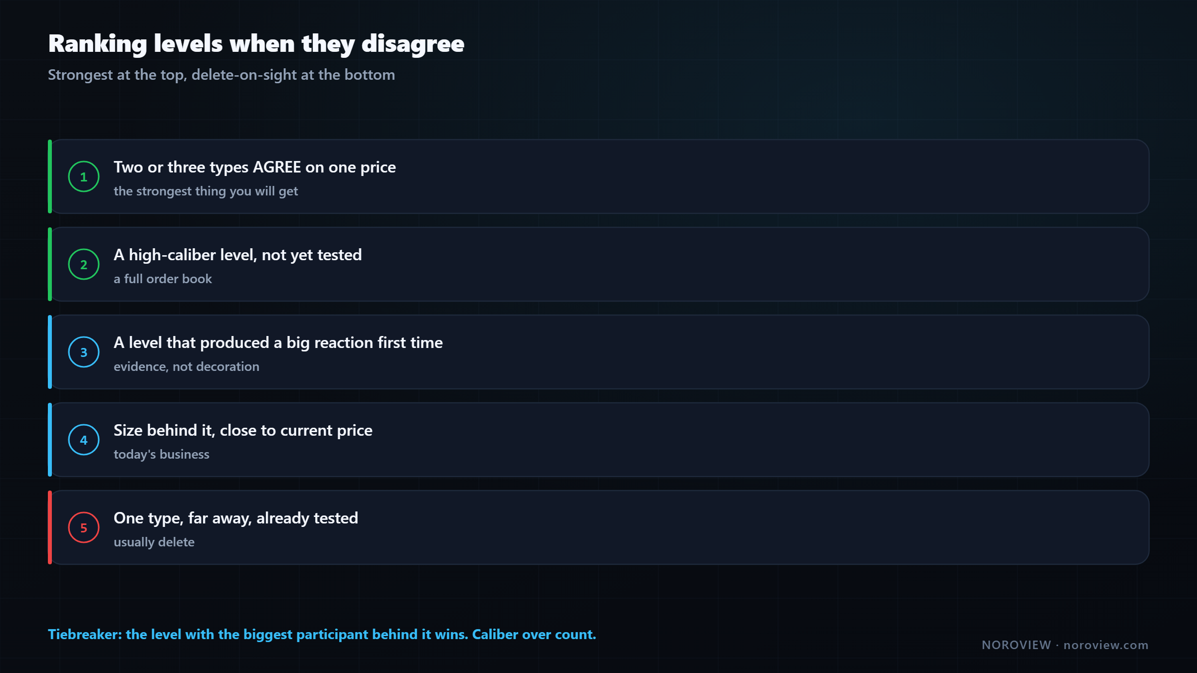
- Two or three types agree on one price → the strongest possible level. Three independent methods, built from different data, pointing at the same price. These are the levels I plan my week around.
- A high-caliber level that has not been tested. Every touch consumes the orders that made the level. An untested high-caliber level is a full order book; a tested one is what survived the attack.
- A level that produced a big reaction the first time. Did price actually do something there? A sharp reversal is evidence; a drift-through is a line you drew.
- A level with size behind it, close to current price. A strong level 5% away is next week's problem. Today's chart holds today's levels.
- A single level type on its own, far away, already tested → lowest. Usually delete.
And the tiebreaker when two levels are genuinely equal:
When in doubt, the level with the biggest participant behind it wins.
Caliber over count. One whale beats a hundred retail traders every time, because one whale can defend a price and a hundred retail traders cannot coordinate.
When a level dies
The other half of the job, and almost nobody does it: taking levels off.
A level you don't delete becomes a reason to take a bad trade.
Every level on your chart is a potential invitation. If it is still there in a week and no longer valid, one day you will be bored and it will look like a reason.
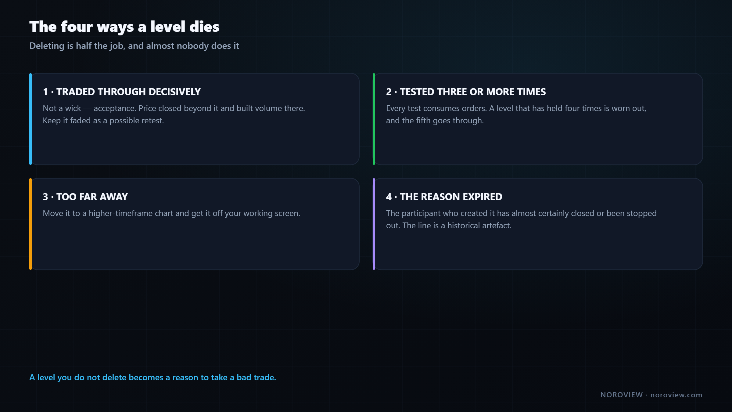
1. Price traded through it decisively. Not a wick — acceptance. Price closed beyond it and built volume there. That level is done in its original direction. Keep it faded as a possible retest, but it is not what it was.
2. It has been tested three or more times. Every test consumes orders. A level that has held four times is not strong — it is worn out, and the fifth test is the one that goes through.
3. It is too far away. Move it to a higher-timeframe chart and get it off your working screen.
4. The reason it existed no longer applies. This is the subtle one. A high-ATS level exists because a big participant transacted there. If price has since moved 20% away, that participant has almost certainly closed or been stopped out. Their orders are not there any more, and the line is a historical artefact.
Levels have a shelf life. So does the position that created them.
Treating levels as permanent is one of the quiet reasons people's charts stop working after a few months.
The level sheet and weekly maintenance
Keep a level sheet. Paper or a spreadsheet, it does not matter.
PRICE      TYPE            CREATED     TESTED   STATUS
──────────────────────────────────────────────────────────
95,240     ATS + NORO      Mon         0        active
94,100     untested POC    last Thu    0        target
93,650     NORO (broken)   Tue         2        faded/retest
Why write it down when it is already on the chart? Three real reasons.
It forces you to name the type. If you cannot say why a level is on your chart, it should not be on your chart. Writing "ATS + untested POC" is fine. Writing "looks important" is a level you delete.
It tracks tests. You will not remember that a level has been tested three times. The sheet does — and test count is the single most reliable death signal.
It makes maintenance a routine instead of a mood. Once a week, go down the sheet and kill everything that meets one of the four death conditions. Ten minutes, and it is the difference between a chart that keeps working and one that slowly turns into decoration.
Common mistakes
- Keeping more levels than you can watch. Your live attention is about three things.
- Treating a high-ATS reading with tiny volume as a level. Three trades is noise.
- Deleting levels the moment they break. Broken levels retest, and that is one of the cleanest setups available.
- Setting break tolerance to zero. Every wick then kills a valid level.
- Counting three nearby levels as three reasons. They are one zone. Merge them.
- Using untested POCs as entries. They are targets.
- Never doing maintenance. A stale level is an invitation you will eventually accept.
Your homework
About an hour.
- Find three high-ATS levels by hand on your main market, and reject at least two candidates out loud for a stated reason.
- Start a level sheet with price, type, created date, test count and status. Fill it with whatever is currently on your chart — and delete anything you cannot name a type for.
- Go back two weeks and find one break-and-retest of a level. Mark what the footprint looked like on the retest.
Open the terminal and start your level sheet →
Three things to remember
- Three level types, not twenty. High-ATS levels, automatic order-flow S&R, and untested POCs — all built from participants rather than price patterns.
- ATS levels are entries; untested POCs are targets. Treating every level identically is why targets never get hit.
- Deleting is half the job. A level dies when it is decisively broken, tested three or more times, too far away, or when the position that created it no longer exists.
← Previous: VWAP and Anchored VWAP · Course index: Order Flow Trading Course · Next → Absorption, Exhaustion, Icebergs and Imbalance
Frequently asked questions
Which support and resistance levels actually work? The ones with orders behind them. Levels built from where large participants actually transacted — high average-trade-size prices and untested points of control — outperform purely geometric levels, because there is a real position at that price whose owner has a reason to act when it is revisited.
Do support levels get stronger the more times they are tested? No, usually the opposite. Each test consumes some of the resting orders that made the level meaningful. A level that has held four times has fewer defenders than it did on the first touch, and the next test is more likely to go through.
How do you find institutional levels on a chart? Look for price levels where average trade size was conspicuously larger than the levels around it, with meaningful volume behind it and a visible reaction at the time. That combination indicates a small number of large transactions rather than many small ones.
How many levels should I mark? Three to five on each side of price. In a live market your effective attention is about three things, so a chart with twenty levels means you will simply react to whichever one price happens to be near and justify a decision you had already made.
What is a break and retest setup? Price closes decisively through a level, then returns to it from the other side and fails to reclaim it. It works because everyone positioned at the original level is now offside and sells or buys to get out flat, adding fuel in the direction of the break.
When should you delete a support or resistance level? When price has traded through it with acceptance rather than a wick, when it has been tested three or more times, when it is too far from current price to matter today, or when the position that created it has almost certainly been closed.
What is an untested POC? An untested or naked point of control is a price with the highest traded volume in some earlier period that price has not returned to since. It tends to act as a magnet, which makes it a strong profit target rather than an entry level.
Sources
- Investopedia — support and resistance basics
- Harris, L. (2003). Trading and Exchanges: Market Microstructure for Practitioners — Oxford University Press
Soroosh Moghimi — six years inside financial markets: algorithmic trading, HFT, crypto and AI, after a decade building startups. He publishes this course free because he already paid for the lessons in it. There is no paid course and no signal group. @sorooshmoghimi · About
Start reading real order flow
You cannot learn this from a candlestick chart, and you do not need to spend a cent to begin. The standard footprint chart is free for every NOROVIEW user, market replay is free, and the paper-trading simulator is free.
Open NOROVIEW free → · Compare plans →
⚠️ DISCLAIMER — EDUCATIONAL CONTENT ONLY
This article is for educational and informational purposes only. It is not financial, investment, or trading advice, and nothing in it is a recommendation to buy, sell, or hold any asset. Trading cryptocurrencies and leveraged derivatives is high risk and can result in the loss of some or all of your capital. Only risk money you can afford to lose. Any levels, indicators, signals or results shown are illustrative and are not a promise or prediction of future performance. Charts may be shown on a demo or paper-trading account and do not represent real trades or returns. Always do your own research. You alone are responsible for your decisions.
Keep reading
Related posts

16. Trade Management: Break-Even, Partials and Trailing Stops
Trade management explained: when break-even stops cost you money, partial exits, four kinds of trailing stop, the order-flow exit, and diagnosing yourself with MFE and MAE.

15. How to Day Trade Crypto With Order Flow (Starting Small)
How to day trade crypto with order flow: exchange security, spot vs perpetuals, leverage and liquidation, order types, fees, and an honest $100 starting plan.

14. Risk, Drawdown and the Mind: Day Trading's Real Edge
Day trading risk management and psychology: position sizing math, drawdown recovery arithmetic, hard limits, decision vs outcome, and the five states that break traders.

13. Fair Value Gaps, Confirmed With Order Flow
Most fair value gaps do nothing. Five order-flow checks that tell you in advance which FVGs are worth trading and which are decoration.

5. Market Structure and Trend: How to Pick Your Side Objectively
How to identify market structure objectively: higher highs and higher lows, swing point rules, impulse vs correction, and the arithmetic behind trading with the trend.
11. My Order Flow Entry Model, Step by Step
A complete order flow entry model: the four conditions, the exact trigger candle, the value-area filter, and the ten-item blocker list that vetoes a trade.
Discussion (0)
Want to join the discussion? Comments live inside the platform.
Open NOROVIEW