
6. The Order Flow Trading Strategy: Levels + Confirmation
A complete order flow trading strategy: the five families of levels, how to rank them, the daily routine, and the six-step sequence from level to live position.

6. The Order Flow Trading Strategy: Levels + Confirmation
Here is the entire order flow trading strategy, in three lines, before anything else:
Find the levels that matter. Wait for price to arrive. Use order flow to decide whether to take it.
That is it. Volume profile, VWAP, absorption, CVD, fair value gaps — every remaining lesson in this course is a detail inside one of those three lines. This article covers the complete list of levels worth marking, how to rank them so your chart does not become a spider web, the routine to run before you trade, and the exact six-step sequence from "I see a level" to "I am in a position."
Build the map alongside this article — open a chart free and draw as you go.
What you'll learn in this lesson
- Why every trade decision is really two questions needing two different tools
- Why levels alone fail, and why order flow alone fails
- The five families of levels, and why anyone would care about each price
- The four ranking criteria that cut forty levels down to five
- The counter-intuitive truth about levels that have "held four times"
- The full daily routine, step by step
- The six-step trade sequence — and the rule that turns a bet into a trade
Lesson 6 of 16 · Part 2 — Technique. Part of the free order flow trading course. Previous: Market Structure and Trend. Next: Volume Profile Trading Guide.
▶ Prefer to watch it?
Building the map: Trend Lines, Fibonacci & Risk/Reward Tools — Every Drawing Tool (Ep 5) · Keeping it clean: Chart Layers (Object Tree), Support & Announcements (Ep 8) · Getting told when price arrives: Crypto Price Alerts & Watchlists (Ep 9)
Two questions, two tools
Every trade decision is really two questions, and they need two different tools.
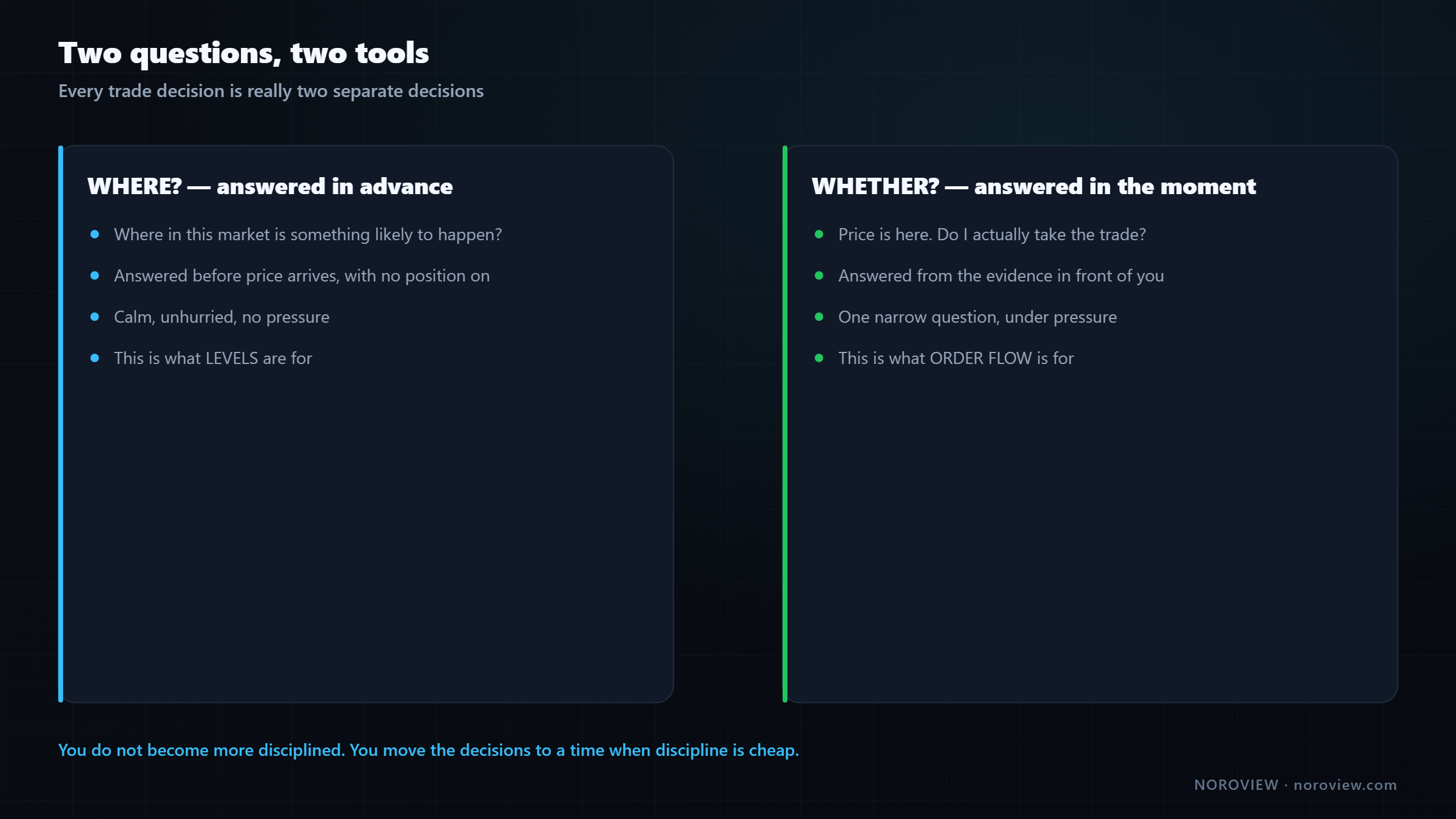
Question 1 — WHERE? Where in this market is something likely to happen? This gets answered before price arrives: calmly, no position on, no pressure. That is what levels are for.
Question 2 — WHETHER? Price is now at that place. Do I actually take the trade? This gets answered in the moment, from the evidence in front of you. That is what order flow is for.
Notice what that structure does for you psychologically, because it is not a small thing. The hard thinking — where does this market matter — happens when you are relaxed, before the session, with no money on the line. So by the time price is moving fast and your heart rate is up, there is exactly one narrow question left: is the evidence here or not?
That is how you stop making decisions under pressure. You do not become more disciplined. You move the decisions to a time when discipline is cheap.
Why levels alone fail
Here is a level — the previous day's low. Price comes down to it, touches it, reverses, and runs $300. Textbook. If that is all you ever saw, you would conclude levels work and start buying every touch.
Now here is the same kind of level a few days later. Same logic, same drawing, same reasoning. Price comes down to it and goes straight through like it is not there. And keeps going.
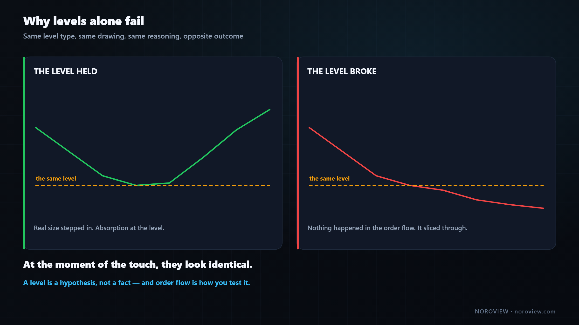
At the moment of the touch, a level that holds and a level that breaks look the same.
This is why "support and resistance trading" has such a mixed reputation. The idea is sound. The problem is that it is only half a method — and the missing half is exactly the half that tells you which of those two you are in.
The mechanical reason comes from how price actually moves: a level is a memory of where liquidity used to be. You drew it because, in the past, orders showed up there and stopped price. But those orders are gone — filled, cancelled, or the participant changed their mind. The line on your chart is a historical record. It tells you where somebody used to care.
A level is a hypothesis, not a fact.
The right way to think about a level is as a hypothesis: "if anybody still cares about this price, they will show up here." That is a question. And the only way to answer it is to look at what happens when price arrives.
Why order flow alone fails
This one catches people who have just learned footprint charts — which is exactly where you are.
Here is a beautiful absorption: heavy sell volume at the low of the candle, price refused to go down, delta strongly negative and the candle closed at the top. In lesson 4 you would have called it a textbook long.
And it did nothing. Chop for two hours, then it drifted the other way.
Why? Because it happened in the middle of nowhere.
Absorption in the middle of nowhere is just two traders arguing.
Somebody big absorbed some selling. Fine. But there was no reason for anybody else to care about that price — no previous-day level, no value-area edge, no VWAP, nothing. So no other participants had orders waiting there, nobody else was watching it, and the move had no fuel behind it.
Here is the framing I find most useful:
Order flow says someone is acting. A level says many people are watching.
A single absorption tells you one participant did something. A level tells you a lot of participants are paying attention to this price. When you get both at once — one big participant acting at a price lots of people are watching — that is when a move actually goes somewhere, because the first action triggers all the others.
And there is a brutally practical reason too, nothing to do with theory:
Without a level, where is your stop?
If you take a trade because of one candle in the middle of a range, you have nothing to hide a stop behind. So you either put it too close and get stopped by noise, or too far and take a loss much bigger than you planned. A level gives you a structure — a place where, if price goes beyond it, your idea is genuinely wrong. That is what makes a stop meaningful instead of arbitrary.
Levels do not just find trades. They define risk.
▶ Try this now
Open a chart, press
Alt+Dto open the Objects panel, and hit Remove all. Start from a genuinely blank chart. Then mark exactly five prices: yesterday's high, yesterday's low, yesterday's close, and this week's high and low. That is a real level map, and it took ninety seconds. Launch NOROVIEW free →
The level map: five families
Every level worth marking comes from one of five families. For each one, the thing to understand is why anybody would care about that price — because a level nobody has a reason to watch is just a line.
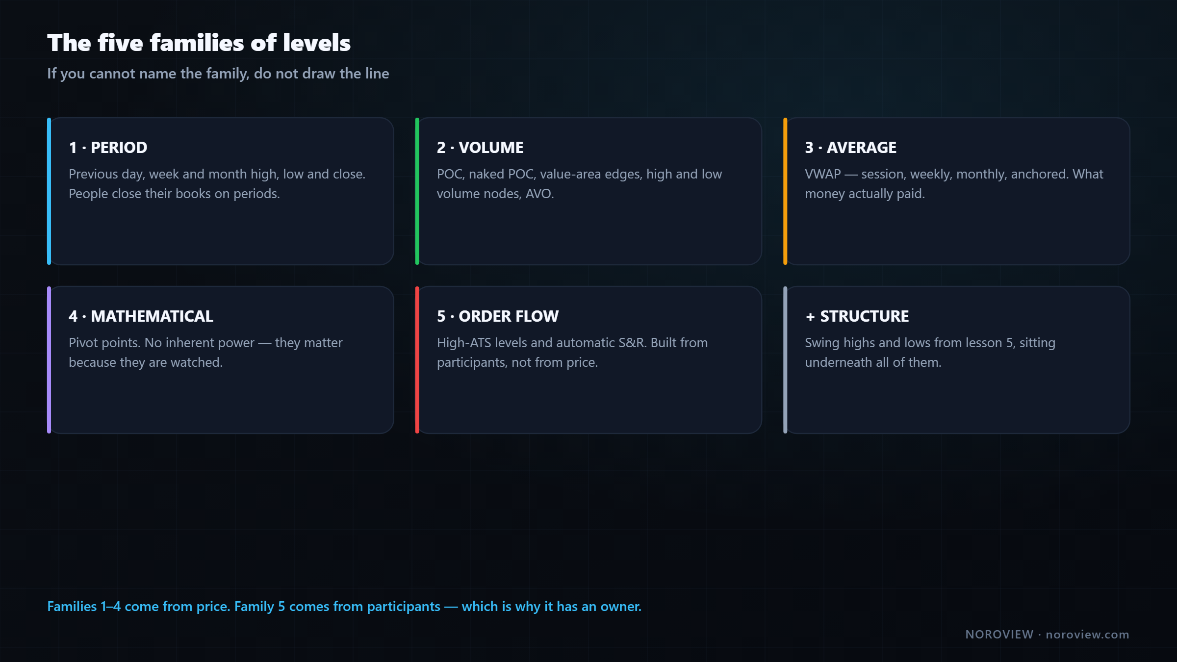
| # | Family | What it contains |
|---|---|---|
| 1 | Period | Previous day / week / month high, low, close |
| 2 | Volume | POC, naked POC, value-area edges, high and low volume nodes, AVO |
| 3 | Average | VWAP — session, weekly, monthly, anchored |
| 4 | Mathematical | Pivot points and their derived levels |
| 5 | Order flow | High-ATS levels, automatic support and resistance |
(Plus structure — the swing highs and lows from lesson 5 — which sits underneath all of them.)
Family 1 — Period levels
The simplest family, and genuinely one of the most reliable: previous day's high, low and close, previous week's, previous month's for the bigger picture.
Why do these matter? Because of something very human: people close their books on periods.
Everybody's P&L is measured against a period boundary.
A fund reports monthly. A trader reviews weekly. An algorithm resets daily. Everybody's profit and loss is measured against where the last period ended. So the previous day's close is not a random number — it is the reference point a large number of participants are measuring themselves against right now.
The previous day's high and low are the same idea in another form: the boundaries of what the market agreed on yesterday. Trading above yesterday's high means the market has decided yesterday's range was too low. That is a real event, and a lot of systems watch for it.
Two practical notes. Turn on daily dividers in the chart appearance settings — a small line at each new day makes period levels obvious instead of something you count out. And choose a day boundary and never change it: on a 24-hour market I use midnight UTC, because that is the exchange's day, it is what the platform's daily reset uses, and it is what range candles reset on. Everything agrees.
Family 2 — Volume levels
A volume profile turns the chart on its side: instead of volume by time along the bottom, it shows volume by price as a horizontal histogram. Immediately you see something a normal chart never shows — some prices had enormous activity and some had almost none.
- POC (point of control) — the single price with the most volume. The price the market agreed on most, and a price markets get drawn back to.
- Value area — the range containing the bulk of the volume, conventionally 70%. Its edges are the boundary between accepted and rejected prices, and price reacts at them constantly. The CME's market profile material is the original source for this framework.
- Low-volume nodes — the thin sections, which matter just as much.
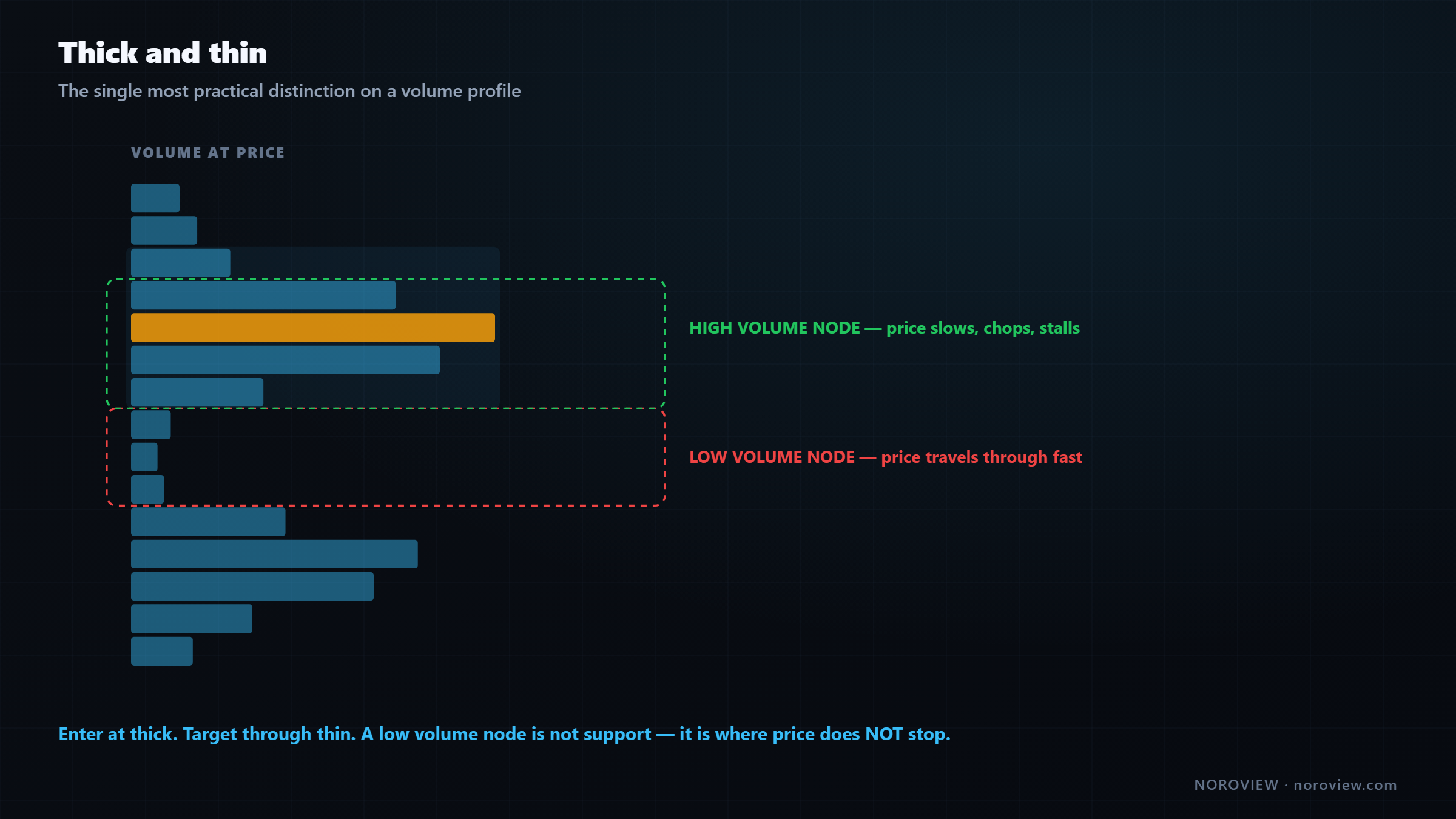
Thick volume → price slows down, reacts, gets stuck. Thin volume → price travels fast, no resistance.
That single distinction is one of the most practical things in the whole course. It tells you where price will fight and where it will run. Thick areas are where you look for entries. Thin areas are what you use to set targets.
AVO is one more from this family and it is a nice one:
AVO = volume at a level ÷ number of candles that traded at that level
Plain arithmetic, answering a question raw volume cannot. High volume at a level can mean two completely different things: price sat there for six hours with moderate business every minute (nothing special happened — that is just where the market was parked), or price touched that level for three candles and an enormous amount of business happened in those three candles. Same total volume, completely different event.
High volume + few candles = something happened fast. That is the interesting one.
On the free plan: the volume profile indicator is a paid tool, but your footprint already draws a POC and a value area on every candle — the same idea at a smaller scale — and you can mark the daily POC by hand with a horizontal line. Same information, slower. Honestly, doing it manually for the first few weeks teaches you more than the automatic version does. Lesson 7 goes deep on all of it.
Family 3 — Average price: VWAP
VWAP = the average price everyone actually paid, weighted by size.
VWAP is the average price of every trade in a period, weighted by how much traded at each price. Not "the average of the candles" — the average price that money actually paid. That makes it the fair value of the session, according to the market itself.
Two reasons it matters practically:
1. Large participants are measured against it. If you are an execution desk buying a large position over a day, your performance is judged against the day's VWAP. Beat it and you did well. Which means a significant amount of real money is actively trying to buy below it and sell above it. That is not a theory — that is how execution gets measured.
2. It is the honest definition of expensive and cheap for that period. Above VWAP, the average participant in this session is in profit on a long. Below it, they are underwater. And that changes behaviour.
You can anchor it to a session, a week, a month, or a rolling window — each answers a different question. There is also anchored VWAP, where you pick the starting point yourself: a major high, a crash, a news event. That gives you the average price of everybody who has traded since that specific moment, which is an extremely powerful level. Lesson 8 is entirely about it.
Family 4 — Mathematical levels: pivots
Pivot points are calculated from the previous period's high, low and close using a fixed formula. Several formulas exist — Traditional, Fibonacci, Woodie, Camarilla, DeMark — with daily, weekly or monthly anchors.
Let me be honest about pivots, because a lot of nonsense is talked about them:
Pivots have no inherent power. They matter because they are watched.
There is nothing magical in the arithmetic. What makes them work, when they work, is that they are widely watched and completely objective: every trader using pivots gets the same numbers automatically, with no drawing skill involved, so orders cluster there. It is self-fulfilling — and self-fulfilling is fine. Real orders at a real price is all a level has ever been.
My practical take: I do not build a strategy on pivots. I use them as confluence. If a pivot happens to sit on top of a level I already care about for a volume or period reason, that level just got better, because now two different groups are watching the same price. If you do use them, Camarilla produces tighter levels that suit intraday ranges.
Family 5 — Order-flow levels
This is the family that makes this course different from every price-action course you have watched.
Families 1–4 come from price. Family 5 comes from participants.
High-ATS levels. From lesson 4: ATS is average trade size, volume divided by trades. A price level where the average trade size was much larger than everywhere around it is a price where big participants were doing business. That gives you something the other four families cannot: a level that exists because somebody large was there, not because of a formula.
Why does that make it a good level? Simple human behaviour. A large participant who did serious business at a price now has a position with a cost basis right there. Price comes back, and they have a reason to act — defend it, add to it, or get out flat.
A price where big money transacted is a price big money cares about.
These are my favourite levels, and lesson 9 is dedicated to finding them properly.
Automatic order-flow levels. NOROVIEW's NORO Support & Resistance is a paid, top-tier indicator that draws the price levels where unusually large participants concentrated, so you are not marking them by hand. How it decides is proprietary — that is NOROVIEW's own analysis running on their servers, and I do not know the internals.
What you control is how selective it is. There is a strength preset — Balanced, Loose, Strict, Maximum — and a Custom mode with two dials, Significance and Caliber. Treat those exactly like a sensitivity control on any instrument: higher gives you fewer, stronger levels; lower gives you more, weaker ones. Start on Balanced.
One setting worth changing: render the levels as zones rather than lines, and turn on width by caliber so the strongest levels are visually boldest. Both match how levels actually work — they are areas, and they are not all equal.
If you are on the free tier you are not locked out of this idea. You can find high-ATS levels by eye on the footprint. It is slower, and doing it manually for a few weeks teaches you more than the automatic version does.
Build your whole desk once, reload it in one click
Multi-chart layouts, symbol-linked panes, and saved workspaces that restore every level and every setting exactly where you left them. Create a free account → · Compare plans
Ranking: which levels survive
Turn on everything from all five families at once and your chart becomes completely useless. Every level on it is legitimate. That is exactly the problem.
A chart with 40 levels has no levels.
If every price is a level, then no price is a level — and what you have actually built is a machine for justifying any trade you feel like taking. That is worse than having no levels at all, because it feels rigorous.
So we rank. Four criteria, about ten seconds per level.
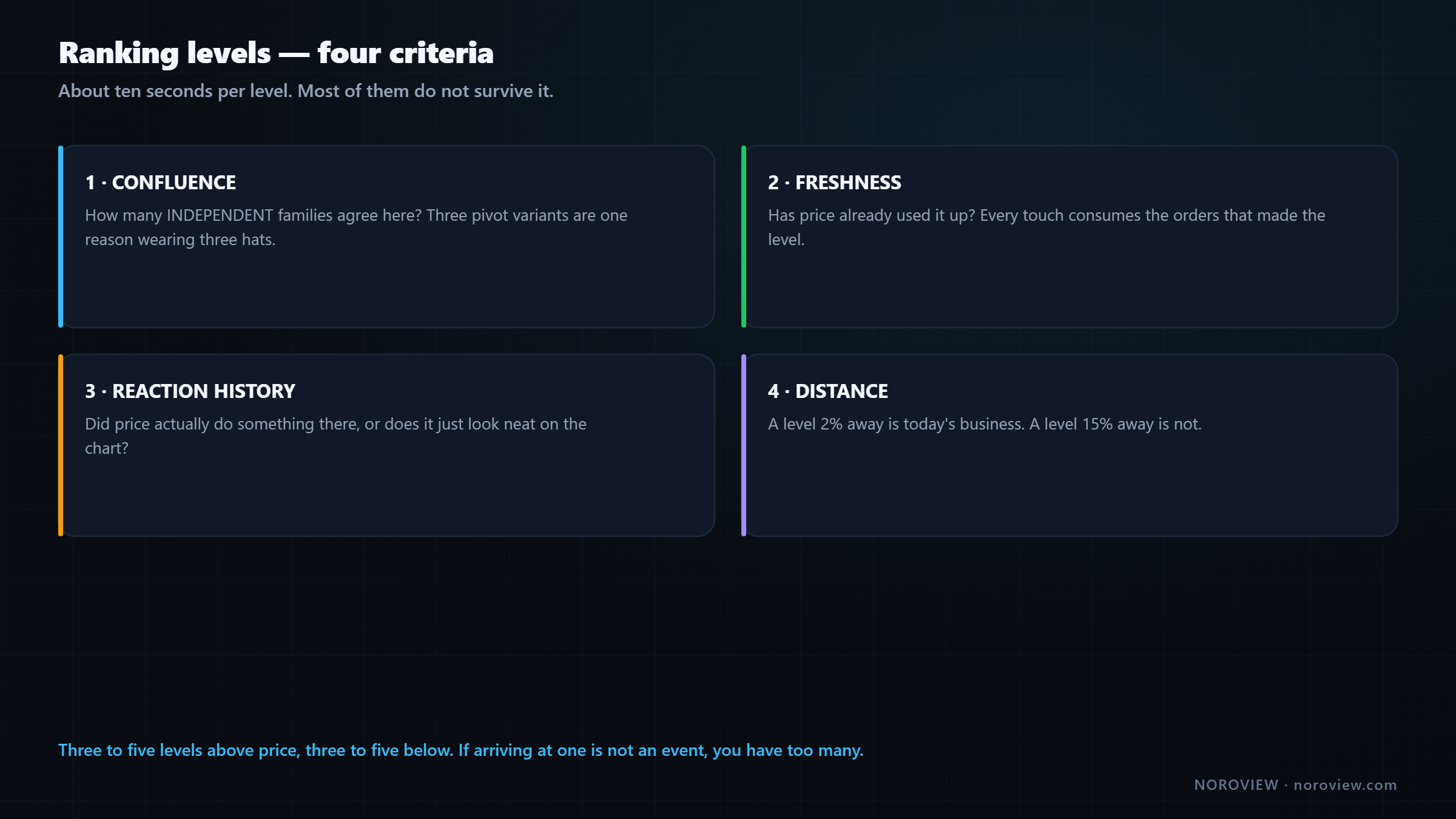
1. Confluence — how many independent families agree here? Previous-day low + value-area low + a high-ATS level is three different groups watching the same price. Strong level. I stress independent: three pivot variants agreeing is not confluence, because they are all computed from the same three numbers. That is one reason wearing three hats.
2. Freshness — has price already used it up? This is the one people get backwards.
Every touch consumes the orders that made the level.
Lots of traders believe a level that has held four times is stronger. Mechanically it is usually weaker, because every touch consumes some of the resting orders that made it a level in the first place. The fourth touch has fewer defenders than the first. An untouched level is a full order book; a level tested four times is what is left after four attacks.
3. Reaction history — did price actually do something there? A level where price previously reversed sharply is evidence. A level price drifted through without noticing is a line you drew.
4. Distance — is it close enough to matter today? A level 2% away is today's business. A level 15% away is not. Keep the far ones on a higher-timeframe chart, off your working screen.
Three to five levels above price. Three to five below. That is it.
Everything else comes off. And if a new one appears that is better than what you have, it replaces one — it does not get added.
That constraint does something important. When your chart has only five levels, arriving at one is an event. You notice. You focus. When your chart has forty, price is always at a level — so being at a level means nothing, and you have destroyed your own signal.
The daily routine
About ten minutes in real life. Start with Objects → Remove all so the chart is genuinely blank.
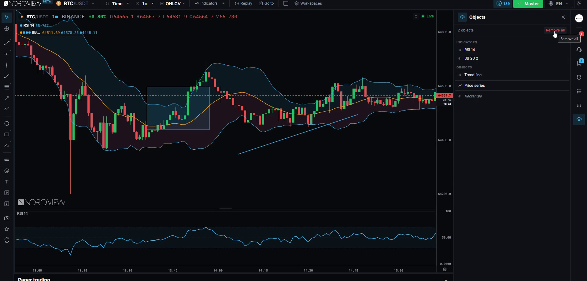
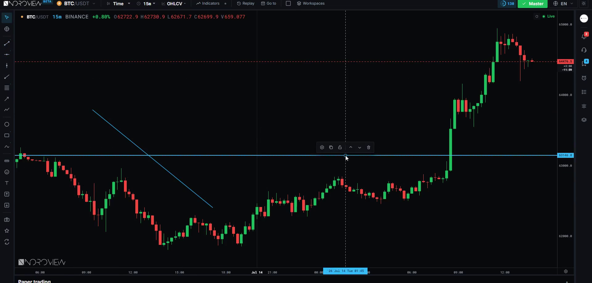
Step 1 — structure. Daily chart, mark the swings, get the bias (lesson 5, three minutes). Write down the last higher low as your invalidation.
Step 2 — period levels. Previous day high, low and close. Previous week high and low. Five lines.
Step 3 — volume levels. Where is the point of control? Where are the value-area edges? Any naked POCs above or below that price has not returned to? Mark them.
Step 4 — VWAP. Where is price relative to it — above, below, or sitting right on it?
Step 5 — order-flow levels. Turn on automatic support and resistance, or scan the footprint for high-ATS levels by hand. Note the strongest two or three.
Step 6 — rank and delete. Aggressively. "That one goes — it is a pivot on its own with nothing else agreeing. That one goes — price already reacted there twice this week, it is used up. These two are within $20 of each other, so they are one zone, not two."
Step 7 — write it down. Four or five prices in a notebook, with one word each for why. And one line for what would make your bias wrong.
If you cannot write your map in five lines, you do not have a map.
And now you are done thinking for the day. The analysis is finished. From here your job is not to have opinions — it is to wait. When price reaches one of those five prices, look at the order flow and answer one narrow question.
That is what a plan is. Not a prediction. A short list of places where you will look at evidence.
The six-step trade sequence
Every time, in order. No step skipped, no step out of order.
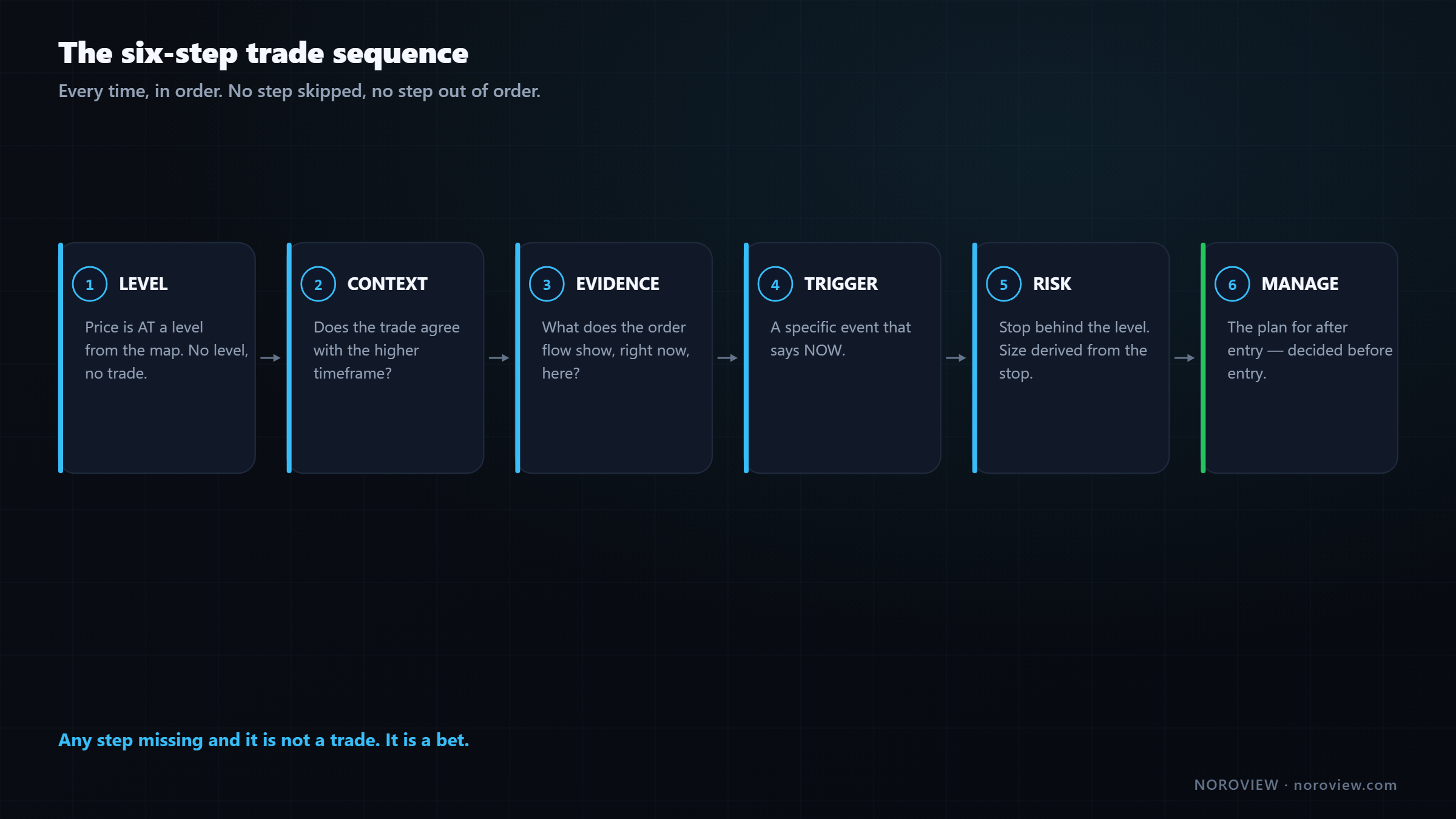
1 · LEVEL. Price reaches a level from your map. If price is not at a level, there is no trade. There is no step zero where you take something because it looks good.
2 · CONTEXT. Does this trade agree with your higher-timeframe bias? A long at support in a daily uptrend is a standard trade. A long at support in a daily downtrend is counter-trend, and it needs much more evidence and less size.
3 · EVIDENCE. Now — and only now — look at the footprint. Is there absorption? Is delta doing something unusual? Did big participants show up? That is what lesson 10 is built to answer.
4 · TRIGGER. Evidence is not entry. You need a specific event that says now. Having a defined trigger is what stops you entering three times into the same idea because you got impatient. Lesson 11.
5 · RISK. The stop goes behind the level — the place where, if price gets there, your idea is genuinely wrong. Then position size is calculated from that stop distance, so a loss costs a fixed, small percentage of your account. Never the other way round. Lesson 14.
6 · MANAGE. What you will do if it goes your way and what you will do if it stalls — decided before you enter. Lesson 16.
Any step missing = not a trade. It's a bet.
Be strict about that in a way that feels excessive, because the excessive version is the one that survives a bad month.
Common mistakes
- Marking every level you can find. Forty levels is the same as zero levels, with extra confidence.
- Counting dependent levels as confluence. Three pivot variants are one reason, not three.
- Believing repeatedly-tested levels are stronger. Each touch consumes defenders.
- Taking order-flow signals away from levels. One participant acting is not the same as many participants watching.
- Deciding the stop after entry. The stop defines the size; the size cannot define the stop.
- Changing the day boundary depending on what makes the chart look better.
- Doing the analysis while price is moving. The whole point is to do it when discipline is cheap.
Your homework
About an hour, and do it for real.
- Build one complete level map on your main market, following the seven steps. Do the ranking honestly and delete until 3–5 remain per side.
- Write the map in your notebook — five prices, one word each for why, one line for what makes your bias wrong.
- Do nothing else for the rest of the day except watch for price to reach one of those prices. When it does, open the footprint and just look. No trade. Just look.
Open the terminal and build your map →
Three things to remember
- Levels answer WHERE; order flow answers WHETHER. Decide the where when you are calm, so the only decision left under pressure is a narrow one.
- Neither half works alone. A level without order flow is a coin flip; order flow without a level is two traders arguing in the middle of nowhere.
- Three to five levels per side, ranked by confluence, freshness, reaction history and distance. If arriving at a level is not an event, you have too many.
← Previous: Market Structure and Trend · Course index: Order Flow Trading Course · Next → Volume Profile Trading Guide
Frequently asked questions
What is an order flow trading strategy? It is a two-part method: map the small number of price levels where participants are likely to act, then use live order-flow evidence — absorption, delta, trade size — to decide whether to take the trade when price actually arrives. Levels answer where; order flow answers whether.
Why do support and resistance levels fail? Because a level is a memory of where liquidity used to be, not a guarantee that it is still there. The orders that created the level have been filled or cancelled. At the moment of the touch, a level that will hold and a level that will break look identical on a candlestick chart.
How many levels should I mark on a chart? Three to five above price and three to five below. Beyond that, price is always near "a level," which destroys the signal. If a better level appears, it should replace an existing one rather than being added to the pile.
Does a level get stronger each time it is tested? Usually the opposite. Each test consumes some of the resting orders that made the level meaningful, so the fourth touch typically has fewer defenders than the first. An untested level represents a full order book; a repeatedly tested one is what remains after several attacks.
What is confluence in trading? Confluence is two or more independent reasons for the same price to matter — for example a previous-day low, a value-area edge and a high average-trade-size level all landing together. Multiple variants of the same calculation do not count, because they share their inputs.
What are order flow trading rules? A workable rule set is the six-step sequence: price must be at a mapped level, the trade must agree with higher-timeframe context, the order flow must show evidence, a specific trigger must fire, the stop must sit behind the level with size derived from it, and the management plan must exist before entry.
How do you build a level map? Start from a blank chart. Add period levels, volume levels, VWAP, pivots and order-flow levels, then rank everything by confluence, freshness, reaction history and distance, and delete until three to five remain on each side. Write the survivors down with one word of reasoning each.
Sources
- CME Group Education — market profile and value
- Investopedia — VWAP
Soroosh Moghimi — six years inside financial markets: algorithmic trading, HFT, crypto and AI, after a decade building startups. He publishes this course free because he already paid for the lessons in it. There is no paid course and no signal group. @sorooshmoghimi · About
Start reading real order flow
You cannot learn this from a candlestick chart, and you do not need to spend a cent to begin. The standard footprint chart is free for every NOROVIEW user, market replay is free, and the paper-trading simulator is free.
Open NOROVIEW free → · Compare plans →
⚠️ DISCLAIMER — EDUCATIONAL CONTENT ONLY
This article is for educational and informational purposes only. It is not financial, investment, or trading advice, and nothing in it is a recommendation to buy, sell, or hold any asset. Trading cryptocurrencies and leveraged derivatives is high risk and can result in the loss of some or all of your capital. Only risk money you can afford to lose. Any levels, indicators, signals or results shown are illustrative and are not a promise or prediction of future performance. Charts may be shown on a demo or paper-trading account and do not represent real trades or returns. Always do your own research. You alone are responsible for your decisions.
Keep reading
Related posts

16. Trade Management: Break-Even, Partials and Trailing Stops
Trade management explained: when break-even stops cost you money, partial exits, four kinds of trailing stop, the order-flow exit, and diagnosing yourself with MFE and MAE.

15. How to Day Trade Crypto With Order Flow (Starting Small)
How to day trade crypto with order flow: exchange security, spot vs perpetuals, leverage and liquidation, order types, fees, and an honest $100 starting plan.

14. Risk, Drawdown and the Mind: Day Trading's Real Edge
Day trading risk management and psychology: position sizing math, drawdown recovery arithmetic, hard limits, decision vs outcome, and the five states that break traders.

13. Fair Value Gaps, Confirmed With Order Flow
Most fair value gaps do nothing. Five order-flow checks that tell you in advance which FVGs are worth trading and which are decoration.

5. Market Structure and Trend: How to Pick Your Side Objectively
How to identify market structure objectively: higher highs and higher lows, swing point rules, impulse vs correction, and the arithmetic behind trading with the trend.
11. My Order Flow Entry Model, Step by Step
A complete order flow entry model: the four conditions, the exact trigger candle, the value-area filter, and the ten-item blocker list that vetoes a trade.
Discussion (0)
Want to join the discussion? Comments live inside the platform.
Open NOROVIEW