
7. Volume Profile Trading: POC, Value Area and Naked POCs
Volume profile trading explained: POC, value area, high and low volume nodes, the five profile shapes, AVO, naked POCs and anchored profiles.
7. Volume Profile Trading: POC, Value Area and Naked POCs
Volume profile trading is built on one rotation: instead of showing volume by time along the bottom of the chart, it shows volume by price down the side. That single change turns a record of what happened into a map of where the market cares — because nobody defends a moment, but people absolutely defend prices. Three numbers do most of the work: the POC (the price with the most volume), and the value area high and low that bound the range where the bulk of business happened.
Open a chart while you read. Even on the free plan your footprint already draws a POC and value area on every candle, which is the same idea at a smaller scale.
What you'll learn in this lesson
- Why volume by price is a fundamentally different question from volume by time
- POC, value area high and value area low — and the three behaviours you actually trade
- Exactly how the value area is calculated, so it stops being a black box
- High and low volume nodes — the single most practical distinction on a profile
- Naked POCs and the developing POC
- AVO: how to tell a parking space from an event
- The five profile shapes, taught as stories rather than patterns
- Anchored profiles — where the real edge lives
Lesson 7 of 16 · Part 2 — Technique. Part of the free order flow trading course. Previous: The Order Flow Trading Strategy. Next: VWAP and Anchored VWAP.
▶ Prefer to watch it?
Volume Profile, Anchored VWAP & CVD Explained — NOROVIEW Order Flow (Ep 14) builds all three on a live chart, setting by setting. 45 seconds on the POC: THE MOST IMPORTANT PRICE
Key terms
| Term | What it means |
|---|---|
| POC | Point of control — the single price with the most traded volume in the period |
| VAH / VAL | Value area high / low — the boundaries of the range holding ~70% of the volume |
| HVN | High volume node — a fat section of the profile where the market agreed |
| LVN | Low volume node — a thin section where the market refused to do business |
| Naked POC | A POC that price has not traded back through |
| Developing POC | The current period's POC, updating live |
| AVO | Level volume ÷ number of candles that traded at that level |
| Anchored profile | A profile whose start point you choose, rather than the calendar |
Turning the chart on its side
At the bottom of every normal chart there is a volume histogram: volume by time. How much traded in this five-minute period, and this one, and this one.
A volume profile asks a different question: volume by price. How much traded at $95,000, and at $95,010, and at $95,020.
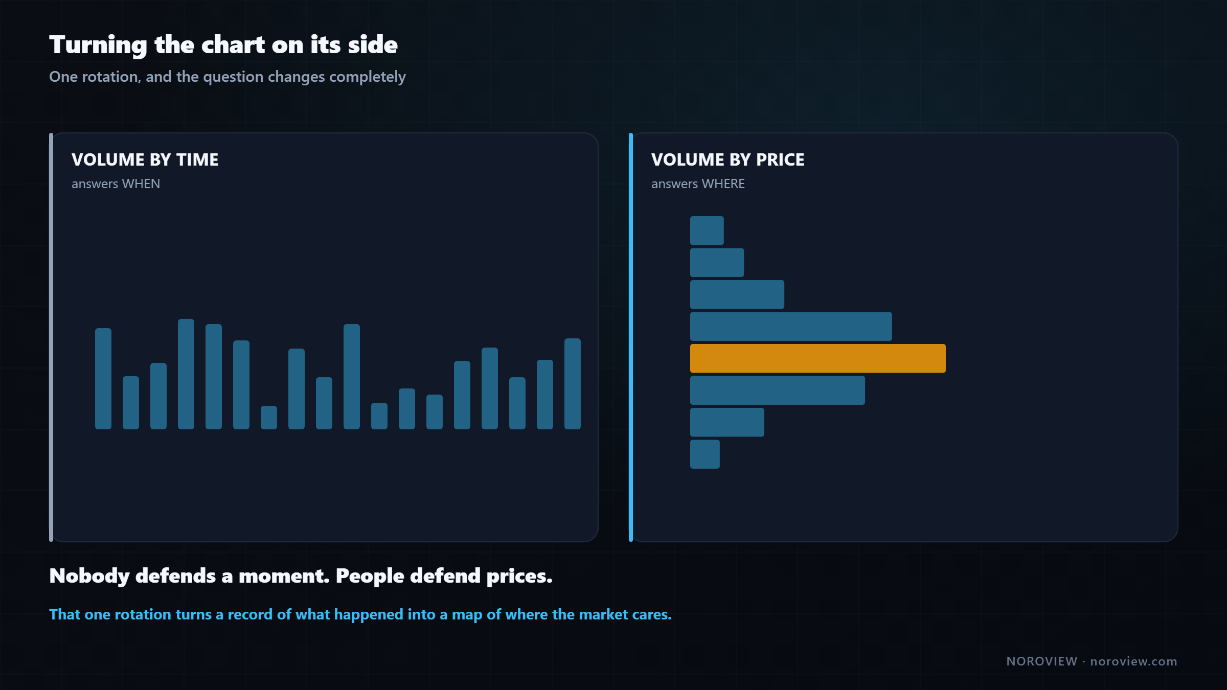
Volume by TIME → when. Volume by PRICE → where.
That one change turns the chart from a record of what happened into a map of where the market cares. Because time honestly is not that interesting — nobody defends a moment. But people absolutely defend prices. That is where their positions are, that is their cost basis, that is where their stops sit.
Go back to the auction, because it explains all of this. The auction moves price around looking for business. Where it finds a lot — where buyers and sellers both agree to transact heavily — it stays, and the profile gets fat. Where it finds none, it leaves quickly, and the profile is thin.
Fat means agreement. Thin means rejection. The shape of the profile is a direct picture of where the market found agreement and where it did not.
A note on plans: the Volume Profile indicator is a paid feature in NOROVIEW. If you are on the free tier you are not shut out of the concept — your footprint already draws a point of control and a value area on every candle, and you can mark the daily POC by hand with a horizontal line. Slower, and honestly doing it manually for a few weeks teaches you more than the automatic version does.
The three numbers that matter
| Name | What it is | |
|---|---|---|
| POC | Point of Control | The price with the most volume |
| VAH | Value Area High | The top of the 70% zone |
| VAL | Value Area Low | The bottom of the 70% zone |
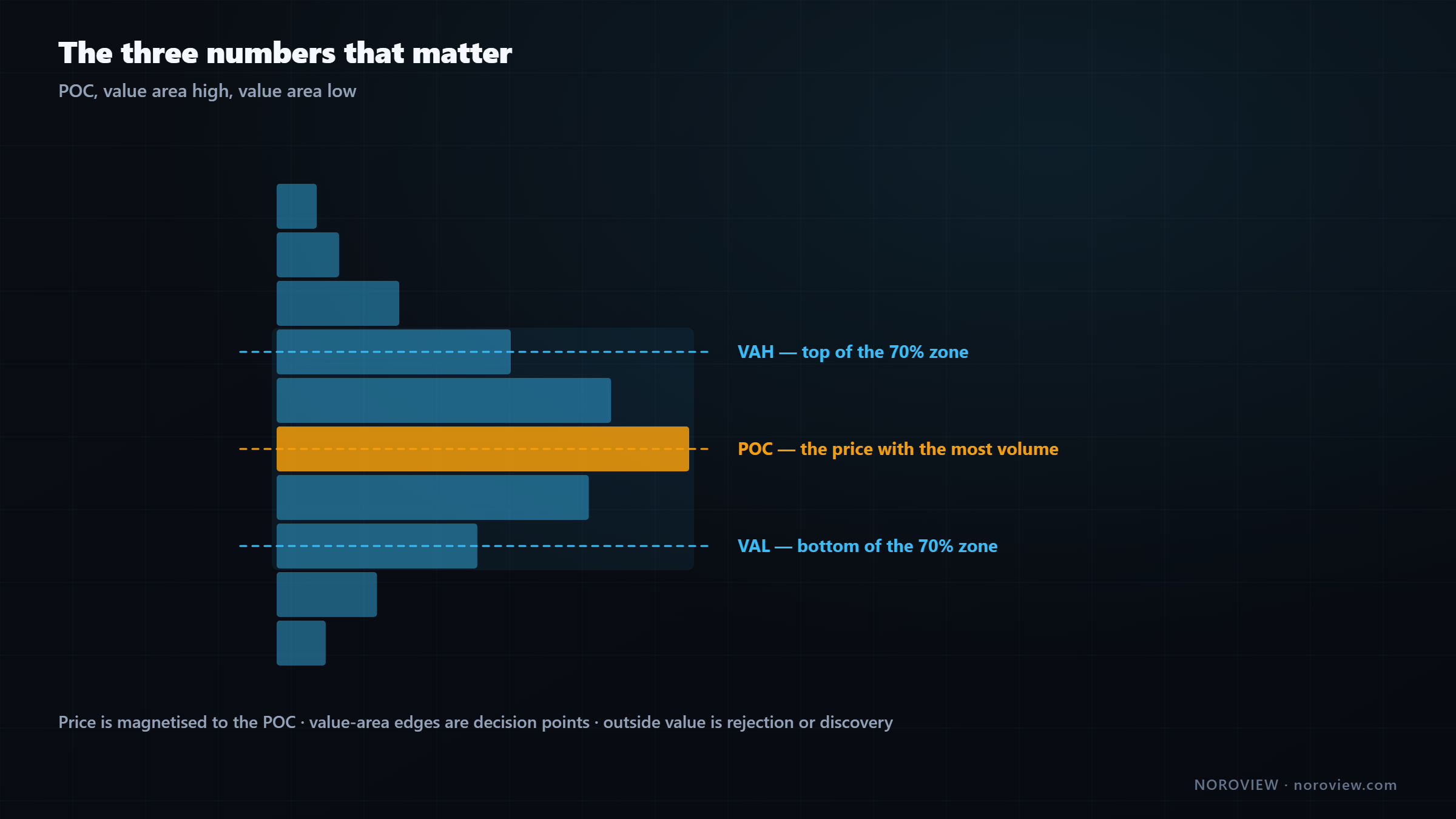
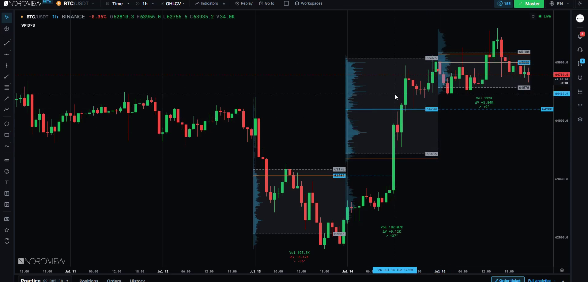
The point of control is the longest bar — the single price where the most volume traded. The market's most agreed-upon price for that period; the "fairest" price, in the sense that more participants were willing to transact there than anywhere else.
The value area is the range containing the bulk of the volume, conventionally 70%. This framework comes from market profile theory, and the CME's material on the value area is the primary reference.
The three behaviours you actually trade
1. Price is magnetised to the POC. If there is no strong reason to be elsewhere, markets drift back toward where the business is. That makes the POC an excellent target — when you need somewhere sensible to take profit, an untested POC is the first place to look.
2. Value-area edges are decision points. The edge of value is the boundary between "the market thinks this price is acceptable" and "the market thinks this price is a stretch." Price arriving at a value-area edge is a genuine question being asked, and it either gets accepted or rejected. Those edges are levels, and they belong on your level map.
3. Outside value, one of two things is happening. Either price pokes out and comes straight back — rejection, and the previous value holds. Or price goes out and stays out, building new volume up there — acceptance, and value is moving.
Rejection = price leaves and does not build volume. Acceptance = it starts building.
Completely different situations, and you can tell them apart in real time by watching whether volume starts building at the new prices.
How the value area is actually calculated
Worth knowing, because it stops the value area being a black box.
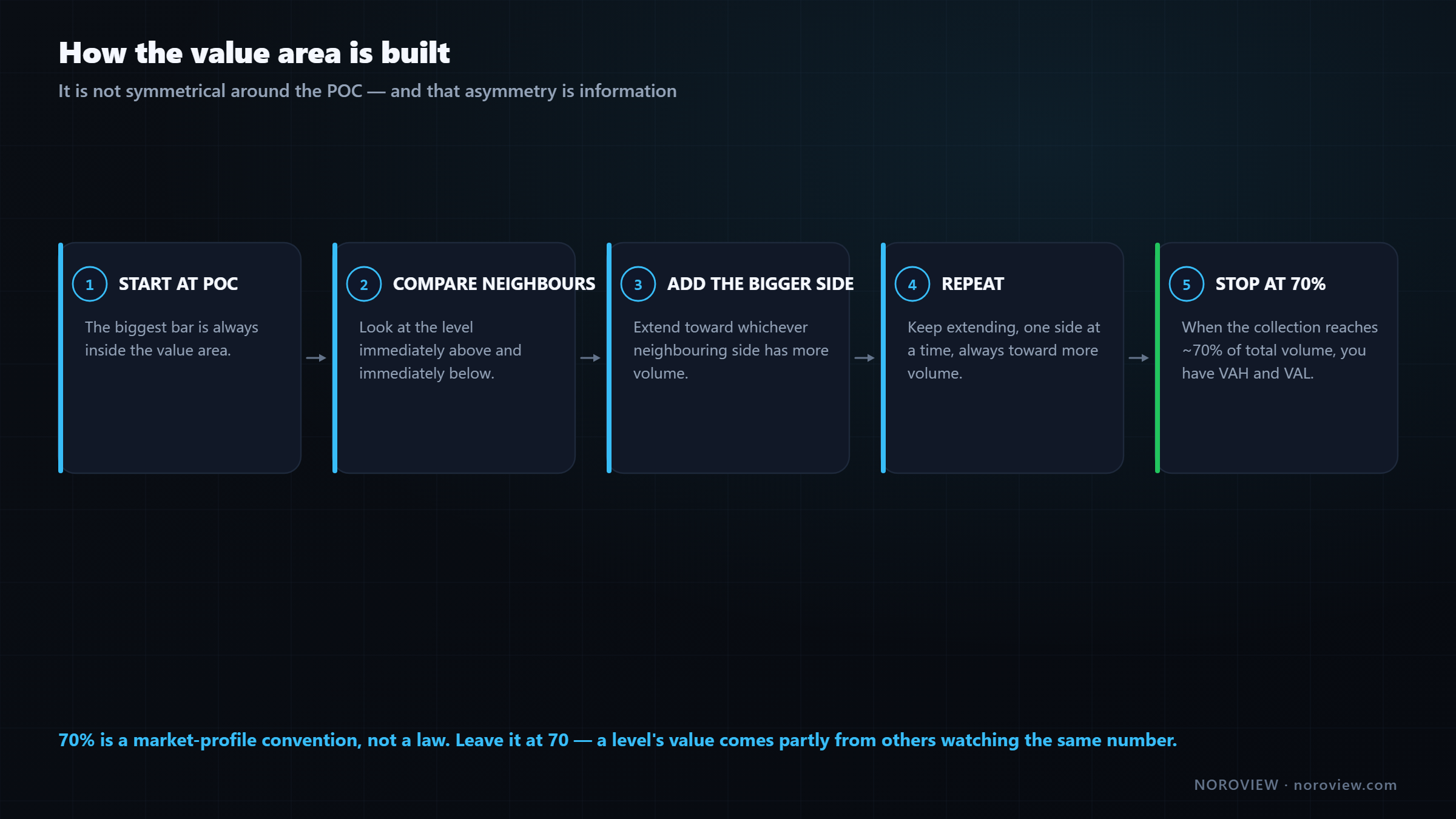
- Start at the point of control. The biggest bar is always in the value area.
- Look at the levels immediately above and below, and add whichever side has more volume.
- Repeat, each time extending toward whichever neighbouring side has more volume.
- Stop when the collection reaches 70% of the period's total volume. The top of the collection is the VAH; the bottom is the VAL.
Two things fall out of that:
The value area is not symmetrical around the POC. It grows toward whichever side had more business. So if the value area extends much further below the POC than above it, volume was concentrated downward — and that shape is information. It is the basis of the profile shapes later in this article.
70% is a convention, not a law. It comes from market profile theory, where it stands in for roughly one standard deviation of a normal distribution. Nothing is sacred about it, and you can change it. I leave it at 70, because it is what everybody else uses — and a level's value comes partly from other people watching the same number.
▶ Try this now
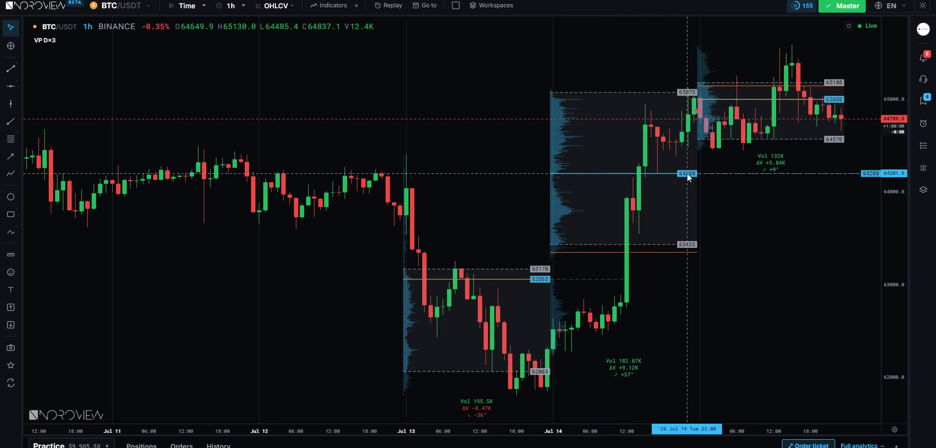
Add the Volume Profile indicator with Mode set to Daily, then set Profiles to draw to 3. Now look at where yesterday's POC sits relative to today's price. That single number is one of the most-watched intraday levels in any market, and you now have it in ten seconds. Launch NOROVIEW free →
Thick and thin: high and low volume nodes
This is the distinction I use more than any other single thing on a profile.
- HVN — high volume node — a fat area. The market agreed here.
- LVN — low volume node — a thin area. The market rejected here.
A high volume node is a price area where a lot of business happened: buyers and sellers both found it acceptable, so they traded heavily. A low volume node is a price area price passed through quickly with almost nothing trading — one side completely dominated there.
Each gives a different, very reliable prediction about what happens when price returns.
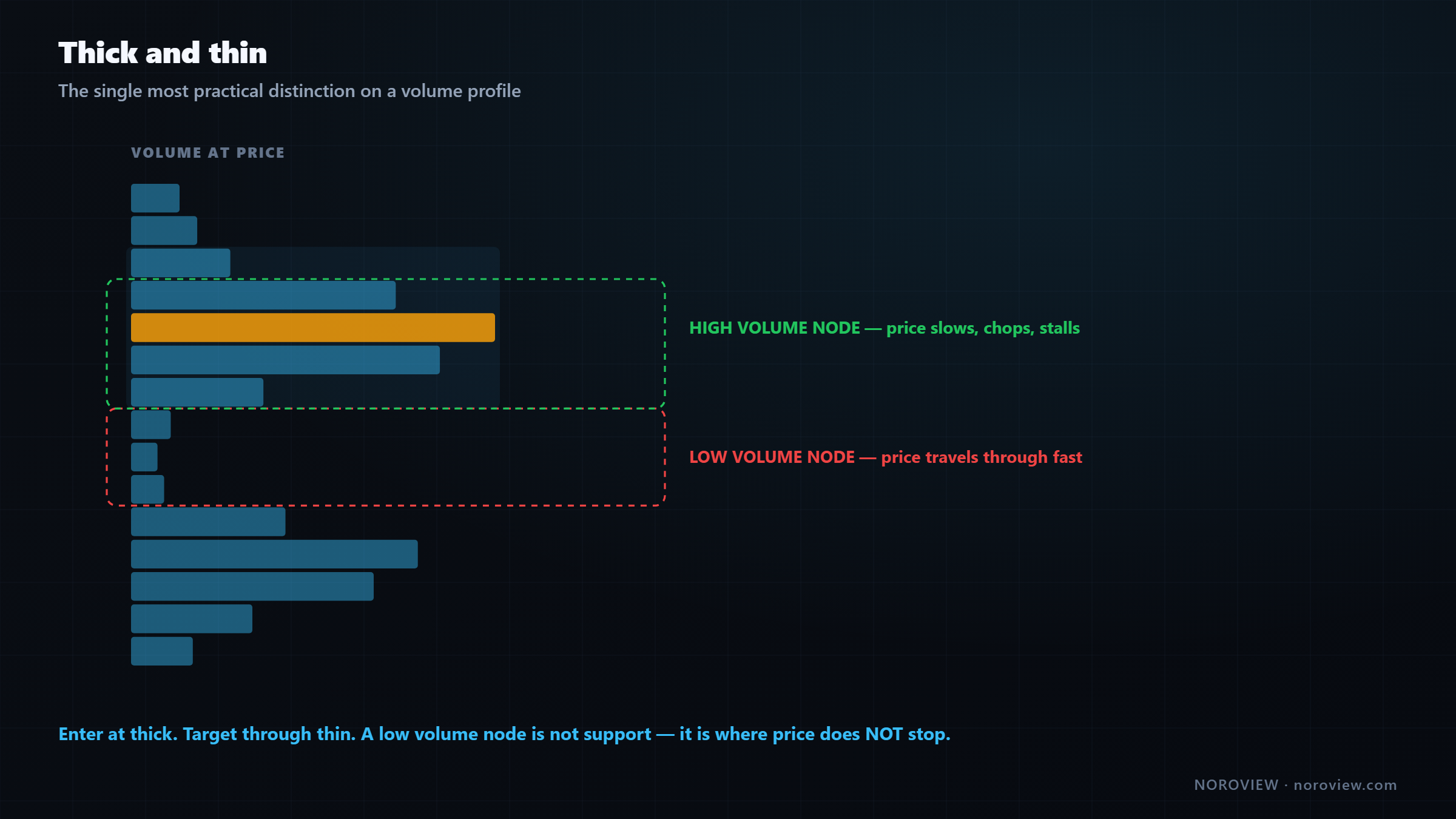
When price returns to a high volume node, it slows down. There is a lot of history at that price. Many participants hold positions there, so there is a lot of two-way interest — people adding, people getting out flat, people defending. That produces chop and stalling.
When price returns to a low volume node, it accelerates. There is nothing there. Nobody built a position at that price, because price never stayed long enough. So there is nothing to slow it down, and price often travels straight through — sometimes violently.
Enter at thick. Target through thin.
Enter at thick areas — that is where reactions happen, where absorption is likely, and where you can put a stop behind something real.
Target through thin areas — if there is a big thin gap between your entry and the next fat area, that is your runway. Price can cover that distance fast, which makes the reward side of your trade realistic instead of hopeful.
And here is the version most people get backwards: a thin area is not support or resistance. It is the opposite — a place where price does not stop. Do not put your target inside a low-volume gap and then wonder why price blew through it. Put your target at the far side: the next fat area.
Naked POCs and the developing POC
Two settings worth turning on today (Volume Profile settings → Style → Extras).
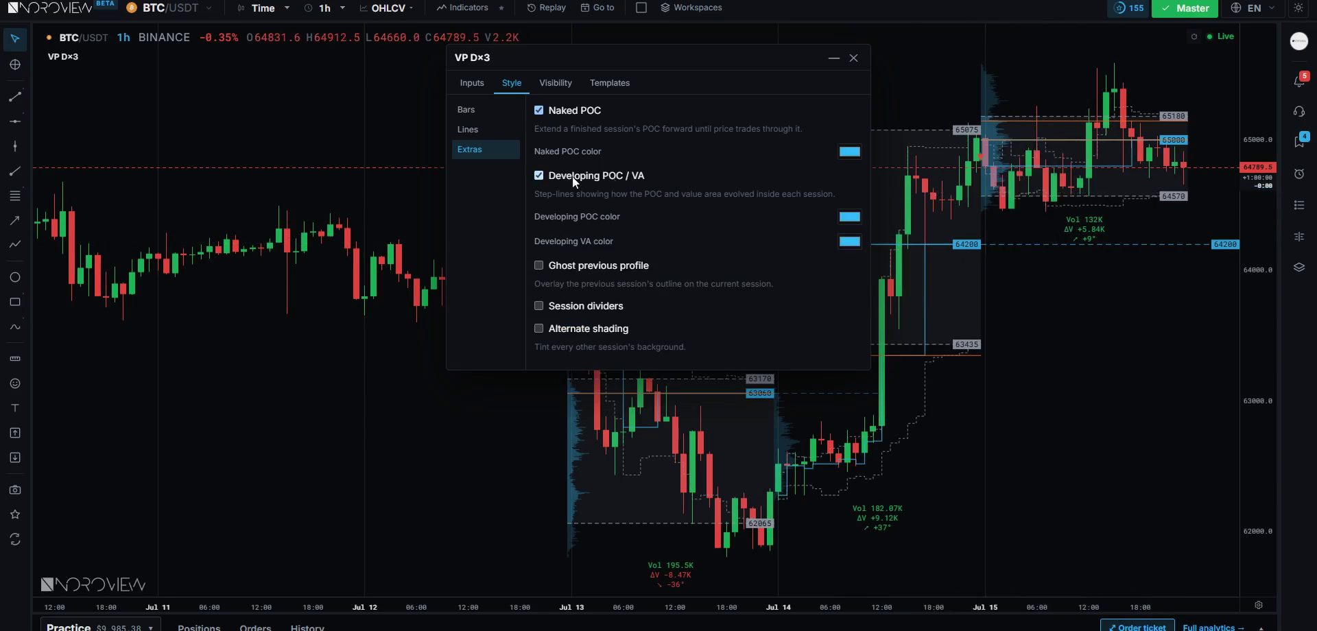
Naked POC
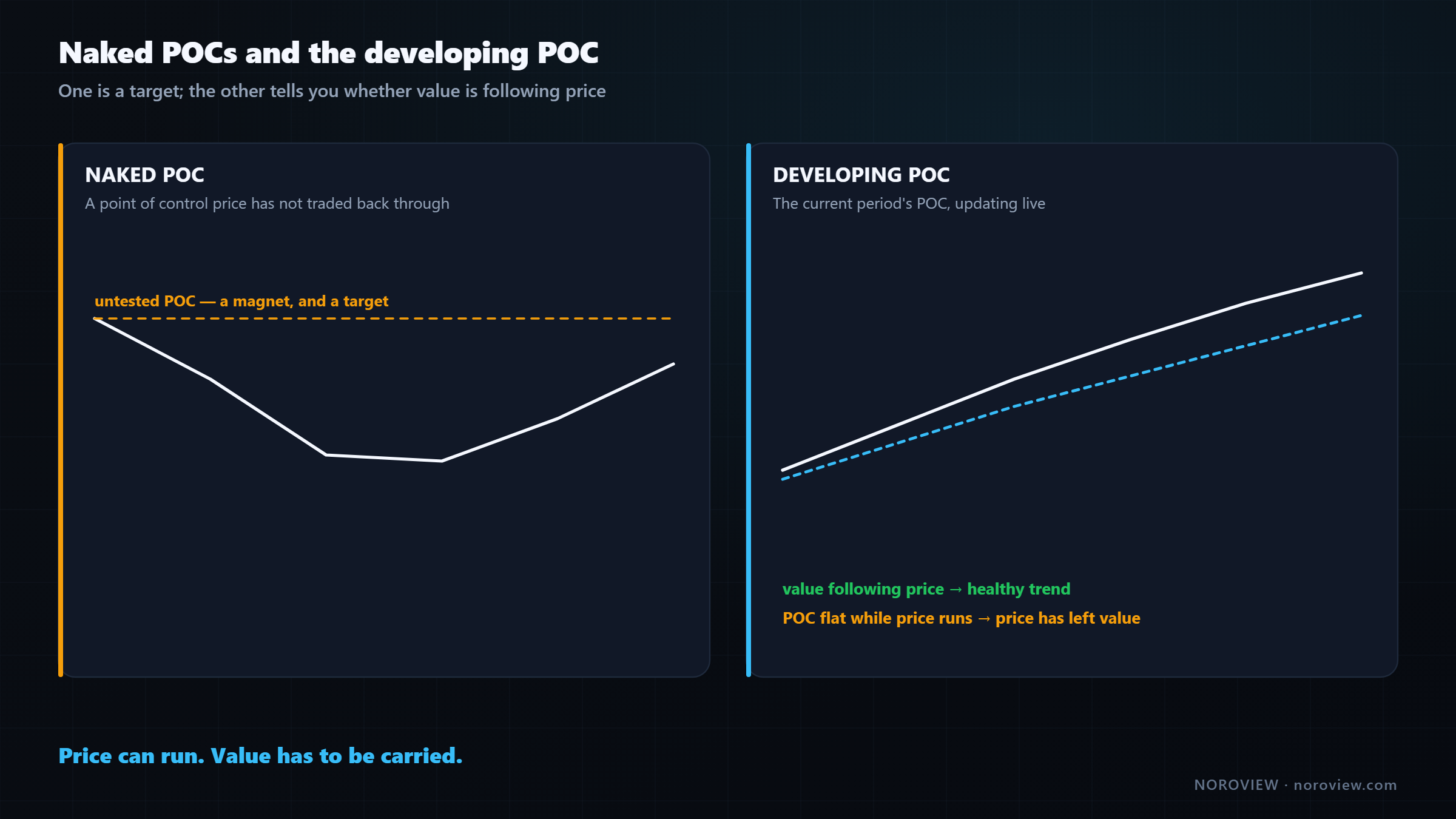
A naked POC is a point of control that price has not traded back through.
These behave like magnets, and they are among my favourite targets.
Why? Back to the auction. A POC is where the market found a lot of agreement — a price many participants wanted to do business at. If price then leaves that area quickly and never comes back, it is very likely there are still participants who wanted to trade there and never got filled. The auction has unfinished business there, and markets return to unfinished business far more often than chance would suggest. Not always. Often.
And "often" is all you need when you use it as a target rather than a prediction. Naked POCs are excellent targets — not entries.
Developing POC
The developing POC is the current period's point of control, updating live as the session goes. It is a genuinely useful real-time read.
Watch which way the developing POC is migrating.
If price is rising and the developing POC is rising with it, value is genuinely moving up. The market is accepting higher prices; business is being done up there. Healthy trend.
If price is rising and the developing POC is flat, price has run away from value. Nobody is doing business at these new prices — it is a stretch, and those moves get pulled back much more often.
Price can run. Value has to be carried.
Same sentence from lesson 4, on a bigger timeframe. Price is where it is right now; value is where the business is. When they separate, something has to give — and usually it is price.
AVO: parking space or event?
AVO = volume at a level ÷ number of candles that traded at that level
Plain arithmetic, answering a question raw volume cannot. Enable it in Volume Profile settings → Info → Show AVO.
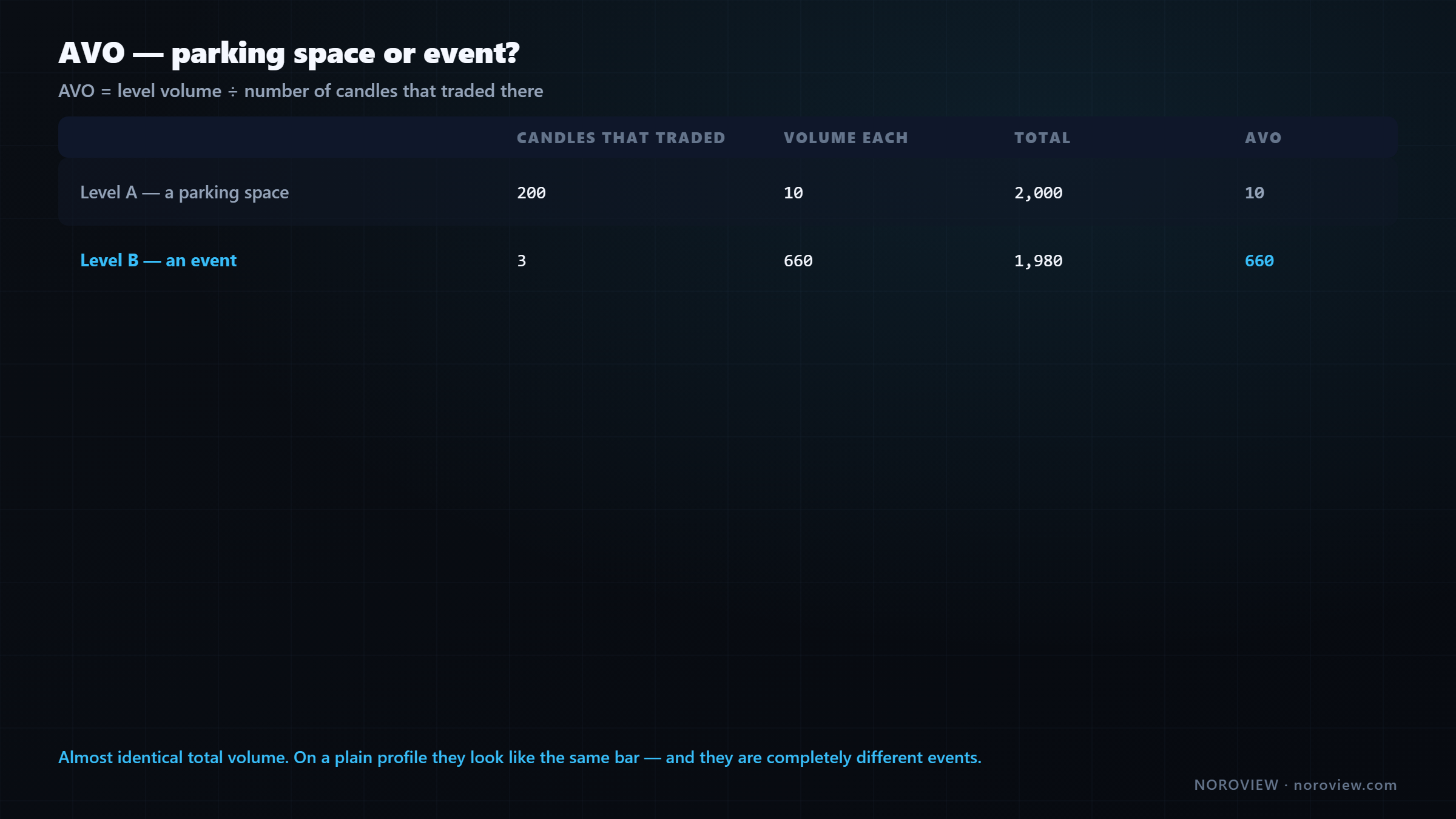
| Candles that traded there | Volume each | Total | AVO | |
|---|---|---|---|---|
| Level A | 200 | 10 | 2,000 | 10 |
| Level B | 3 | 660 | 1,980 | 660 |
Almost identical total volume, so on a plain profile they look like the same size bar. They are completely different events.
Level A is a price the market sat at for hours, doing ordinary business the whole time. Nothing happened — that is just where the market was parked.
Level B is a price the market touched for three candles, and in those three candles an enormous amount of business got done. Something happened there. Somebody made a decision, fast, with size.
Same volume. One is a parking space. One is an event.
The high-AVO levels are the ones worth caring about, because they are prices where somebody did something deliberate rather than prices where time simply passed.
Notice how this connects back to ATS. High AVO is a cousin of high average trade size — both are asking the same underlying question: was this concentrated and intentional, or diffuse and accidental? That question is most of order flow.
Volume profile, footprint and Level 2 in one browser tab
No installation, no market-data subscription, no workstation. The heavy compute runs server-side. Create a free account → · Compare plans
The five profile shapes, taught as stories
This is the part people come to volume profile for, and the part most commonly taught badly. I am going to teach these as stories, not patterns — because if you memorise shapes you will see them everywhere and they will mean nothing. If you understand the story each shape tells, you will read them correctly even when they look messy. And in real life they usually do.
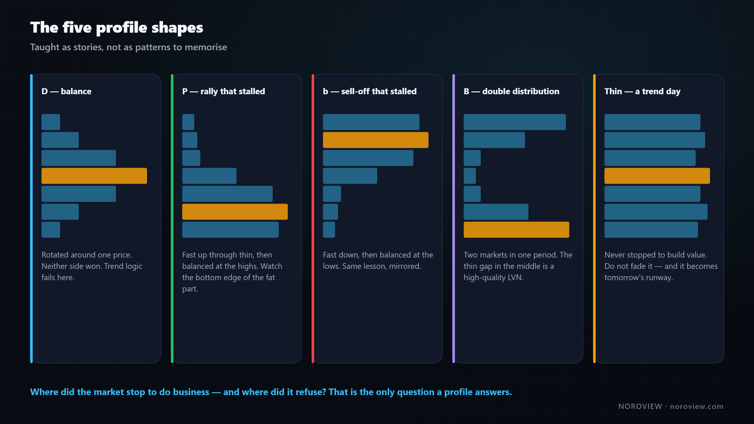
The D — balance
Fat in the middle, thinner at both ends, roughly symmetrical. A bell curve turned sideways, which is exactly what it is.
The story: the market spent the period rotating around one central price. It went up, found sellers, came back. Went down, found buyers, came back. Both sides active; neither took control.
What it means: this is a balanced market — a range. Trend logic does not work here. Buying the top of a D and selling the bottom of it is how people lose money in ranges (lesson 5).
How to trade it: fade the edges toward the POC, or wait. And pay close attention to the breakout, because balance is usually followed by imbalance. A market cannot rotate forever, and when it finally leaves a well-formed D, the move often runs.
The P — a rally that stalled
Thin at the bottom, fat at the top. Like the letter P.
The story, read bottom to top in time order: price started low and moved up quickly — that is the thin part, price passing through without doing business. Then it arrived at a higher area and stopped, doing a lot of business there — the fat part.
What it means: buyers were aggressive early, and then the auction found two-sided business at the higher prices. Somebody was willing to sell up there, in size, and the buying got met.
And here is the nuance this shape gets misread on constantly:
A P shape is bullish IF the fat area holds. If it fails, it's a trap.
If price holds inside that fat top and then continues up, the balance was accumulation and the trend continues. If price falls out of the bottom of that fat area, everybody who bought in that heavy zone is underwater — a lot of trapped longs, whose exits accelerate the move down.
So the P shape does not tell you direction. It tells you where the decision will be made: the bottom edge of the fat part. Watch that edge.
The b — a sell-off that stalled
The mirror image: thin at the top, fat at the bottom.
The story: price started high and dropped quickly through the thin area — often a liquidation, a stop cascade, or forced selling. Then it found buyers at the lower prices and balanced there.
Same nuance, mirrored: if that fat bottom holds and price recovers, the selling got absorbed and the low is real. If price breaks below the fat area, everybody who bought the dip in that zone is trapped, and their stops fuel the next leg down.
Notice that P and b are the same lesson twice. The fat area is where positions got built. The edge of the fat area is where those positions get proven right or wrong. That is the level worth marking.
The B — double distribution
Two separate fat areas with a thin gap in between.
The story: the market balanced at one price area, then something changed — news, a break, a large participant — and it moved fast through the middle to a completely different area, where it balanced again.
This is one of the most information-rich profiles you can get, for one reason: that thin gap in the middle is a low volume node, and it is a very high-quality one. Price rejected that entire zone; it refused to do business there. So when price comes back to it later — and it usually does — you have two useful expectations: if price enters the gap it tends to travel through fast, and the far fat area is where it will slow down.
Mark that gap. It is one of the most reliable pieces of geometry a profile gives you.
The thin profile — a trend day
A long, thin profile with no real fat anywhere.
The story: price moved in one direction all period and never stopped long enough to build value anywhere. One side was in control from start to finish.
What it means: first, if you recognise it early, do not fade it. Every mean-reversion instinct you have is wrong on this kind of day, and this is where counter-trend traders get destroyed. Second, the whole day becomes a low volume node on tomorrow's chart — which means the entire range is unfinished, thin and unaccepted, and easy for price to travel back through. Trend days are frequently followed by fast retracements, and now you know the mechanical reason why.
The question underneath all five
Where did the market stop to do business — and where did it refuse?
That is the only question a profile answers. The letters are just a convenient way to describe the answer.
Session modes and the settings that matter
Mode decides what period each profile covers:
| Mode | Use |
|---|---|
| Daily | One profile per day. The default for intraday work, and what generates your previous-day POC and value area |
| Weekly / Monthly | The bigger picture. A monthly POC is a serious level and survives for weeks |
| On-screen | Builds one profile from whatever is currently visible. Careful — it changes when you scroll, so the levels move as you pan. Use it to look, not to plan |
| Anchored | You choose the start point. The most powerful mode — covered below |
Profiles to draw controls how many periods get drawn. Keep it small: ten days of overlapping profiles is unreadable. Two or three days plus the naked POCs from further back is usually right.
Levels per row is aggregation, exactly like the footprint, with the same trade-off — too fine gives you a hairy mess, too coarse hides the thin areas that make the profile useful. The default is usually fine, and if you change it, change it once and leave it.
In Style → Extras: turn on naked POC and developing POC/VA, and turn on dividers so you can see where each profile begins.
Profiling by delta (the feature nobody uses)
The profile does not have to be built from volume.
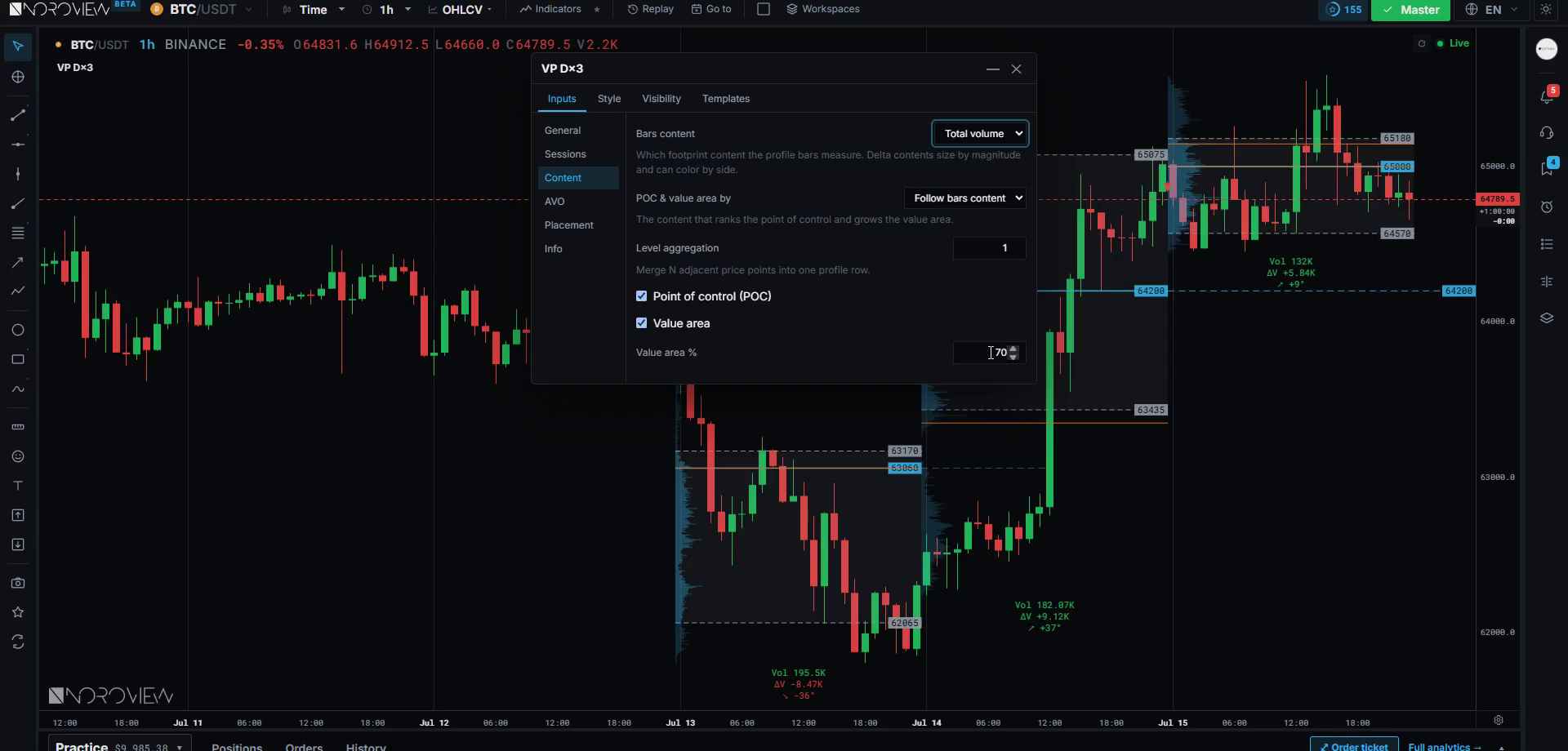
Open Content → Bars content and you will find the same twenty order-flow metrics from lesson 4 — volume, trades, ATS, AVB and ABS, each in total, buy, sell and delta.
Set the content to Volume delta and you are no longer looking at where the most volume happened. You are looking at where the most net aggression happened — which prices had the biggest imbalance between aggressive buying and aggressive selling.
That answers a different question. A normal profile says "the market did a lot of business here." A delta profile says "at this price, one side was overwhelmingly in control." Not the same thing at all — and where they disagree is interesting. A price with huge volume but delta near zero is a genuine battleground where both sides fought to a draw. A price with moderate volume but enormous one-sided delta is a price where one side simply took over.
You can do the same with ATS total — profiling the market by where the biggest average trades happened, which gives you a visual version of the ATS levels and is a preview of lesson 9.
Do not leave it on delta permanently. Volume is your default — that is the standard reading and it is what the levels are built from. But when you want a second opinion on a specific area, switching the content for thirty seconds tells you something a volume profile cannot.
Anchored volume profile — where the edge lives
Anchored = you choose where the profile starts.
Daily, weekly and monthly profiles are anchored to the calendar. And the calendar does not know anything about this market. Midnight is not a market event.
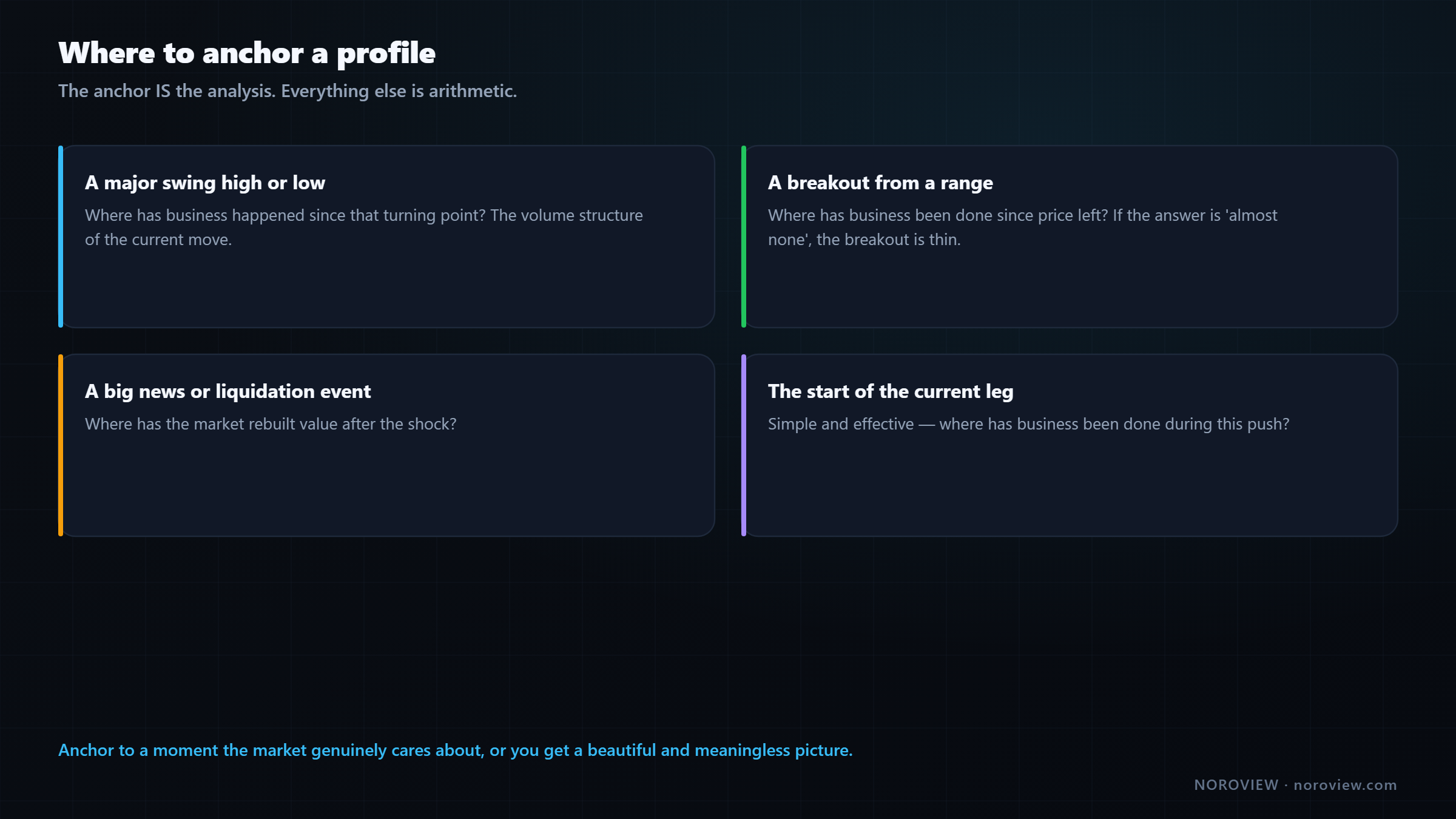
An anchored profile starts where you say it starts, which lets you profile a period that is actually meaningful. Four places to anchor:
1. A major swing high or low. The profile then tells you where all the business has happened since that turning point — the volume structure of the current move, not of an arbitrary calendar day.
2. A breakout. Anchor at the moment price left a range. Now you can see where business has been done since the breakout — and if the answer is "almost none," the breakout is thin and probably fails.
3. A big event. A crash, a liquidation cascade, a major announcement. The profile since that moment shows where the market has rebuilt value after the shock.
4. The start of the current leg. Simple and effective: where has business been done during this push?
The POC of an anchored profile is a genuinely high-quality level. It is the price where the most business has been done since the moment that mattered — a much more meaningful number than "the busiest price during Tuesday."
The anchor is the analysis. Everything else is arithmetic.
Which means the skill here is not operating the tool. It is choosing the anchor. Anchor to something the market genuinely cares about and the profile is powerful. Anchor to a random candle and you get a beautiful, meaningless picture.
Volume profile vs market profile
They are related but not identical, and the distinction is worth one paragraph. Market profile (TPO) was developed at the CBOT and measures time at price — how many time periods traded at each level, drawn as letters. Volume profile measures volume at price. The vocabulary is shared — POC, value area, the letter shapes — because volume profile borrowed the framework, but the underlying measurement is different. In a market where a lot of volume can print in a very short time, which describes crypto precisely, volume at price is generally the more useful of the two. CME's market profile course is the canonical reference for the original framework.
How I actually use it
- Daily profiles, last two or three days. Mark the previous day's POC, VAH and VAL. These go straight onto the level map.
- Note every naked POC above and below current price. These are targets, not entries.
- Find the thin areas. Between price and the nearest naked POC, is there a low volume node? That is the runway, and it determines whether the reward side of a trade is realistic.
- Read the shape of yesterday. Balance or trend? That single word changes which setups I am allowed to take today.
- Anchor one profile to whatever the most recent meaningful event was — the swing that started this move, or the breakout.
- Check the developing POC during the session. Is value following price, or has price run away from it?
That whole routine is about four minutes once you have done it twenty times.
Common mistakes
- Putting targets inside low volume nodes. Price does not stop there — that is the definition.
- Using On-screen mode to mark levels. The levels move when you scroll.
- Drawing ten days of overlapping profiles. Unreadable is the same as useless.
- Memorising the letter shapes as patterns instead of reading them as stories.
- Treating a naked POC as an entry. It is a target.
- Fading a thin trend-day profile. That is precisely the day mean reversion fails.
- Anchoring to a random candle. The anchor is the analysis.
Your homework
About an hour.
- Mark the previous day's POC, VAH and VAL on your main market. Then scroll back two weeks and check, day by day, what price did the first time it returned to each previous-day POC.
- Find one clear example of each shape — D, P, b, B, thin — in the last month. Write one sentence for each explaining the story.
- Anchor a profile to the most recent major swing and compare its POC with the calendar-day POC. Which one is closer to where price has actually been reacting?
Open the terminal and mark yesterday's profile →
Three things to remember
- Volume by price is a map of where the market cares. Fat means agreement; thin means rejection.
- Enter at thick, target through thin. A low volume node is not support — it is where price does not stop.
- The anchor is the analysis. An anchored profile from a meaningful moment beats a calendar profile every time.
← Previous: The Order Flow Trading Strategy · Course index: Order Flow Trading Course · Next → VWAP and Anchored VWAP
Frequently asked questions
What is the point of control in volume profile? The point of control is the single price level with the most traded volume in the profiled period — the price the market agreed on most. Price tends to be drawn back toward it when there is no strong reason to be elsewhere, which makes it more useful as a profit target than as an entry.
How is the value area calculated? Start at the point of control, then repeatedly extend to whichever adjacent price level has more volume, until the collected levels account for roughly 70% of the period's total volume. The top and bottom of that collection are the value area high and low. It is deliberately asymmetric.
What is a low volume node? A low volume node is a thin section of the profile — a price area price passed through quickly with almost no business done. When price returns to it, it tends to move through fast rather than stall, because nobody built positions there. It is the opposite of support.
What is a naked POC? A naked POC is a point of control from an earlier period that price has not traded back through. Because a POC represents a price where many participants wanted to transact, an untested one often has unfilled interest still waiting, which makes it act as a magnet and a good target.
What is a developing POC? The developing POC is the current period's point of control, recalculated live as the session progresses. Watching whether it migrates with price tells you whether value is genuinely following the move or whether price has run away from where business is being done.
What does a P-shaped volume profile mean? A P shape is thin at the bottom and fat at the top: price rallied quickly through the thin area, then balanced at higher prices. It is constructive while the fat top holds, and becomes a trap if price falls out of the bottom of it, because everyone who bought in that heavy zone is then underwater.
What is the difference between volume profile and market profile? Market profile measures time at price, drawn as TPO letters, and originated at the CBOT. Volume profile measures volume at price. They share the vocabulary of POC, value area and shapes, but volume profile is generally more informative in markets where large volume can print in very little time.
How do you use volume profile for day trading crypto? Mark the previous day's POC, value area high and low as levels; note any naked POCs as targets; identify the thin areas between price and those targets as runway; and read yesterday's shape to decide whether today favours range or trend logic. Then use order flow to confirm at the level.
Sources
- CME Group Education — market profile
- CME Group Education — understanding the value area
- Investopedia — volume analysis
Soroosh Moghimi — six years inside financial markets: algorithmic trading, HFT, crypto and AI, after a decade building startups. He publishes this course free because he already paid for the lessons in it. There is no paid course and no signal group. @sorooshmoghimi · About
Start reading real order flow
You cannot learn this from a candlestick chart, and you do not need to spend a cent to begin. The standard footprint chart is free for every NOROVIEW user, market replay is free, and the paper-trading simulator is free.
Open NOROVIEW free → · Compare plans →
⚠️ DISCLAIMER — EDUCATIONAL CONTENT ONLY
This article is for educational and informational purposes only. It is not financial, investment, or trading advice, and nothing in it is a recommendation to buy, sell, or hold any asset. Trading cryptocurrencies and leveraged derivatives is high risk and can result in the loss of some or all of your capital. Only risk money you can afford to lose. Any levels, indicators, signals or results shown are illustrative and are not a promise or prediction of future performance. Charts may be shown on a demo or paper-trading account and do not represent real trades or returns. Always do your own research. You alone are responsible for your decisions.
Keep reading
Related posts

16. Trade Management: Break-Even, Partials and Trailing Stops
Trade management explained: when break-even stops cost you money, partial exits, four kinds of trailing stop, the order-flow exit, and diagnosing yourself with MFE and MAE.

15. How to Day Trade Crypto With Order Flow (Starting Small)
How to day trade crypto with order flow: exchange security, spot vs perpetuals, leverage and liquidation, order types, fees, and an honest $100 starting plan.

14. Risk, Drawdown and the Mind: Day Trading's Real Edge
Day trading risk management and psychology: position sizing math, drawdown recovery arithmetic, hard limits, decision vs outcome, and the five states that break traders.

13. Fair Value Gaps, Confirmed With Order Flow
Most fair value gaps do nothing. Five order-flow checks that tell you in advance which FVGs are worth trading and which are decoration.

5. Market Structure and Trend: How to Pick Your Side Objectively
How to identify market structure objectively: higher highs and higher lows, swing point rules, impulse vs correction, and the arithmetic behind trading with the trend.
11. My Order Flow Entry Model, Step by Step
A complete order flow entry model: the four conditions, the exact trigger candle, the value-area filter, and the ten-item blocker list that vetoes a trade.
Discussion (0)
Want to join the discussion? Comments live inside the platform.
Open NOROVIEW